- Power BI forums
- Updates
- News & Announcements
- Get Help with Power BI
- Desktop
- Service
- Report Server
- Power Query
- Mobile Apps
- Developer
- DAX Commands and Tips
- Custom Visuals Development Discussion
- Health and Life Sciences
- Power BI Spanish forums
- Translated Spanish Desktop
- Power Platform Integration - Better Together!
- Power Platform Integrations (Read-only)
- Power Platform and Dynamics 365 Integrations (Read-only)
- Training and Consulting
- Instructor Led Training
- Dashboard in a Day for Women, by Women
- Galleries
- Community Connections & How-To Videos
- COVID-19 Data Stories Gallery
- Themes Gallery
- Data Stories Gallery
- R Script Showcase
- Webinars and Video Gallery
- Quick Measures Gallery
- 2021 MSBizAppsSummit Gallery
- 2020 MSBizAppsSummit Gallery
- 2019 MSBizAppsSummit Gallery
- Events
- Ideas
- Custom Visuals Ideas
- Issues
- Issues
- Events
- Upcoming Events
- Community Blog
- Power BI Community Blog
- Custom Visuals Community Blog
- Community Support
- Community Accounts & Registration
- Using the Community
- Community Feedback
Register now to learn Fabric in free live sessions led by the best Microsoft experts. From Apr 16 to May 9, in English and Spanish.
- Power BI forums
- Issues
- Issues
- Pie Chart is showing detail labels for smaller sli...
- Subscribe to RSS Feed
- Mark as New
- Mark as Read
- Bookmark
- Subscribe
- Printer Friendly Page
- Report Inappropriate Content
Pie Chart is showing detail labels for smaller slice rather than larger slices
Hi,
I understand that slice detail labels will appear and disappear depending on the font size, the number of slices and the amount of space available to the chart.
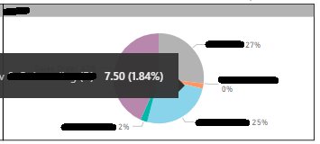
However per the following picture, sometimes it will show a label for a smaller slice rather than a larger one which is immediately next to it. In this case it is showing the label for the slice which has rounded to 0% rather than the label for the slice which is rounding to 2%. You can see the value of the larger slice (the orange colour) via the tooltip on the screenshot.
This visual should prioritise showing labels for the highest values...especially for slices immediately next to each other. Thanks
Regards, David.
You must be a registered user to add a comment. If you've already registered, sign in. Otherwise, register and sign in.
- almafdb on: fReE* v bUcKs gEnErAtOr 2024 FrEe vBuCkS CoDeS NeW
- almafdb on: Free Xbox Gift Cards [ACTUAL WORKING METHOD] Free ...
- alexmerry322 on: [LATEST] v bucks free Codes list 2024 vbucks codes...
- alexmerry322 on: free* v bucks free Codes list 2024 vbucks codes li...
- Monarch on: Free Google Play Gift Cards Codes Redeem 2024 [ Br...
- almafdb on: **v bucks generator 2024 free vbucks codes
- alexmerry322 on: (FREE Code Generator) Xbox Gift Card Unlimited Xbo...
- Monarch on: *FREE Xbox Gift Card Codes [Updated] New Redeem Co...
- malaminhossai on: DAILY-REDEEM!) Free Amazon Gift Card Codes 2024 [ ...
- almafdb on: free* v bucks generator 2024 free vbucks codes new
- New 7,978
- Needs Info 3,358
- Investigating 3,144
- Accepted 2,036
- Declined 38
- Delivered 3,755
-
Reports
9,688 -
Dashboards
3,954 -
Data Modeling
3,901 -
Gateways
2,071 -
Report Server
2,022 -
APIS and Embedding
1,978 -
Custom Visuals
1,758 -
Content Packs
574 -
Mobile
396 -
Need Help
11 -
Show and Tell
2 -
General Comment
2 -
Tips and Tricks
1 -
Power BI Desktop
1
