- Power BI forums
- Updates
- News & Announcements
- Get Help with Power BI
- Desktop
- Service
- Report Server
- Power Query
- Mobile Apps
- Developer
- DAX Commands and Tips
- Custom Visuals Development Discussion
- Health and Life Sciences
- Power BI Spanish forums
- Translated Spanish Desktop
- Power Platform Integration - Better Together!
- Power Platform Integrations (Read-only)
- Power Platform and Dynamics 365 Integrations (Read-only)
- Training and Consulting
- Instructor Led Training
- Dashboard in a Day for Women, by Women
- Galleries
- Community Connections & How-To Videos
- COVID-19 Data Stories Gallery
- Themes Gallery
- Data Stories Gallery
- R Script Showcase
- Webinars and Video Gallery
- Quick Measures Gallery
- 2021 MSBizAppsSummit Gallery
- 2020 MSBizAppsSummit Gallery
- 2019 MSBizAppsSummit Gallery
- Events
- Ideas
- Custom Visuals Ideas
- Issues
- Issues
- Events
- Upcoming Events
- Community Blog
- Power BI Community Blog
- Custom Visuals Community Blog
- Community Support
- Community Accounts & Registration
- Using the Community
- Community Feedback
Register now to learn Fabric in free live sessions led by the best Microsoft experts. From Apr 16 to May 9, in English and Spanish.
- Power BI forums
- Issues
- Issues
- Weird Date Format on Clustered Column Chart X-Axis
- Subscribe to RSS Feed
- Mark as New
- Mark as Read
- Bookmark
- Subscribe
- Printer Friendly Page
- Report Inappropriate Content
Weird Date Format on Clustered Column Chart X-Axis
Hi there,
I have encountered some weird formatting in the PBI Service, that is not occurring in the desktop application.
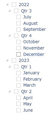
In one of my reports, I have a clustered column chart with date (type: continuous) along the X-Axis and a date list slicer for years, quarters and months. The date format on the chart when the slicer is unfiltered, or when a year or quarter is selected, is 'MMM YYYY' as expected.
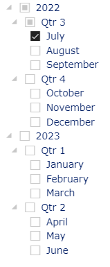
However, when I select a single month from the date list slicer, the format is inconsistent - sometimes it is 'MMM YYYY' but other times, it is 'DD MMM hh:mm', or sometimes 'YYYY' only.
Something appears to have gone awry with the interaction at the month level. Please may you investigate?
Default slicer & chart x-axis format:
Slicer month selection & updated x-axis (Service ONLY):
You must be a registered user to add a comment. If you've already registered, sign in. Otherwise, register and sign in.
- tsiry2 on: Help
-
 v-xiaoyan-msft
on:
Field Parameters Convert to Regular Tables When Li...
-
 v-xiaoyan-msft
on:
Sorry, we need additional information to verify yo...
-
 v-xiaoyan-msft
on:
Synchronize buttons and selectors across pages
-
 v-xiaoyan-msft
on:
ERROR CONNEC|T |TO SEMANTIC MODEL
-
 v-yetao1-msft
on:
Blank Query/FetchXML semantic model not refreshing...
-
 v-xiaoyan-msft
on:
Credenciales de origen de datos con Pyton
-
 v-xiaoyan-msft
on:
Power BI in-place semantic model - not showing in ...
-
 v-tianyich-msft
on:
DAX
- New 8,073
- Needs Info 3,368
- Investigating 3,153
- Accepted 2,037
- Declined 38
- Delivered 3,764
-
Reports
9,711 -
Dashboards
3,996 -
Data Modeling
3,934 -
Gateways
2,080 -
APIS and Embedding
2,039 -
Report Server
2,033 -
Custom Visuals
1,823 -
Content Packs
633 -
Mobile
406 -
Need Help
11 -
Show and Tell
2 -
General Comment
2 -
Tips and Tricks
1 -
Power BI Desktop
1


Hi @BITomS ,
I tried to reproduce your problem, but my result is that the time display on Power BI Service is the same as in Power BI Desktop.
Am I missing something? Can you provide a sample pbix or tell me the detailed reproduction steps?
Does this issue occur in other reports?
Best Regards,
Community Support Team _ Caitlyn