cancel
Showing results for 
Search instead for 
Did you mean: 

Register now to learn Fabric in free live sessions led by the best Microsoft experts. From Apr 16 to May 9, in English and Spanish.

Matrix Content Misalignment in Power BI Workspace upon Publishing

Description of the Issue:

Hello Power BI Support Team,

I am facing a visualization inconsistency between my report as viewed on Power BI Desktop and its appearance after being published to Power BI Workspace. While the report is displayed perfectly on Power BI Desktop, the visualization changes post-publishing, leading to a misalignment in the matrix content.

Detailed Observations:

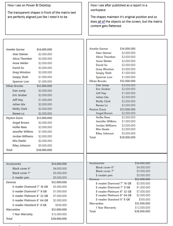
  1. In Power BI Desktop: Transparent shapes overlay the matrix content, which are precisely aligned as intended.
  2. Upon Publishing to Power BI Workspace: The published report reveals that, although transparent shapes and other objects retain their initial placement, the matrix content seems misaligned or compressed. Specifically, it appears the matrix rows have shifted or adjusted, causing the transparent shapes no longer to align correctly with their intended content.
  3. Font Size Observations: When setting the font size to 8, the matrix rows seem compressed. However, when configuring the font sizes to any value above 8, the matrix appears to stretch, introducing a side scrollbar as evidence.

Steps to Reproduce:

  1. Create a report in Power BI Desktop, incorporating a matrix with transparent shapes overlaying its content.
  2. Ensure these shapes are aligned with the matrix content.
  3. Adjust the font size of the matrix to observe varying behavior.
  4. Publish this report to Power BI Workspace.
  5. View the published report and contrast against its Desktop version.

Significance of the Issue:

I require precision in alignment due to my intent to export every report page post-publishing. Each page will serve as an individual slide for a presentation aimed at the company's executive board. This perfect alignment is not merely an aesthetic preference but vital for delivering clear and professional presentations to our leadership.

I would deeply appreciate your guidance or a solution to rectify this challenge.

Thank you in advance for your assistance.

Demonstration of the issue:

BO Matriz.PNG

Link to PBIX File 

Best regards,


Bruno Monteiro Gomes de Araujo

Status: Investigating

Hi  @bruno_araujo ,


Can you provide detailed version information so we can reproduce the issue? We'll get back to the product team as soon as it's acknowledged as an issue!
Thanks in advance!


Best regards.
Community Support Team_Caitlyn

Comments
v-xiaoyan-msft
Community Support
Status changed to: Delivered

Hi @bruno_araujo ,


Thank you very much for your feedback, but it doesn't seem to be a bug in the product!

If you would like to suggest  feature improvements, you may  vote the idea and comment here to improve this feature. It is a place for customers provide feedback about Microsoft Office products . What’s more, if a feedback is high voted there by other customers, it will be promising that Microsoft Product Team will take it into consideration when designing the next version in the future.


Best Regards,
Community Support Team _ Caitlyn

bruno_araujo
Frequent Visitor

Hello Caitlyn and the Community Support Team,


I appreciate your prompt response. However, I must respectfully disagree with the assessment that this is not a bug. Here are the reasons why this issue should be considered a bug and not just a feature improvement:


  1. Consistency between Platforms: Power BI Desktop and Power BI Workspace are products from the same suite, and as such, one would expect a consistent visualization experience across both platforms. A design that looks one way on the desktop but displays differently upon publishing to the workspace is inconsistent behavior, which is a hallmark of a software bug.

  2. Reproducibility: The steps provided in the initial ticket clearly lay out a way to reproduce the issue consistently. A deviation from expected behavior that is consistently reproducible typically qualifies as a bug.

  3. Impact on Professionalism: As dashboard designers, we rely on Power BI to convey critical business insights to executive stakeholders. These stakeholders expect a high level of professionalism and clarity in the presentations. Misaligned visual components not only hinder the understanding of the data but also reflect poorly on the professionalism of the presentation.

  4. Lack of Workarounds: This isn't a minor aesthetic preference but a foundational design requirement. If there were alternative methods to achieve the desired alignment without facing the issue, it could be considered a feature request. However, given the current circumstances, the lack of a solution renders the tool less effective for its intended purpose.

  5. Strategic Importance for Microsoft: Power BI is one of the leading BI tools in the market, used by countless organizations globally. Addressing such issues promptly not only enhances user trust and satisfaction but also strengthens Power BI's market position against competitors. Recognizing and rectifying this issue could be instrumental in retaining users who require precise design capabilities, particularly for executive dashboards.

In light of the above arguments, I urge the team to reconsider the categorization of this issue and provide a timely resolution. We genuinely value Power BI and its capabilities, and it's crucial for us to have this inconsistency addressed to continue delivering high-quality dashboards to our leadership.

Thank you for your understanding and attention to this matter.


 Best regards,


 Bruno Araujo

bruno_araujo
Frequent Visitor

@v-xiaoyan-msft I must say I'm very disappointed with your answer. I've provided a lot of arguments on why it should be considered as a bug and all you can say is that it's not a bug and that I can publish this as a new feature requirement. IT IS a bug, it might not be a specific Power BI Desktop bug nor a Power BI online platform bug, but it is a bug at the backend responsible for converting the visual properties between ambients and it needs to be fixed. I can't even imagine a way to convert this situation into a new feature requirement, how could I do that? Would it be something like: "HI Microsoft, I have an amazing idea for your product! How about you make your desktop and online ambients sync and reflect each other's job properly?" It just don't make sense, it is not a new feature, it's a very old feature that doesn't work properly, so it's a bug!

bruno_araujo
Frequent Visitor

Hello.

I would like to update you on the evolving nature of the issue we've been discussing. While the original misalignment issue between Power BI Desktop and Power BI Workspace seems to have been addressed, we are now experiencing a similar problem when exporting reports to PDF or Power Point.

Specifically, here are the details of the new situation:

  1. Alignment in Power BI Tools: In both Power BI Desktop and Power BI Workspace, the visual components, including shapes and matrix rows, appear to be perfectly aligned as expected.

  2. Misalignment during Export: However, when exporting the report to either PDF or Power Point, the matrix rows appear to shift or adjust, causing a misalignment similar to the one we initially reported

makberry
Regular Visitor

@bruno_araujo @v-xiaoyan-msft I have been dealing with this issue for a while now. I have noticed that the misalignment not only exists between the desktop and the workspace server, but also on the workspace between different users. 


For example, I will align visuals in the editing feature on a workspace. The matrix will be properly aligned on my screen and some of my coworkers' screens. However, other coworkers, will see it misaligned. This could be caused by different screen sizes and resolutions, but am not sure. 


@bruno_araujo Can you please explain how the issue has been addressed? I am still experiencing it as of this morning. 

v-xiaoyan-msft
Community Support
Status changed to: Investigating

Hi  @bruno_araujo ,


Can you provide detailed version information so we can reproduce the issue? We'll get back to the product team as soon as it's acknowledged as an issue!
Thanks in advance!


Best regards.
Community Support Team_Caitlyn

makberry
Regular Visitor

@v-xiaoyan-msft 


Here is a detailed explanation of the steps to recreate using the Power BI sample dataset:

  1. Load in the sample data set into Power BI desktop
  2. Set dimensions of the page to custom 720px by 1500 px
  3. Add a slicer to Page 1 with Sheet1[Product]
    1. Change slicer setting to dropdown and single select
  4. Add a slicer to Page 1 with Sheet1[Product]
    1. Change slicer setting to dropdown and single select
  5. Add a slicer to Page 1 with Sheet1[Year]
    1. Change slicer setting to dropdown
  6. Create a Matrix with the following fields from the Sheet1 source:
    1. Columns: Sheet1[Year] and Sheet1[Month Name]
      • Sort Sheet1[Month Name] by Sheet1[Month Number]
    2. Values: Create the following measures and add them to the Values Section of the Matrix
      • Sum of Units Sold = SUM(Sheet1[Units Sold])
      • Average Unit Sale Price = SUM(Sheet1[ Sales])/SUM(Sheet1[Units Sold])
      • Average Unit Cost = SUM(Sheet1[COGS])/SUM(Sheet1[Units Sold])
      • Blank = “xxxxxxxxxxxx”
      • Total Sales = SUM(Sheet1[ Sales])
      • Total COGS = SUM(Sheet1[COGS])
      • Blank = “xxxxxxxxxxxx”
      • Total Profit = SUM(Sheet1[Profit])


        *I add the “Blank” measures to the matrix to add spacing between sections

    3. Format Matrix
      1. Under "Values" turn on "Switch values to rows"
      2. Under “Values”, set the Alternate Background Color to white
      3. Under Specific Column,
        • Select “Blank” series and set the text color and background to white
          • Apply to header, subtotals, total, and values
        • Select “Total Profit” series and set the background color to light grey
          • Apply to header, subtotals, total, and values
  1. Add a text box to the top of the page with text “Total Sales” as a page title
  2. Add a rounded rectangle shape to the page
    1. Change the Rounded Corners to 10%
    2. Change the background color to light grey
    3. Change the border color to dark grey
    4. Turn on Text and type “Units”. Change the text to font 12 with font color black.
    5. Move and resize to be next to the “Sum of Units Sold”, “Average Unit Sale Price”, and “Average Unit Cost” lines of the Matrix
  3. Add a rounded rectangle shape to the page
    1. Change the Rounded Corners to 10%
    2. Change the background color to light grey
    3. Change the border color to dark grey
    4. Turn on Text and type “Total $”. Change the text to font 12 with font color black.
    5. Move and resize to be next to the “Total Sales” and “Total COGS” rows of the Matrix
  4. Upload to Power BI Server


Here is a screenshot of the page in Power BI Desktop:

makberry_2-1698074067783.png


Here is a screenshot of the page in the server:

makberry_3-1698074133238.png

Notice 2 things:

1. Although the dimensions of the visual have not changed, the font inside the matrix seems to have expanded and now requires a scroll bar.

2. The dimensions of both the matrix and the rectangle shapes have not changed, but the shapes do not line up the rows like they did in the desktop view.

*Similar to what @bruno_araujo mentioned in an earlier post in this thread, I have noticed that at some font sizes, the matrix tends to expand. At other font sizes, the matrix tends to retract. But, both of these situations affect the alignment of the visuals on the page and have a similar effect on the user experience. 


Additionally, the effects of point 2 grow as you add more rows to the matrix. For the sake of explanation, I have duplicated each measure in the matrix to show the effects on a larger matrix with more value rows.


In Power BI desktop:

makberry_4-1698074525128.png


In Power BI Server:

makberry_5-1698074580011.png


bruno_araujo
Frequent Visitor

@makberry  Actually I don't understand how the issue has been adressed, it seams a very unstable issue, I'm having trouble to track down the exact conditions on wich it happens or not.


@v-xiaoyan-msft Please find the requested information below:


Release:
September 2023

Product Version:
2.121.903.0 (23.09) (x64)

OS Version:
Microsoft Windows NT 10.0.17763.0 (x64 en-US)

CLR Version:
4.8 or later [Release Number = 528049]

tiffanyd89
New Member

I too am facing a similar issue. 

I built an report in Powr BI Desktop and when I publish it to my Power BI Workspace or view it in my Power BI App, most of my visuals become misaligned. I'm not sure if it's all (Matrix, Cards, Shapes) of them or just the Matrix

Desktop View:

tiffanyd89_7-1707872093253.png


Power Bi APP View:

tiffanyd89_6-1707872040617.png


I have tried to embed the same Power BI Report onto SharePoint and it slightly matches my Desktop Layout which made me think that it's a ratio issue in the Power Bi Service Workspace? 

SharePoint Embed View:

tiffanyd89_5-1707872006676.png


The report uses a standard 16:9 layout (1280x720), I've tested it on Edge and Chrome but get the same result. This error occurs for myself and for other users. 

I do recall that the report worked fine in October/November but definitely hasn't worked since February so it may be related to a recent update. I've tried clearing the cache, trying it on a different computer. I've seen that there was a similar issue a couple of years ago.

Is there anything I can do or is this a bug that will be fixed in the next update?