- Power BI forums
- Updates
- News & Announcements
- Get Help with Power BI
- Desktop
- Service
- Report Server
- Power Query
- Mobile Apps
- Developer
- DAX Commands and Tips
- Custom Visuals Development Discussion
- Health and Life Sciences
- Power BI Spanish forums
- Translated Spanish Desktop
- Power Platform Integration - Better Together!
- Power Platform Integrations (Read-only)
- Power Platform and Dynamics 365 Integrations (Read-only)
- Training and Consulting
- Instructor Led Training
- Dashboard in a Day for Women, by Women
- Galleries
- Community Connections & How-To Videos
- COVID-19 Data Stories Gallery
- Themes Gallery
- Data Stories Gallery
- R Script Showcase
- Webinars and Video Gallery
- Quick Measures Gallery
- 2021 MSBizAppsSummit Gallery
- 2020 MSBizAppsSummit Gallery
- 2019 MSBizAppsSummit Gallery
- Events
- Ideas
- Custom Visuals Ideas
- Issues
- Issues
- Events
- Upcoming Events
- Community Blog
- Power BI Community Blog
- Custom Visuals Community Blog
- Community Support
- Community Accounts & Registration
- Using the Community
- Community Feedback
Register now to learn Fabric in free live sessions led by the best Microsoft experts. From Apr 16 to May 9, in English and Spanish.
- Power BI forums
- Issues
- Issues
- Bug with Bing Maps for defined USA counties
- Subscribe to RSS Feed
- Mark as New
- Mark as Read
- Bookmark
- Subscribe
- Printer Friendly Page
- Report Inappropriate Content
Bug with Bing Maps for defined USA counties
Hello together,
I would like to visualize a kind of heatmap for the unemployment rate of all US states and counties.
Source for US Unemployment Rate States: https://www.bls.gov/web/laus/laumstrk.htm
Source for US Unemployment Rate Counties (just the latest): https://www.bls.gov/web/metro/laucntycur14.txt
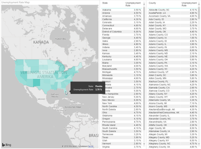
With the states everything is fine, like this: (data category = "state or province")
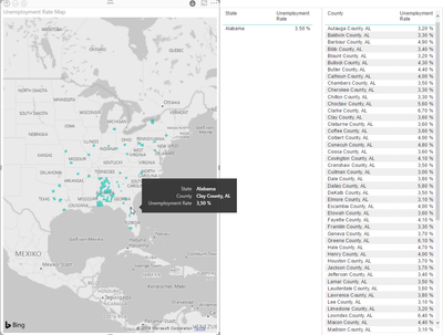
But with the counties it looks like this: (data category = "county", all counties named like "Anderson County, SC"
I've already tried to describe the county rows like this: "<County>, County, <State Code>", but there's no other result.
Could help me someone or is this a Bug with Bing/Microsoft?
Thank you very much!
BG,
Sven
You must be a registered user to add a comment. If you've already registered, sign in. Otherwise, register and sign in.
- w3schools24 on: ᐉ✔[DIRETTA@LIVE!] Juventus-Roma In Diretta Streami...
- Smithkali on: ᐉ✔[DIRETTA@2024!] Juventus Roma In Diretta Streami...
- f1gp on: 🏁🚗[opTv@kijk] Miami GP 2024 live kijken OP tv!
- f1gp on: 🏁🚗[LIVESTREAM.] Miami GP 2024 Grand Prix Live Fr...
- sweety on: +>[LIVESTREAMs!] Miami Grand Prix 2024 Live Free O...
- sweety on: ~>[LIVESTREAMs!] F1 Miami Grand Prix 2024 Live Fre...
- f1gp on: [LIVESTREAMs] 2024 Miami Grand Prix Live Free Broa...
- jibon1 on: [+[!streams!]+] F1 Miami Grand Prix 2024 live free...
- jibon1 on: [LIVESTREAMs!] 2024 Miami Grand Prix Live Free Bro...
- f1gp on: 🔯[[[STREAMING]']] Roma-Juventus in tv e streaming...
- New 8,110
- Needs Info 3,371
- Investigating 3,147
- Accepted 2,036
- Declined 38
- Delivered 3,757
-
Reports
9,707 -
Dashboards
4,005 -
Data Modeling
3,944 -
Gateways
2,079 -
APIS and Embedding
2,046 -
Report Server
2,029 -
Custom Visuals
1,828 -
Content Packs
650 -
Mobile
409 -
Need Help
11 -
Show and Tell
2 -
General Comment
2 -
Tips and Tricks
1 -
Power BI Desktop
1

