- Power BI forums
- Updates
- News & Announcements
- Get Help with Power BI
- Desktop
- Service
- Report Server
- Power Query
- Mobile Apps
- Developer
- DAX Commands and Tips
- Custom Visuals Development Discussion
- Health and Life Sciences
- Power BI Spanish forums
- Translated Spanish Desktop
- Power Platform Integration - Better Together!
- Power Platform Integrations (Read-only)
- Power Platform and Dynamics 365 Integrations (Read-only)
- Training and Consulting
- Instructor Led Training
- Dashboard in a Day for Women, by Women
- Galleries
- Community Connections & How-To Videos
- COVID-19 Data Stories Gallery
- Themes Gallery
- Data Stories Gallery
- R Script Showcase
- Webinars and Video Gallery
- Quick Measures Gallery
- 2021 MSBizAppsSummit Gallery
- 2020 MSBizAppsSummit Gallery
- 2019 MSBizAppsSummit Gallery
- Events
- Ideas
- Custom Visuals Ideas
- Issues
- Issues
- Events
- Upcoming Events
- Community Blog
- Power BI Community Blog
- Custom Visuals Community Blog
- Community Support
- Community Accounts & Registration
- Using the Community
- Community Feedback
Register now to learn Fabric in free live sessions led by the best Microsoft experts. From Apr 16 to May 9, in English and Spanish.
- Power BI forums
- Community Blog
- Power BI Community Blog
- When Big Numbers Become Big Problems
- Subscribe to RSS Feed
- Mark as New
- Mark as Read
- Bookmark
- Subscribe
- Printer Friendly Page
- Report Inappropriate Content
- Subscribe to RSS Feed
- Mark as New
- Mark as Read
- Bookmark
- Subscribe
- Printer Friendly Page
- Report Inappropriate Content
A few days ago, I had a conversation with a colleague about Data Visualization.
I explained that in data visualization, it is the relationships between numbers that matter, rather than the numbers themselves.
His opinion was different. From his point of view, the dashboard should have numbers because that's how users see the main KPIs.
In response to my inquiry about how exactly a single number could provide insight, he gave an example of the large BANS that appear at the top of the screen and, according to him, explained the situation in seconds. This is indeed the opinion that many dashboard developers hold, including myself in the past.
Why do Bans/cards on dashboards become so common?
1. " Experts" recommendations such as:
"Don’t bury the most important fact, your KPI, in a chart. Show it loud and proud as a Big A** Number (BAN)!"
2. Considering a dashboard as a stage for telling a story. The big and beautiful numbers go well with the idea of presenting the main point.
3. The desire to impress. Sometimes managers have a fantasy of seeing running numbers with indicators on the plasma, and that's how they think they know what the "pulse" of the business is. Because we have a tool that can make it happen easily, we run to meet their "desires".
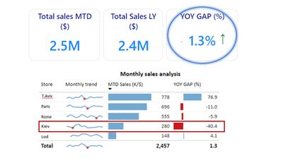
The result - is "cards" with large numbers like in the picture below appearing in most of the dashboards.
As I began investigating the real goals of data visualization, I realized graphs are a functional tool, not a decoration. Dashboards are not a stage for a story, but a monitoring tool to improve a situation. All of this should be accomplished with a minimum of time and effort. Part of the change was that cards simply disappeared from the screen without being noticed.

1. By using this format, the whole is separated from the parts. It is like putting a central piece of the puzzle on top, not in its place where it belongs. The result - on the one hand, the center part is separated, on the other, the picture has a "hole". It's not a good way to develop a dashboard.
2. These BANS take up a lot of space on the screen.
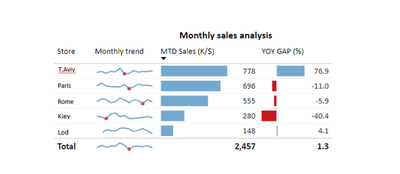
Below is a picture of a detailed table that is almost the same size as the Cards area.

3. There is an "advantage" to decoration, but it can also "hide" your insights. In the picture, it appears that the month was successful in total and that there was an increase from last year. But when we look at the full picture, one of the stores has seen a drop in performance of over 40%... Maybe not so good after all.

Final thoughts
The cards have simply disappeared from my last dashboards without me noticing.
It requires a lot of work and scientific precision to create a correct and detailed visualization. However, when I see the use of dashboards is leading to discussions and changes in processes, I know it was worth it.
*All graphs were created using POWER BI
Let me know what you think by giving us a thumbs up,
Greetings, Rita

You must be a registered user to add a comment. If you've already registered, sign in. Otherwise, register and sign in.
- Dynamic rollback of the previous N weeks of data
- Supercharge Your Visuals: Easy Conditional Formatt...
- The using of Cartesian products in many-to-many re...
- How to Filter similar Columns Based on Specific Co...
- Power BI Dynamic Date Filters: Automatically Updat...
- Enhanced Data Profiling in Power Query: GUI and Ta...
- How to use Tooltip to display breakdown data for a...
- Unveiling the Power of Lakehouse's SQL Analytics E...
- [DAX] Time Intelligence vs WINDOW vs OFFSET
- Display data in a fixed order and show data for th...
- joseftantawi on: How to customize open-sourced custom visual.
- kalpeshdangar on: Creating Custom Calendars for Accurate Working Day...
- gwayne on: Embracing TMDL Functionalities in Power BI and Pre...
- jian123 on: Sharing Power Query tables
-
 Martin_D
on:
From the Desk of An Experienced Power BI Analyst
-
 ibarrau
on:
[PowerQuery] Catch errors in a request http
- Aditya07 on: How to import customised themes in Power BI - usin...
-
 Martin_D
on:
Currency Conversion in Power BI: Enabling Seamless...
-
 technolog
on:
Unveiling Top Products with categories: A Guide to...
-
 Ritaf1983
on:
When Big Numbers Become Big Problems
-
How To
573 -
Tips & Tricks
526 -
Support insights
121 -
Events
107 -
DAX
66 -
Power BI
65 -
Opinion
64 -
Power Query
62 -
Power BI Desktop
40 -
Power BI Dev Camp
36 -
Roundup
31 -
Power BI Embedded
20 -
Time Intelligence
19 -
Tips&Tricks
18 -
PowerBI REST API
12 -
Power BI Service
8 -
Power Query Tips & Tricks
8 -
finance
8 -
Direct Query
7 -
Power Automate
6 -
Data Visualization
6 -
Python
6 -
Power BI REST API
6 -
Auto ML
6 -
financial reporting
6 -
Data Analysis
6 -
powerbi
5 -
service
5 -
Power BI PowerShell
5 -
Machine Learning
5 -
Featured User Group Leader
5 -
Dax studio
5 -
Income Statement
5 -
Power BI Goals
4 -
PowerShell
4 -
Desktop
4 -
Bookmarks
4 -
Group By
4 -
Line chart
4 -
community
4 -
RLS
4 -
M language
4 -
External tool
4 -
Paginated Reports
4 -
calendar
3 -
Gateways
3 -
R
3 -
M Query
3 -
R visual
3 -
Webinar
3 -
CALCULATE
3 -
Reports
3 -
PowerApps
3 -
Data Science
3 -
Azure
3 -
Data model
3 -
Conditional Formatting
3 -
Visualisation
3 -
Administration
3 -
M code
3 -
SQL Server 2017 Express Edition
3 -
Visuals
3 -
R script
3 -
Aggregation
3 -
Dataflow
3 -
Formatting
2 -
Power Platform
2 -
Workday
2 -
external tools
2 -
slicers
2 -
SAP
2 -
index
2 -
RANKX
2 -
Integer
2 -
PBI Desktop
2 -
Date Dimension
2 -
Power BI Challenge
2 -
Query Parameter
2 -
Visualization
2 -
Tabular Editor
2 -
Date
2 -
SharePoint
2 -
Power BI Installation and Updates
2 -
How Things Work
2 -
troubleshooting
2 -
Date DIFF
2 -
Transform data
2 -
rank
2 -
ladataweb
2 -
Tips and Tricks
2 -
Incremental Refresh
2 -
Query Plans
2 -
Power BI & Power Apps
2 -
Random numbers
2 -
Day of the Week
2 -
Number Ranges
2 -
M
2 -
hierarchies
2 -
Power BI Anniversary
2 -
Language M
2 -
Custom Visual
2 -
VLOOKUP
2 -
pivot
2 -
calculated column
2 -
Power BI Premium Per user
2 -
inexact
2 -
Date Comparison
2 -
Split
2 -
Forecasting
2 -
REST API
2 -
Editor
2 -
Working with Non Standatd Periods
2 -
powerbi.tips
2 -
Custom function
2 -
Reverse
2 -
measure
2 -
Microsoft-flow
2 -
Paginated Report Builder
2 -
PUG
2 -
Custom Measures
2 -
Filtering
2 -
Row and column conversion
2 -
Python script
2 -
Nulls
2 -
DVW Analytics
2 -
Industrial App Store
2 -
Week
2 -
Date duration
2 -
parameter
2 -
Weekday Calendar
2 -
Support insights.
2 -
construct list
2 -
update
1 -
Slicer
1 -
Visual
1 -
forecast
1 -
Regression
1 -
CICD
1 -
sport statistics
1 -
Intelligent Plant
1 -
Circular dependency
1 -
GE
1 -
Exchange rate
1 -
Dendrogram
1 -
range of values
1 -
activity log
1 -
Decimal
1 -
Charticulator Challenge
1 -
Field parameters
1 -
Training
1 -
Announcement
1 -
Features
1 -
domain
1 -
pbiviz
1 -
Color Map
1 -
Industrial
1 -
Weekday
1 -
Working Date
1 -
Space Issue
1 -
Emerson
1 -
Date Table
1 -
Cluster Analysis
1 -
Stacked Area Chart
1 -
union tables
1 -
Number
1 -
Start of Week
1 -
Tips& Tricks
1 -
deployment
1 -
ssrs traffic light indicators
1 -
SQL
1 -
trick
1 -
Scripts
1 -
Extract
1 -
Topper Color On Map
1 -
Historians
1 -
context transition
1 -
Custom textbox
1 -
OPC
1 -
Zabbix
1 -
Label: DAX
1 -
Business Analysis
1 -
Supporting Insight
1 -
rank value
1 -
Synapse
1 -
End of Week
1 -
Tips&Trick
1 -
Workspace
1 -
Theme Colours
1 -
Text
1 -
Flow
1 -
Publish to Web
1 -
patch
1 -
Top Category Color
1 -
A&E data
1 -
Previous Order
1 -
Substring
1 -
Wonderware
1 -
Power M
1 -
Format DAX
1 -
Custom functions
1 -
accumulative
1 -
DAX&Power Query
1 -
Premium Per User
1 -
GENERATESERIES
1 -
Showcase
1 -
custom connector
1 -
Waterfall Chart
1 -
Power BI On-Premise Data Gateway
1 -
step by step
1 -
Top Brand Color on Map
1 -
Tutorial
1 -
Previous Date
1 -
XMLA End point
1 -
color reference
1 -
Date Time
1 -
Marker
1 -
Lineage
1 -
CSV file
1 -
conditional accumulative
1 -
Matrix Subtotal
1 -
Check
1 -
null value
1 -
Report Server
1 -
Audit Logs
1 -
analytics pane
1 -
mahak
1 -
pandas
1 -
Networkdays
1 -
Button
1 -
Dataset list
1 -
Keyboard Shortcuts
1 -
Fill Function
1 -
LOOKUPVALUE()
1 -
Tips &Tricks
1 -
Plotly package
1 -
refresh M language Python script Support Insights
1 -
Excel
1 -
Cumulative Totals
1 -
Report Theme
1 -
Bookmarking
1 -
oracle
1 -
Canvas Apps
1 -
total
1 -
Filter context
1 -
Difference between two dates
1 -
get data
1 -
OSI
1 -
Query format convert
1 -
ETL
1 -
Json files
1 -
Merge Rows
1 -
CONCATENATEX()
1 -
take over Datasets;
1 -
Networkdays.Intl
1 -
Get row and column totals
1 -
Sameperiodlastyear
1 -
Office Theme
1 -
matrix
1 -
bar chart
1 -
Measures
1 -
powerbi argentina
1 -
Model Driven Apps
1 -
REMOVEFILTERS
1 -
XMLA endpoint
1 -
translations
1 -
OSI pi
1 -
Parquet
1 -
Change rows to columns
1 -
remove spaces
1 -
Azure AAD
1 -
Governance
1 -
Fun
1 -
Power BI gateway
1 -
gateway
1 -
Elementary
1 -
Custom filters
1 -
Vertipaq Analyzer
1 -
powerbi cordoba
1 -
DIisconnected Tables
1 -
Sandbox
1 -
Honeywell
1 -
Combine queries
1 -
X axis at different granularity
1 -
ADLS
1 -
Primary Key
1 -
Microsoft 365 usage analytics data
1 -
Randomly filter
1 -
Week of the Day
1 -
Get latest sign-in data for each user
1 -
Retail
1 -
Power BI Report Server
1 -
School
1 -
Cost-Benefit Analysis
1 -
ISV
1 -
Ties
1 -
unpivot
1 -
Practice Model
1 -
Continuous streak
1 -
ProcessVue
1 -
Create function
1 -
Table.Schema
1 -
Acknowledging
1 -
Postman
1 -
Text.ContainsAny
1 -
Power BI Show
1 -
query
1 -
Dynamic Visuals
1 -
KPI
1 -
Intro
1 -
Icons
1 -
Issues
1 -
function
1 -
stacked column chart
1 -
ho
1 -
ABB
1 -
KNN algorithm
1 -
List.Zip
1 -
optimization
1 -
Artificial Intelligence
1 -
Map Visual
1 -
Text.ContainsAll
1 -
Tuesday
1 -
API
1 -
Kingsley
1 -
Merge
1 -
variable
1 -
financial reporting hierarchies RLS
1 -
Featured Data Stories
1 -
MQTT
1 -
Custom Periods
1 -
Partial group
1 -
Reduce Size
1 -
FBL3N
1 -
Wednesday
1 -
help
1 -
group
1 -
Scorecard
1 -
Json
1 -
Tops
1 -
Multivalued column
1 -
pipeline
1 -
Path
1 -
Yokogawa
1 -
Dynamic calculation
1 -
Data Wrangling
1 -
native folded query
1 -
transform table
1 -
UX
1 -
Cell content
1 -
General Ledger
1 -
Thursday
1 -
Power Pivot
1 -
Quick Tips
1 -
data
1 -
PBIRS
1 -
Usage Metrics in Power BI
1 -
HR Analytics
1 -
keepfilters
1 -
Connect Data
1 -
Financial Year
1 -
Schneider
1 -
dynamically delete records
1 -
Copy Measures
1 -
Friday
1 -
Table
1 -
Natural Query Language
1 -
Infographic
1 -
automation
1 -
Prediction
1 -
newworkspacepowerbi
1 -
Performance KPIs
1 -
Active Employee
1 -
Custom Date Range on Date Slicer
1 -
refresh error
1 -
PAS
1 -
certain duration
1 -
DA-100
1 -
bulk renaming of columns
1 -
Single Date Picker
1 -
Monday
1 -
PCS
1 -
Saturday
1 -
Q&A
1 -
Event
1 -
Custom Visuals
1 -
Free vs Pro
1 -
Format
1 -
Current Employees
1 -
date hierarchy
1 -
relationship
1 -
SIEMENS
1 -
Multiple Currency
1 -
Power BI Premium
1 -
On-premises data gateway
1 -
Binary
1 -
Power BI Connector for SAP
1 -
Sunday
1

