- Power BI forums
- Updates
- News & Announcements
- Get Help with Power BI
- Desktop
- Service
- Report Server
- Power Query
- Mobile Apps
- Developer
- DAX Commands and Tips
- Custom Visuals Development Discussion
- Health and Life Sciences
- Power BI Spanish forums
- Translated Spanish Desktop
- Power Platform Integration - Better Together!
- Power Platform Integrations (Read-only)
- Power Platform and Dynamics 365 Integrations (Read-only)
- Training and Consulting
- Instructor Led Training
- Dashboard in a Day for Women, by Women
- Galleries
- Community Connections & How-To Videos
- COVID-19 Data Stories Gallery
- Themes Gallery
- Data Stories Gallery
- R Script Showcase
- Webinars and Video Gallery
- Quick Measures Gallery
- 2021 MSBizAppsSummit Gallery
- 2020 MSBizAppsSummit Gallery
- 2019 MSBizAppsSummit Gallery
- Events
- Ideas
- Custom Visuals Ideas
- Issues
- Issues
- Events
- Upcoming Events
- Community Blog
- Power BI Community Blog
- Custom Visuals Community Blog
- Community Support
- Community Accounts & Registration
- Using the Community
- Community Feedback
Earn a 50% discount on the DP-600 certification exam by completing the Fabric 30 Days to Learn It challenge.
- Power BI forums
- Community Blog
- Power BI Community Blog
- Data Derivatives in Power BI: A Python-based Inter...
- Subscribe to RSS Feed
- Mark as New
- Mark as Read
- Bookmark
- Subscribe
- Printer Friendly Page
- Report Inappropriate Content
Data Derivatives in Power BI: A Python-based Interpolation and Approximation Analysis
- Subscribe to RSS Feed
- Mark as New
- Mark as Read
- Bookmark
- Subscribe
- Printer Friendly Page
- Report Inappropriate Content
This article focuses on exploring the use of interpolation and approximation of data sets in Power BI utilizing Python.
Given a data set, as depicted in the following figure:
x = np.array([15, 20, 25, 30, 35, 40, 45, 50, 55, 60, 65, 70, 75])
y1 = np.array([243, 265, 287, 313, 343, 373, 401, 435, 475, 519, 571, 630, 699])
y2 = np.array([244, 269, 291, 320, 350, 379, 406, 442, 482, 526, 578, 633, 703])
y3 = np.array([371, 379, 395, 411, 427, 445, 463, 485, 509, 533, 555, 583, 615])
y4 = np.array([374, 382, 399, 416, 433, 457, 482, 509, 533, 561, 587, 615, 645])
y5 = np.array([370, 382, 390, 398, 408, 420, 432, 446, 460, 476, 494, 514, 538])
y6 = np.array([370, 388, 398, 410, 424, 438, 452, 466, 482, 500, 518, 540, 564])
y7 = np.array([348, 378, 408, 454, 508, 566, 638, 720, 0  , 0  , 0  , 0  , 0  ])
An important aspect to be considered is that a portion of our y7 data contains zeroes, which will be crucial to bear in mind during further calculations.
The aim is to construct derivatives from the data for all values of x and y, inclusive of y2, y3, etc. To facilitate this, we commence by building an interpolation based on these data, from which we will then derive.
import numpy as np
import matplotlib.pyplot as plt
from scipy import interpolate


x = np.array([15, 20, 25, 30, 35, 40, 45, 50, 55, 60, 65, 70, 75])
y1 = np.array([243, 265, 287, 313, 343, 373, 401, 435, 475, 519, 571, 630, 699])
y2 = np.array([244, 269, 291, 320, 350, 379, 406, 442, 482, 526, 578, 633, 703])
y3 = np.array([371, 379, 395, 411, 427, 445, 463, 485, 509, 533, 555, 583, 615])
y4 = np.array([374, 382, 399, 416, 433, 457, 482, 509, 533, 561, 587, 615, 645])
y5 = np.array([370, 382, 390, 398, 408, 420, 432, 446, 460, 476, 494, 514, 538])
y6 = np.array([370, 388, 398, 410, 424, 438, 452, 466, 482, 500, 518, 540, 564])
y7 = np.array([348, 378, 408, 454, 508, 566, 638, 720, 0  , 0  , 0  , 0  , 0  ])
y8 = np.array([351, 388, 430, 478, 528, 588, 660, 740, 0  , 0  , 0  , 0  , 0  ])
y9 = np.array([358, 378, 400, 424, 463, 502, 538, 584, 628, 680, 0  , 0  , 0  ])
y10 = np.array([363, 383, 402, 430, 469, 507, 545, 590, 633, 685, 0  , 0  , 0  ])
y11 = np.array([243, 269, 295, 320, 350, 383, 416, 453, 497, 545, 593, 662, 722])
y12 = np.array([243, 264, 287, 313, 339, 372, 405, 445, 486, 534, 582, 649, 711])

y_arr = np.concatenate((y1,y2,y3,y4,y5,y6,y7,y8,y9,y10,y11,y12), axis = 0)
y_arr = np.reshape(y_arr, (12, 13))

i = 1

for y_list in y_arr:
    x = np.array([15, 20, 25, 30, 35, 40, 45, 50, 55, 60, 65, 70, 75])
    y_list = y_list[y_list > 0]

    x = np.resize(x, len(y_list))

    minx = np.min(x)
    maxx = np.max(x)


    tck = interpolate.splrep(x, y_list, s=0)

    xnew = np.arange(minx, maxx, 0.5)
    ynew = interpolate.splev(xnew, tck, der=0)
    yder2 = interpolate.splev(xnew, tck, der=1)

    fig, ax1 = plt.subplots()

    ax2 = ax1.twinx()

    ax1.plot(x, y_list, 'o', xnew, ynew, x, y_list, 'b')
    plt.title('Cubic-spline interpolation for ' + str(i) + ' line')

    ax2.plot(xnew, yder2)

    plt.show()
    i = i+1
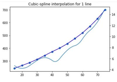
Following the implementation of the aforementioned method, we are presented with the subsequent graph. This illustrates the original data points along with the derivative values:
An observation of the derivative reveals a considerable irregularity, which is primarily due to the non-uniform arrangement of data points. This irregularity may impose challenges for any conclusions to be drawn from these data in the future.
Hence, we aim to improve the initial code to perform data approximation instead of interpolation, and then compute the derivative from the resulting function.
import scipy as sp
import numpy as np
import matplotlib.pyplot as plt
from scipy import interpolate

x = np.array([15, 20, 25, 30, 35, 40, 45, 50, 55, 60, 65, 70, 75])
y = np.array([243, 265, 287, 313, 343, 373, 401, 435, 475, 519, 571, 630, 699])
y2 = np.array([244, 269, 291, 320, 350, 379, 406, 442, 482, 526, 578, 633, 703])
y3 = np.array([371, 379, 395, 411, 427, 445, 463, 485, 509, 533, 555, 583, 615])
y4 = np.array([374, 382, 399, 416, 433, 457, 482, 509, 533, 561, 587, 615, 645])
y5 = np.array([370, 382, 390, 398, 408, 420, 432, 446, 460, 476, 494, 514, 538])
y6 = np.array([370, 388, 398, 410, 424, 438, 452, 466, 482, 500, 518, 540, 564])
y7 = np.array([348, 378, 408, 454, 508, 566, 638, 720, 0  , 0  , 0  , 0  , 0  ])
y8 = np.array([351, 388, 430, 478, 528, 588, 660, 740, 0  , 0  , 0  , 0  , 0  ])
y9 = np.array([358, 378, 400, 424, 463, 502, 538, 584, 628, 680, 0  , 0  , 0  ])
y10 = np.array([363, 383, 402, 430, 469, 507, 545, 590, 633, 685, 0  , 0  , 0  ])
y11 = np.array([243, 269, 295, 320, 350, 383, 416, 453, 497, 545, 593, 662, 722])
y12 = np.array([243, 264, 287, 313, 339, 372, 405, 445, 486, 534, 582, 649, 711])

y_arr = np.concatenate((y,y2,y3,y4,y5,y6,y7,y8,y9,y10,y11,y12), axis = 0)
y_arr = np.reshape(y_arr, (12, 13))

i = 1

for y_list in y_arr:
    x = np.array([15, 20, 25, 30, 35, 40, 45, 50, 55, 60, 65, 70, 75])
    y = y_list

    y = y[y > 0]

    x = np.resize(x, len(y))


    minx = np.min(x)
    maxx = np.max(x)

    d=3 # степень полинома
    fp, residuals, rank, sv, rcond = np.polyfit(x, y, d, full=True) # Модель
    f = sp.poly1d(fp) # аппроксимирующая функция
    y1=[fp[0]*x[i]**2+fp[1]*x[i]+fp[2] for i in range(0,len(x))] # значения функции a*x**2+b*x+c
    so=round(sum([abs(y[i]-y1[i]) for i in range(0,len(x))])/(len(x)*sum(y))*100,4) # средняя ошибка
    fx = np.linspace(x[0], x[-1] + 1, len(x)) # можно установить вместо len(x) большее число для интерполяции

    y_list = f(fx)

    tck = interpolate.splrep(x, y_list, s=0)

    xnew = np.arange(minx, maxx, 0.5)
    ynew = interpolate.splev(xnew, tck, der=0)
    yder2 = interpolate.splev(xnew, tck, der=1)

    fig, ax1 = plt.subplots()

    ax2 = ax1.twinx()

    ax1.plot(x, y_list, 'o', xnew, ynew, x, y_list, 'b')
    plt.title('Approximation for ' + str(i) + ' line')
    ax2.plot(xnew, yder2)

    plt.show()
    i = i + 1
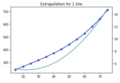
The result is displayed below:
As demonstrated, employing an approximation function results in a significantly smoother derivative of the function.
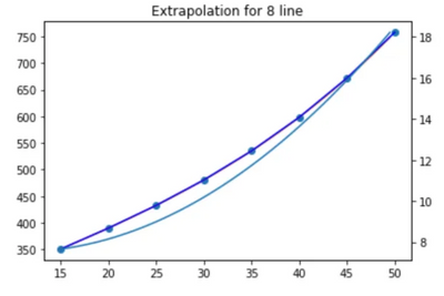
We proceed by examining the implementation for y8:
Upon inspection, we notice that excessive data along the x-axis is eliminated, with no attempt to transition to zero.
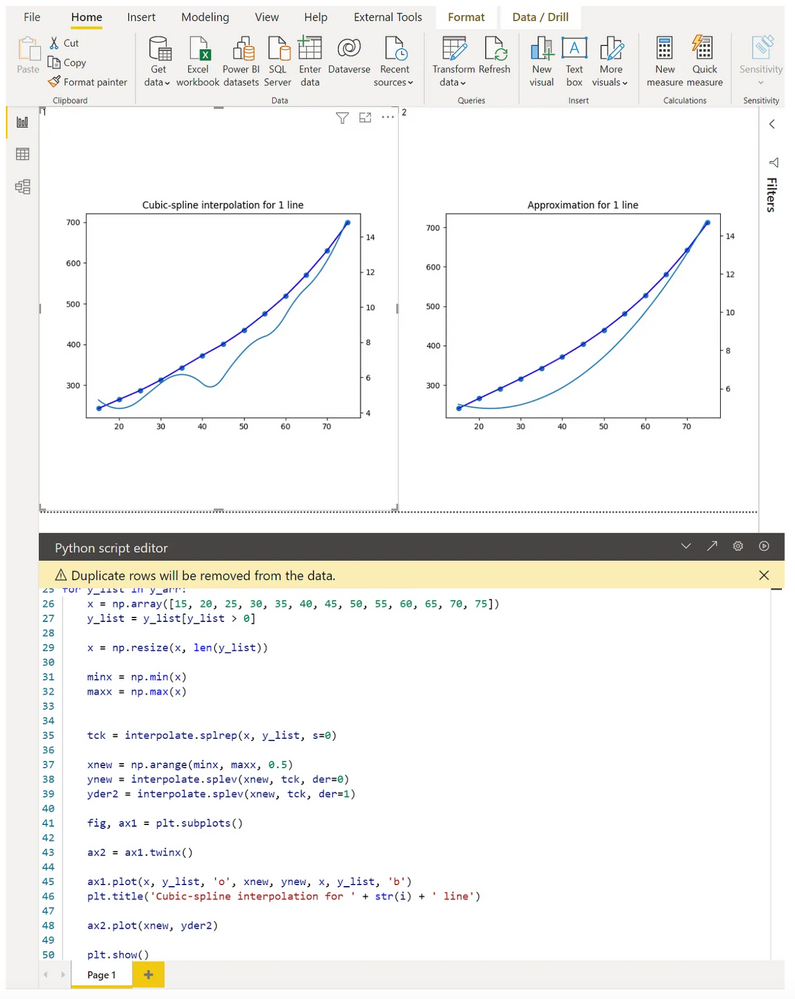
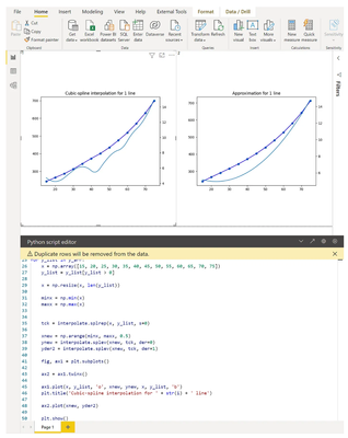
Subsequently, to continue working with the code and set up the necessary visualizations, we transfer the scripts into Power BI, as displayed below:
The contrast between the two approaches - interpolation and approximation - can be vividly discerned here.
You must be a registered user to add a comment. If you've already registered, sign in. Otherwise, register and sign in.
- Integrating Power BI with Tableau and Google Data ...
- Use a Python script to annotate special points on ...
- How to compare data in different date ranges
- Split a column and store values into corresponding...
- Administering Microsoft Fabric: Strategies and Rea...
- Optimizing DAX in Power BI: A Comprehensive How-To...
- Design Mobile and Browser Layout view within Power...
- Mastering the Art of Storytelling with Power BI Co...
- Dynamic rollback of the previous N weeks of data
- Supercharge Your Visuals: Easy Conditional Formatt...
-
 Fowmy
on:
Supercharge Your Visuals: Easy Conditional Formatt...
-
marcoselias
 on:
Power BI Dynamic Date Filters: Automatically Updat...
- joseftantawi on: How to customize open-sourced custom visual.
- kalpeshdangar on: Creating Custom Calendars for Accurate Working Day...
- gwayne on: Embracing TMDL Functionalities in Power BI and Pre...
- jian123 on: Sharing Power Query tables
-
 Martin_D
on:
From the Desk of An Experienced Power BI Analyst
-
 ibarrau
on:
[PowerQuery] Catch errors in a request http
- Aditya07 on: How to import customised themes in Power BI - usin...
-
 Martin_D
on:
Currency Conversion in Power BI: Enabling Seamless...
-
How To
579 -
Tips & Tricks
534 -
Support insights
121 -
Events
107 -
DAX
66 -
Opinion
65 -
Power BI
65 -
Power Query
62 -
Power BI Desktop
40 -
Power BI Dev Camp
36 -
Roundup
32 -
Power BI Embedded
20 -
Time Intelligence
19 -
Tips&Tricks
18 -
PowerBI REST API
12 -
Power BI Service
8 -
Power Query Tips & Tricks
8 -
finance
8 -
Direct Query
7 -
Auto ML
6 -
financial reporting
6 -
Data Analysis
6 -
Power Automate
6 -
Data Visualization
6 -
Python
6 -
Power BI REST API
6 -
powerbi
5 -
service
5 -
Power BI PowerShell
5 -
Machine Learning
5 -
Featured User Group Leader
5 -
Dax studio
5 -
Income Statement
5 -
Power BI Goals
4 -
PowerShell
4 -
Desktop
4 -
Bookmarks
4 -
Group By
4 -
Line chart
4 -
community
4 -
RLS
4 -
M language
4 -
External tool
4 -
Paginated Reports
4 -
Dataflow
3 -
calendar
3 -
Gateways
3 -
R
3 -
M Query
3 -
R visual
3 -
Webinar
3 -
CALCULATE
3 -
Reports
3 -
PowerApps
3 -
Data Science
3 -
Azure
3 -
Data model
3 -
Conditional Formatting
3 -
Visualisation
3 -
Administration
3 -
M code
3 -
SQL Server 2017 Express Edition
3 -
Visuals
3 -
R script
3 -
Aggregation
3 -
parameter
2 -
Weekday Calendar
2 -
Support insights.
2 -
construct list
2 -
Formatting
2 -
Power Platform
2 -
Workday
2 -
external tools
2 -
slicers
2 -
SAP
2 -
index
2 -
RANKX
2 -
Integer
2 -
PBI Desktop
2 -
Date Dimension
2 -
Power BI Challenge
2 -
Query Parameter
2 -
Visualization
2 -
Tabular Editor
2 -
Date
2 -
SharePoint
2 -
Power BI Installation and Updates
2 -
How Things Work
2 -
troubleshooting
2 -
Date DIFF
2 -
Transform data
2 -
rank
2 -
ladataweb
2 -
Tips and Tricks
2 -
Incremental Refresh
2 -
Query Plans
2 -
Power BI & Power Apps
2 -
Random numbers
2 -
Day of the Week
2 -
Number Ranges
2 -
M
2 -
hierarchies
2 -
Power BI Anniversary
2 -
Language M
2 -
Custom Visual
2 -
VLOOKUP
2 -
pivot
2 -
calculated column
2 -
Power BI Premium Per user
2 -
inexact
2 -
Date Comparison
2 -
Split
2 -
Forecasting
2 -
REST API
2 -
Editor
2 -
Working with Non Standatd Periods
2 -
powerbi.tips
2 -
Custom function
2 -
Reverse
2 -
measure
2 -
Microsoft-flow
2 -
Paginated Report Builder
2 -
PUG
2 -
Custom Measures
2 -
Filtering
2 -
Row and column conversion
2 -
Python script
2 -
Nulls
2 -
DVW Analytics
2 -
Industrial App Store
2 -
Week
2 -
Date duration
2 -
Q&A
1 -
Event
1 -
Custom Visuals
1 -
Free vs Pro
1 -
Format
1 -
Current Employees
1 -
date hierarchy
1 -
relationship
1 -
SIEMENS
1 -
Multiple Currency
1 -
Power BI Premium
1 -
On-premises data gateway
1 -
Binary
1 -
Power BI Connector for SAP
1 -
Sunday
1 -
update
1 -
Slicer
1 -
Visual
1 -
forecast
1 -
Regression
1 -
CICD
1 -
sport statistics
1 -
Intelligent Plant
1 -
Circular dependency
1 -
GE
1 -
Exchange rate
1 -
Dendrogram
1 -
range of values
1 -
activity log
1 -
Decimal
1 -
Charticulator Challenge
1 -
Field parameters
1 -
Training
1 -
Announcement
1 -
Features
1 -
domain
1 -
pbiviz
1 -
Color Map
1 -
Industrial
1 -
Weekday
1 -
Working Date
1 -
Space Issue
1 -
Emerson
1 -
Date Table
1 -
Cluster Analysis
1 -
Stacked Area Chart
1 -
union tables
1 -
Number
1 -
Start of Week
1 -
Tips& Tricks
1 -
deployment
1 -
ssrs traffic light indicators
1 -
SQL
1 -
trick
1 -
Scripts
1 -
Extract
1 -
Topper Color On Map
1 -
Historians
1 -
context transition
1 -
Custom textbox
1 -
OPC
1 -
Zabbix
1 -
Label: DAX
1 -
Business Analysis
1 -
Supporting Insight
1 -
rank value
1 -
Synapse
1 -
End of Week
1 -
Tips&Trick
1 -
Workspace
1 -
Theme Colours
1 -
Text
1 -
Flow
1 -
Publish to Web
1 -
patch
1 -
Top Category Color
1 -
A&E data
1 -
Previous Order
1 -
Substring
1 -
Wonderware
1 -
Power M
1 -
Format DAX
1 -
Custom functions
1 -
accumulative
1 -
DAX&Power Query
1 -
Premium Per User
1 -
GENERATESERIES
1 -
Showcase
1 -
custom connector
1 -
Waterfall Chart
1 -
Power BI On-Premise Data Gateway
1 -
step by step
1 -
Top Brand Color on Map
1 -
Tutorial
1 -
Previous Date
1 -
XMLA End point
1 -
color reference
1 -
Date Time
1 -
Marker
1 -
Lineage
1 -
CSV file
1 -
conditional accumulative
1 -
Matrix Subtotal
1 -
Check
1 -
null value
1 -
Report Server
1 -
Audit Logs
1 -
analytics pane
1 -
mahak
1 -
pandas
1 -
Networkdays
1 -
Button
1 -
Dataset list
1 -
Keyboard Shortcuts
1 -
Fill Function
1 -
LOOKUPVALUE()
1 -
Tips &Tricks
1 -
Plotly package
1 -
refresh M language Python script Support Insights
1 -
Excel
1 -
Cumulative Totals
1 -
Report Theme
1 -
Bookmarking
1 -
oracle
1 -
Canvas Apps
1 -
total
1 -
Filter context
1 -
Difference between two dates
1 -
get data
1 -
OSI
1 -
Query format convert
1 -
ETL
1 -
Json files
1 -
Merge Rows
1 -
CONCATENATEX()
1 -
take over Datasets;
1 -
Networkdays.Intl
1 -
Get row and column totals
1 -
Sameperiodlastyear
1 -
Office Theme
1 -
matrix
1 -
bar chart
1 -
Measures
1 -
powerbi argentina
1 -
Model Driven Apps
1 -
REMOVEFILTERS
1 -
XMLA endpoint
1 -
translations
1 -
OSI pi
1 -
Parquet
1 -
Change rows to columns
1 -
remove spaces
1 -
Azure AAD
1 -
Governance
1 -
Fun
1 -
Power BI gateway
1 -
gateway
1 -
Elementary
1 -
Custom filters
1 -
Vertipaq Analyzer
1 -
powerbi cordoba
1 -
DIisconnected Tables
1 -
Sandbox
1 -
Honeywell
1 -
Combine queries
1 -
X axis at different granularity
1 -
ADLS
1 -
Primary Key
1 -
Microsoft 365 usage analytics data
1 -
Randomly filter
1 -
Week of the Day
1 -
Get latest sign-in data for each user
1 -
Retail
1 -
Power BI Report Server
1 -
School
1 -
Cost-Benefit Analysis
1 -
ISV
1 -
Ties
1 -
unpivot
1 -
Practice Model
1 -
Continuous streak
1 -
ProcessVue
1 -
Create function
1 -
Table.Schema
1 -
Acknowledging
1 -
Postman
1 -
Text.ContainsAny
1 -
Power BI Show
1 -
query
1 -
Dynamic Visuals
1 -
KPI
1 -
Intro
1 -
Icons
1 -
Issues
1 -
function
1 -
stacked column chart
1 -
ho
1 -
ABB
1 -
KNN algorithm
1 -
List.Zip
1 -
optimization
1 -
Artificial Intelligence
1 -
Map Visual
1 -
Text.ContainsAll
1 -
Tuesday
1 -
API
1 -
Kingsley
1 -
Merge
1 -
variable
1 -
financial reporting hierarchies RLS
1 -
Featured Data Stories
1 -
MQTT
1 -
Custom Periods
1 -
Partial group
1 -
Reduce Size
1 -
FBL3N
1 -
Wednesday
1 -
help
1 -
group
1 -
Scorecard
1 -
Json
1 -
Tops
1 -
Multivalued column
1 -
pipeline
1 -
Path
1 -
Yokogawa
1 -
Dynamic calculation
1 -
Data Wrangling
1 -
native folded query
1 -
transform table
1 -
UX
1 -
Cell content
1 -
General Ledger
1 -
Thursday
1 -
Power Pivot
1 -
Quick Tips
1 -
data
1 -
PBIRS
1 -
Usage Metrics in Power BI
1 -
HR Analytics
1 -
keepfilters
1 -
Connect Data
1 -
Financial Year
1 -
Schneider
1 -
dynamically delete records
1 -
Copy Measures
1 -
Friday
1 -
Table
1 -
Natural Query Language
1 -
Infographic
1 -
automation
1 -
Prediction
1 -
newworkspacepowerbi
1 -
Performance KPIs
1 -
Active Employee
1 -
Custom Date Range on Date Slicer
1 -
refresh error
1 -
PAS
1 -
certain duration
1 -
DA-100
1 -
bulk renaming of columns
1 -
Single Date Picker
1 -
Monday
1 -
PCS
1 -
Saturday
1
- 05-05-2024 - 05-10-2024
- 04-28-2024 - 05-04-2024
- 04-14-2024 - 04-20-2024
- 04-07-2024 - 04-13-2024
- 03-24-2024 - 03-30-2024
- 03-17-2024 - 03-23-2024
- 03-10-2024 - 03-16-2024
- 03-03-2024 - 03-09-2024
- 02-25-2024 - 03-02-2024
- 02-18-2024 - 02-24-2024
- 02-11-2024 - 02-17-2024
- 02-04-2024 - 02-10-2024
- View Complete Archives
