- Power BI forums
- Updates
- News & Announcements
- Get Help with Power BI
- Desktop
- Service
- Report Server
- Power Query
- Mobile Apps
- Developer
- DAX Commands and Tips
- Custom Visuals Development Discussion
- Health and Life Sciences
- Power BI Spanish forums
- Translated Spanish Desktop
- Power Platform Integration - Better Together!
- Power Platform Integrations (Read-only)
- Power Platform and Dynamics 365 Integrations (Read-only)
- Training and Consulting
- Instructor Led Training
- Dashboard in a Day for Women, by Women
- Galleries
- Community Connections & How-To Videos
- COVID-19 Data Stories Gallery
- Themes Gallery
- Data Stories Gallery
- R Script Showcase
- Webinars and Video Gallery
- Quick Measures Gallery
- 2021 MSBizAppsSummit Gallery
- 2020 MSBizAppsSummit Gallery
- 2019 MSBizAppsSummit Gallery
- Events
- Ideas
- Custom Visuals Ideas
- Issues
- Issues
- Events
- Upcoming Events
- Community Blog
- Power BI Community Blog
- Custom Visuals Community Blog
- Community Support
- Community Accounts & Registration
- Using the Community
- Community Feedback
Register now to learn Fabric in free live sessions led by the best Microsoft experts. From Apr 16 to May 9, in English and Spanish.
- Power BI forums
- Forums
- Get Help with Power BI
- Desktop
- Dynamic Donut Charts
- Subscribe to RSS Feed
- Mark Topic as New
- Mark Topic as Read
- Float this Topic for Current User
- Bookmark
- Subscribe
- Printer Friendly Page
- Mark as New
- Bookmark
- Subscribe
- Mute
- Subscribe to RSS Feed
- Permalink
- Report Inappropriate Content
Dynamic Donut Charts
I have a slicer which contains Divisions like
- (Select All)
- Automotive
- Aviation
- Transportation
When the User Clicks Select All, I need a donut chart for each division. Therefore I need 3 Donut charts in this case, each chart showing Total Cost for Projects, Ideas and Gap.
However, when the User clicks Automotive, I need donut chart for each Department under Automotive like Final Assembly, Press Shop for the same measures (Total Cost for Projects, Ideas and Gap). Same holds true for other Divisions (Aviation and Transportation).
I am able to create charts at Division Level, but not able to display department specific charts inthe same dashboard. Any pointers on how to proceed ?
Thanks!
- Mark as New
- Bookmark
- Subscribe
- Mute
- Subscribe to RSS Feed
- Permalink
- Report Inappropriate Content
You can use drill down feature of the PowerBI to create your chart and use atttribute slicer visual ( can be downloaded from POWERBI Visuals Site) to set your slicers at Hierarchy level.
or
You create hierarchy in your model and use hierarchy to create donut chart.
Hope this would solve your problem.
if you can provide a snapshot of dataset, I am happy to provide you exact solution.
Bhavesh
Love the Self Service BI.
Please use the 'Mark as answer' link to mark a post that answers your question. If you find a reply helpful, please remember to give Kudos.
- Mark as New
- Bookmark
- Subscribe
- Mute
- Subscribe to RSS Feed
- Permalink
- Report Inappropriate Content
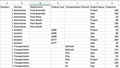
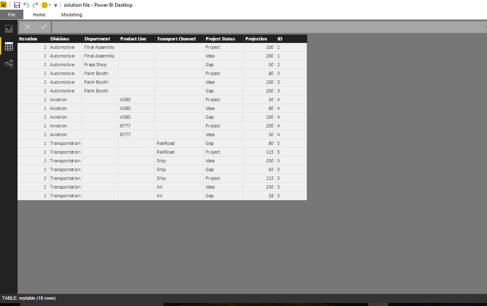
Here is the screenshot of the dataset.
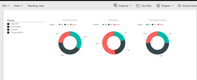
The first report should look like this (that is when user chooses "Select All", each division appears as a separate donut chart.
If the User chooses a particular Division, say Automotive, then departments under Automotive should appear as Donut Charts like the one below.
Likewise if user chooses Aviation then 2 donut - One for A380 and other for B777. And if User chooses Transportation, then 3 donut chart - One each for Railroad, Ship and Air. I'm able to recreate these in separate pages, but unable to create them as a single visual that dynamically changes based on Slicer input
- Mark as New
- Bookmark
- Subscribe
- Mute
- Subscribe to RSS Feed
- Permalink
- Report Inappropriate Content
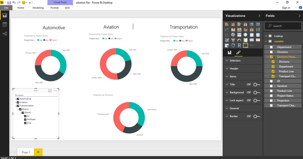
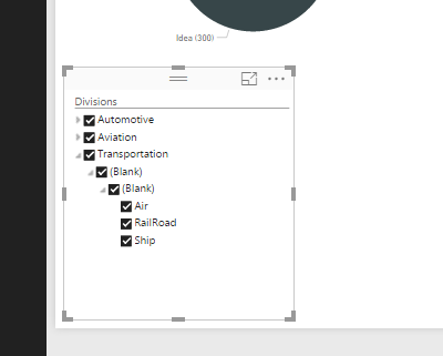
Bhavesh
Love the Self Service BI.
Please use the 'Mark as answer' link to mark a post that answers your question. If you find a reply helpful, please remember to give Kudos.
- Mark as New
- Bookmark
- Subscribe
- Mute
- Subscribe to RSS Feed
- Permalink
- Report Inappropriate Content
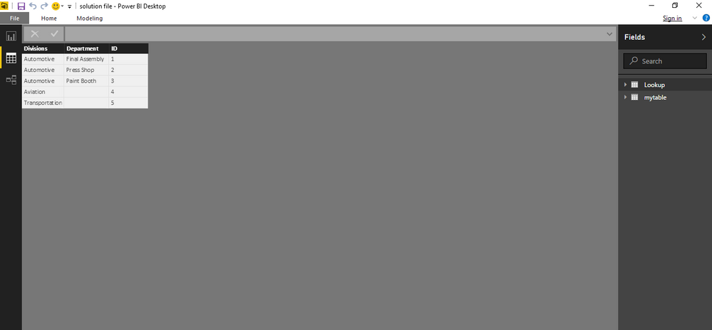
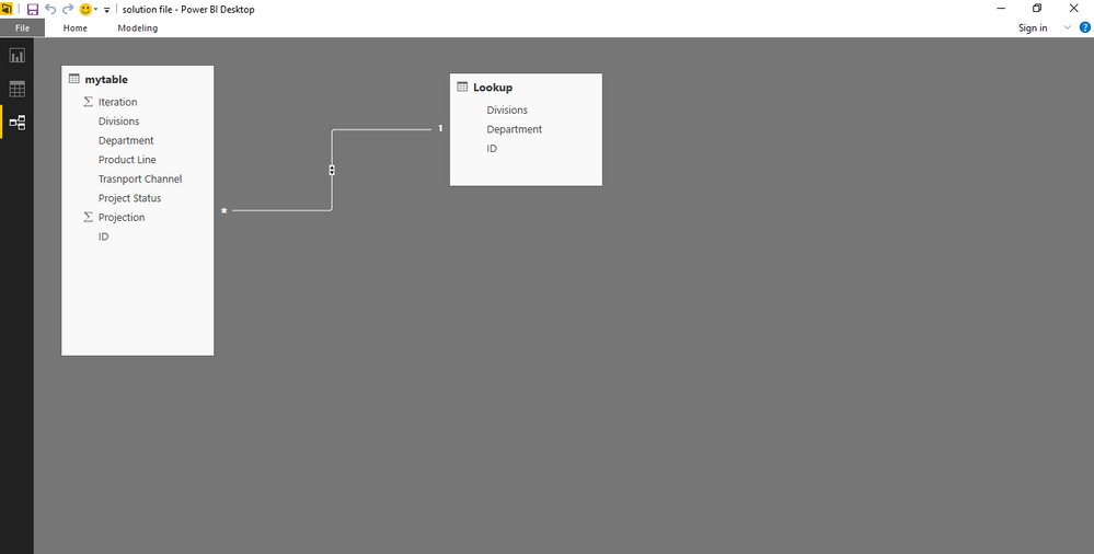
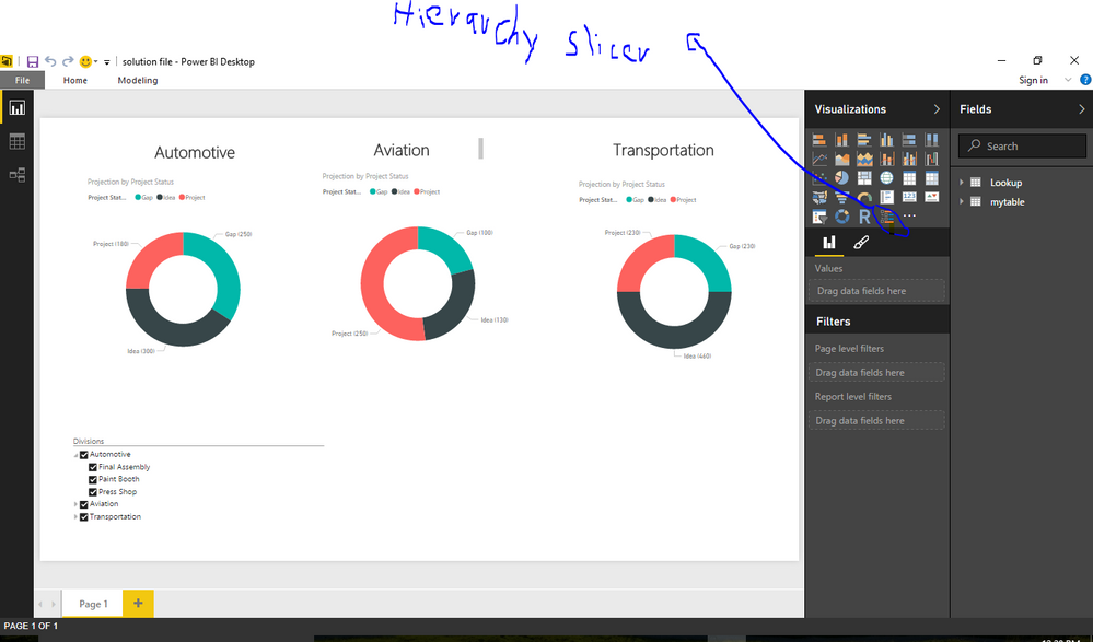
Bhavesh
Love the Self Service BI.
Please use the 'Mark as answer' link to mark a post that answers your question. If you find a reply helpful, please remember to give Kudos.
Helpful resources

Microsoft Fabric Learn Together
Covering the world! 9:00-10:30 AM Sydney, 4:00-5:30 PM CET (Paris/Berlin), 7:00-8:30 PM Mexico City

Power BI Monthly Update - April 2024
Check out the April 2024 Power BI update to learn about new features.

| User | Count |
|---|---|
| 114 | |
| 105 | |
| 78 | |
| 68 | |
| 63 |
| User | Count |
|---|---|
| 148 | |
| 107 | |
| 106 | |
| 83 | |
| 70 |
