Jumpstart your career with the Fabric Career Hub
Find everything you need to get certified on Fabric—skills challenges, live sessions, exam prep, role guidance, and more.
Get started- Power BI forums
- Updates
- News & Announcements
- Get Help with Power BI
- Desktop
- Service
- Report Server
- Power Query
- Mobile Apps
- Developer
- DAX Commands and Tips
- Custom Visuals Development Discussion
- Health and Life Sciences
- Power BI Spanish forums
- Translated Spanish Desktop
- Training and Consulting
- Instructor Led Training
- Dashboard in a Day for Women, by Women
- Galleries
- Community Connections & How-To Videos
- COVID-19 Data Stories Gallery
- Themes Gallery
- Data Stories Gallery
- R Script Showcase
- Webinars and Video Gallery
- Quick Measures Gallery
- 2021 MSBizAppsSummit Gallery
- 2020 MSBizAppsSummit Gallery
- 2019 MSBizAppsSummit Gallery
- Events
- Ideas
- Custom Visuals Ideas
- Issues
- Issues
- Events
- Upcoming Events
- Community Blog
- Power BI Community Blog
- Custom Visuals Community Blog
- Community Support
- Community Accounts & Registration
- Using the Community
- Community Feedback
Grow your Fabric skills and prepare for the DP-600 certification exam by completing the latest Microsoft Fabric challenge.
- Power BI forums
- Forums
- Get Help with Power BI
- Desktop
- Using a clustered chart to compare distributions
- Subscribe to RSS Feed
- Mark Topic as New
- Mark Topic as Read
- Float this Topic for Current User
- Bookmark
- Subscribe
- Printer Friendly Page
- Mark as New
- Bookmark
- Subscribe
- Mute
- Subscribe to RSS Feed
- Permalink
- Report Inappropriate Content
Using a clustered chart to compare distributions
I have an issue where I am trying to use a clustered bar chart to provide A/B distribution comparisions. The problem I am encoutering is when calculating the percentage of grand total, it is using the global grand total as a denominator, rather than to total for each individual dataset. This is causing the larger dataset to swamp-out the smaller one, and make the comparison not useful. Is there a setting or option to segregate the category totals for the clustered data sets?
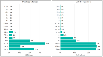
To illustrate, the graph below shows the primary distribution:
The next graph shows the secondary latency distribution:
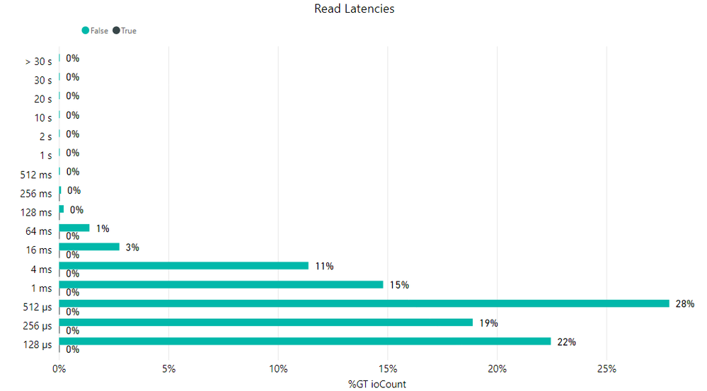
The clustered chart would ideally be a composite of these two distribution graphs. However, when combined the %GT ioCount appears to cover the ioCount for both latency categories, giving a graph as follows:
This is causing the green category to be dominant, and the black category to be statistically insignificant. Is there an option that would normalize these data sets better?
- Mark as New
- Bookmark
- Subscribe
- Mute
- Subscribe to RSS Feed
- Permalink
- Report Inappropriate Content
@gaglenn , In such cases you should prefer combo visuals and use line for the second measure. Like Line clustered column chart. But that will show vertical bar
Or try Log axis
Microsoft Power BI Learning Resources, 2023 !!
Learn Power BI - Full Course with Dec-2022, with Window, Index, Offset, 100+ Topics !!
Did I answer your question? Mark my post as a solution! Appreciate your Kudos !! Proud to be a Super User! !!
- Mark as New
- Bookmark
- Subscribe
- Mute
- Subscribe to RSS Feed
- Permalink
- Report Inappropriate Content
Thank you for the suggestion. In this case, I just opted to go for two side-by-size bar graphs, as it seemed the clustered graph was not going to work the way I wanted it to.
Helpful resources

Europe’s largest Microsoft Fabric Community Conference
Join the community in Stockholm for expert Microsoft Fabric learning including a very exciting keynote from Arun Ulag, Corporate Vice President, Azure Data.

Power BI Monthly Update - June 2024
Check out the June 2024 Power BI update to learn about new features.

| User | Count |
|---|---|
| 93 | |
| 87 | |
| 80 | |
| 69 | |
| 68 |
| User | Count |
|---|---|
| 226 | |
| 129 | |
| 119 | |
| 83 | |
| 77 |


