- Power BI forums
- Updates
- News & Announcements
- Get Help with Power BI
- Desktop
- Service
- Report Server
- Power Query
- Mobile Apps
- Developer
- DAX Commands and Tips
- Custom Visuals Development Discussion
- Health and Life Sciences
- Power BI Spanish forums
- Translated Spanish Desktop
- Power Platform Integration - Better Together!
- Power Platform Integrations (Read-only)
- Power Platform and Dynamics 365 Integrations (Read-only)
- Training and Consulting
- Instructor Led Training
- Dashboard in a Day for Women, by Women
- Galleries
- Community Connections & How-To Videos
- COVID-19 Data Stories Gallery
- Themes Gallery
- Data Stories Gallery
- R Script Showcase
- Webinars and Video Gallery
- Quick Measures Gallery
- 2021 MSBizAppsSummit Gallery
- 2020 MSBizAppsSummit Gallery
- 2019 MSBizAppsSummit Gallery
- Events
- Ideas
- Custom Visuals Ideas
- Issues
- Issues
- Events
- Upcoming Events
- Community Blog
- Power BI Community Blog
- Custom Visuals Community Blog
- Community Support
- Community Accounts & Registration
- Using the Community
- Community Feedback
Register now to learn Fabric in free live sessions led by the best Microsoft experts. From Apr 16 to May 9, in English and Spanish.
- Power BI forums
- Forums
- Get Help with Power BI
- Desktop
- Text Spacing changes when publishing
- Subscribe to RSS Feed
- Mark Topic as New
- Mark Topic as Read
- Float this Topic for Current User
- Bookmark
- Subscribe
- Printer Friendly Page
- Mark as New
- Bookmark
- Subscribe
- Mute
- Subscribe to RSS Feed
- Permalink
- Report Inappropriate Content
Text Spacing changes when publishing
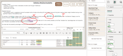
Trying to publish a guide page with some transparent shapes "highlighting" certain words by just floating behind the text box. When publishing, not only does the text box itself change position and size by a few pixels in all directions (which in itself is infuriating), but even when manually corrected on the published dashboard, the highlighted shapes are all still in the exact same position, but the spacing of the words in the text box has placed all the words below where they should be. This is more aesthetically displeasing than functionally, but I want to understand why on Earth this is happening and if there is a way to fix it, as it seems to be just such an easy ask that Power BI refuses to handle in a funtional, sensible way.
This is the desktop version, looking how I want it with the correct words and shapes all aligned:
And here is the version on the latest version of Chrome when I publish, same position and size and padding, but the line spacing has clearly cause the words I am trying ot highlight to shift off where they were on the desktop version. (I know this is the case because the "highlights" are the same size/position down to the pixel.) What is happening ????
- Mark as New
- Bookmark
- Subscribe
- Mute
- Subscribe to RSS Feed
- Permalink
- Report Inappropriate Content
Hi @ekent
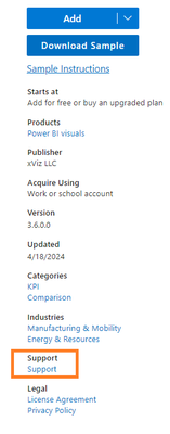
Can you tell me what visualization you are using, please? I wasn't able to find a visualization similar to yours, so I can't test it. If it's a custom visual, you can ask for more specialized help in the location shown below. Each custom visual has a corresponding support link, as an example:
If you still have questions, please feel free to ask me.
Best Regards,
Yulia Xu
If this post helps, then please consider Accept it as the solution to help the other members find it more quickly.
- Mark as New
- Bookmark
- Subscribe
- Mute
- Subscribe to RSS Feed
- Permalink
- Report Inappropriate Content
The visual I am using is simply a text box and a rectangle shape with a 50% transparency. All built-in assets that come with Power BI, nothing 3rd party or custom. So to the user, it appears as one text box with some words highlighted, it is several rectangle colored shapes behind a text box.
Helpful resources

Microsoft Fabric Learn Together
Covering the world! 9:00-10:30 AM Sydney, 4:00-5:30 PM CET (Paris/Berlin), 7:00-8:30 PM Mexico City

Power BI Monthly Update - April 2024
Check out the April 2024 Power BI update to learn about new features.

| User | Count |
|---|---|
| 113 | |
| 104 | |
| 77 | |
| 67 | |
| 63 |
| User | Count |
|---|---|
| 144 | |
| 107 | |
| 105 | |
| 82 | |
| 69 |


