- Power BI forums
- Updates
- News & Announcements
- Get Help with Power BI
- Desktop
- Service
- Report Server
- Power Query
- Mobile Apps
- Developer
- DAX Commands and Tips
- Custom Visuals Development Discussion
- Health and Life Sciences
- Power BI Spanish forums
- Translated Spanish Desktop
- Power Platform Integration - Better Together!
- Power Platform Integrations (Read-only)
- Power Platform and Dynamics 365 Integrations (Read-only)
- Training and Consulting
- Instructor Led Training
- Dashboard in a Day for Women, by Women
- Galleries
- Community Connections & How-To Videos
- COVID-19 Data Stories Gallery
- Themes Gallery
- Data Stories Gallery
- R Script Showcase
- Webinars and Video Gallery
- Quick Measures Gallery
- 2021 MSBizAppsSummit Gallery
- 2020 MSBizAppsSummit Gallery
- 2019 MSBizAppsSummit Gallery
- Events
- Ideas
- Custom Visuals Ideas
- Issues
- Issues
- Events
- Upcoming Events
- Community Blog
- Power BI Community Blog
- Custom Visuals Community Blog
- Community Support
- Community Accounts & Registration
- Using the Community
- Community Feedback
Register now to learn Fabric in free live sessions led by the best Microsoft experts. From Apr 16 to May 9, in English and Spanish.
- Subscribe to RSS Feed
- Mark Topic as New
- Mark Topic as Read
- Float this Topic for Current User
- Bookmark
- Subscribe
- Printer Friendly Page
- Mark as New
- Bookmark
- Subscribe
- Mute
- Subscribe to RSS Feed
- Permalink
- Report Inappropriate Content
Report
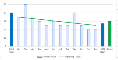
I have Montly data bars on my bar graph and I would like to display bar with current year average and a custome value bar of target at the end, how can I achieve this.
Thankyou!
Solved! Go to Solution.
- Mark as New
- Bookmark
- Subscribe
- Mute
- Subscribe to RSS Feed
- Permalink
- Report Inappropriate Content
Hi, @mokhan
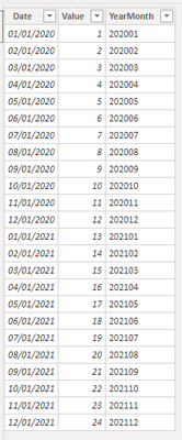
Based on your description, I created data to reproduce your scenario. The pbix file is attached in the end.
Table:
Table 2(a calculated table):
Table 2 =
UNION(
    DISTINCT('Table'[YearMonth]),
    ROW("YearMonth","2020-Avg"),
    ROW("YearMonth","2021-Avg"),
    ROW("YearMonth","Target")
)
You may two measures as below.
Result =
SWITCH(
    MAX('Table 2'[YearMonth]),
    "2020-Avg",
    CALCULATE(
        AVERAGE('Table'[Value]),
        FILTER(
            ALL('Table'),
            YEAR([Date])=2020
        )
    ),
    "2021-Avg",
    CALCULATE(
        AVERAGE('Table'[Value]),
        FILTER(
            ALL('Table'),
            YEAR([Date])=2021
        )
    ),
    "Target",12,
    CALCULATE(
        SUM('Table'[Value]),
        FILTER(
            ALL('Table'),
            [YearMonth]=MAX('Table 2'[YearMonth])
        )
    )
)
Color Control =
SWITCH(
MAX('Table 2'[YearMonth]),
"2020-Avg","yellow",
"2021-Avg","red",
"Target","green"
)
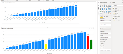
Then you may use 'YearMonth' from 'Table 2' as 'Shared axis' and apply conditional format based on 'Color Control'.
Result:
Best Regards
Allan
If this post helps, then please consider Accept it as the solution to help the other members find it more quickly.
- Mark as New
- Bookmark
- Subscribe
- Mute
- Subscribe to RSS Feed
- Permalink
- Report Inappropriate Content
I need this
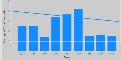
So far I got this
- Mark as New
- Bookmark
- Subscribe
- Mute
- Subscribe to RSS Feed
- Permalink
- Report Inappropriate Content
Need to add current year avg and target bar at the end.
- Mark as New
- Bookmark
- Subscribe
- Mute
- Subscribe to RSS Feed
- Permalink
- Report Inappropriate Content
@mokhan You will need to do a lot of manual work/calculations to achieve this. Would you settle for using the Line Column combo chart and putting the custom target value as a line value?
Or you could even use the Analytics features to set custom target as constant line and average for current year:
https://docs.microsoft.com/en-us/power-bi/transform-model/desktop-analytics-pane
Please @mention me in your reply if you want a response.
Copying DAX from this post? Click here for a hack to quickly replace it with your own table names
Has this post solved your problem? Please Accept as Solution so that others can find it quickly and to let the community know your problem has been solved.
If you found this post helpful, please give Kudos C
I work as a Microsoft trainer and consultant, specialising in Power BI and Power Query.
www.excelwithallison.com
- Mark as New
- Bookmark
- Subscribe
- Mute
- Subscribe to RSS Feed
- Permalink
- Report Inappropriate Content
@mokhan ,Can you share sample data and sample output in table format? Or a sample pbix after removing sensitive data.
Microsoft Power BI Learning Resources, 2023 !!
Learn Power BI - Full Course with Dec-2022, with Window, Index, Offset, 100+ Topics !!
Did I answer your question? Mark my post as a solution! Appreciate your Kudos !! Proud to be a Super User! !!
Helpful resources

Microsoft Fabric Learn Together
Covering the world! 9:00-10:30 AM Sydney, 4:00-5:30 PM CET (Paris/Berlin), 7:00-8:30 PM Mexico City

Power BI Monthly Update - April 2024
Check out the April 2024 Power BI update to learn about new features.

| User | Count |
|---|---|
| 104 | |
| 95 | |
| 80 | |
| 67 | |
| 62 |
| User | Count |
|---|---|
| 146 | |
| 110 | |
| 107 | |
| 86 | |
| 63 |


