- Power BI forums
- Updates
- News & Announcements
- Get Help with Power BI
- Desktop
- Service
- Report Server
- Power Query
- Mobile Apps
- Developer
- DAX Commands and Tips
- Custom Visuals Development Discussion
- Health and Life Sciences
- Power BI Spanish forums
- Translated Spanish Desktop
- Power Platform Integration - Better Together!
- Power Platform Integrations (Read-only)
- Power Platform and Dynamics 365 Integrations (Read-only)
- Training and Consulting
- Instructor Led Training
- Dashboard in a Day for Women, by Women
- Galleries
- Community Connections & How-To Videos
- COVID-19 Data Stories Gallery
- Themes Gallery
- Data Stories Gallery
- R Script Showcase
- Webinars and Video Gallery
- Quick Measures Gallery
- 2021 MSBizAppsSummit Gallery
- 2020 MSBizAppsSummit Gallery
- 2019 MSBizAppsSummit Gallery
- Events
- Ideas
- Custom Visuals Ideas
- Issues
- Issues
- Events
- Upcoming Events
- Community Blog
- Power BI Community Blog
- Custom Visuals Community Blog
- Community Support
- Community Accounts & Registration
- Using the Community
- Community Feedback
Register now to learn Fabric in free live sessions led by the best Microsoft experts. From Apr 16 to May 9, in English and Spanish.
- Power BI forums
- Forums
- Get Help with Power BI
- Desktop
- Re: Line chart combined with scatter
- Subscribe to RSS Feed
- Mark Topic as New
- Mark Topic as Read
- Float this Topic for Current User
- Bookmark
- Subscribe
- Printer Friendly Page
- Mark as New
- Bookmark
- Subscribe
- Mute
- Subscribe to RSS Feed
- Permalink
- Report Inappropriate Content
Line chart combined with scatter
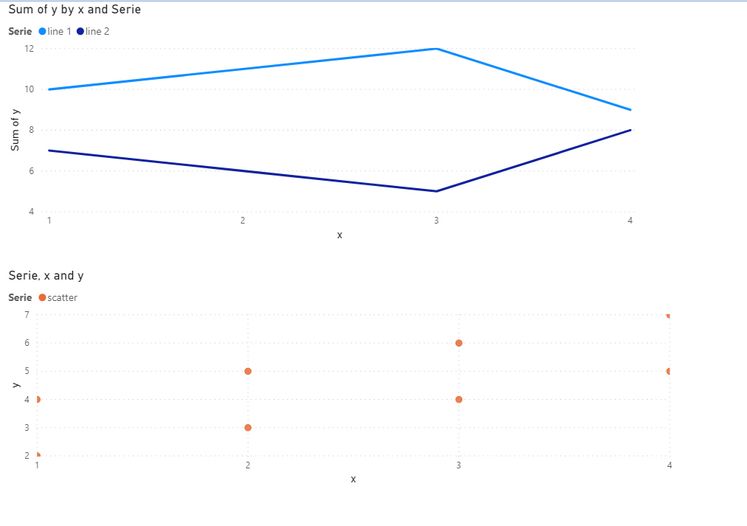
I would like to create a line chart combined with scatter in Power BI.
A requirement is that the scatter serie may contain the same xaxis values, but I want to see all the values (so use the not summarize option, like available in a scatter chart.
Basically I want to combine the 2 (line and scatter) charts in 1 chart:
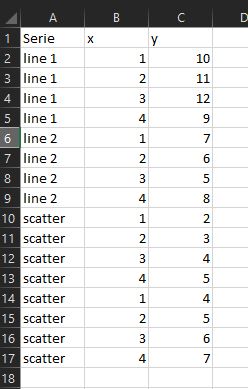
I used this dataset:
the problem is that i want to use the not summarize option, which is not available in de combined charts.
I have tried the standard visuals, also did some experimenting with R, but to no avail
anyone knows how to do this?
Solved! Go to Solution.
- Mark as New
- Bookmark
- Subscribe
- Mute
- Subscribe to RSS Feed
- Permalink
- Report Inappropriate Content
I have solved the issue, by creating a custom visual using charticulator
- Mark as New
- Bookmark
- Subscribe
- Mute
- Subscribe to RSS Feed
- Permalink
- Report Inappropriate Content
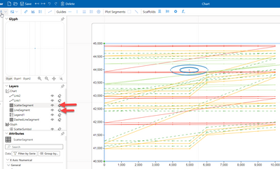
I used Charticulator (https://charticulator.com/app/index.html) to combine a scatter segment with several line segments, like this:
note: now you can use the charticulator integration in power bi desktop (charticulator is a custom visual) .
Good luck
- Mark as New
- Bookmark
- Subscribe
- Mute
- Subscribe to RSS Feed
- Permalink
- Report Inappropriate Content
I have solved the issue, by creating a custom visual using charticulator
- Mark as New
- Bookmark
- Subscribe
- Mute
- Subscribe to RSS Feed
- Permalink
- Report Inappropriate Content
I would like to know how you did as I have tried and failed to achieve
- Mark as New
- Bookmark
- Subscribe
- Mute
- Subscribe to RSS Feed
- Permalink
- Report Inappropriate Content
I would like to reach such a result
- Mark as New
- Bookmark
- Subscribe
- Mute
- Subscribe to RSS Feed
- Permalink
- Report Inappropriate Content
I used Charticulator (https://charticulator.com/app/index.html) to combine a scatter segment with several line segments, like this:
note: now you can use the charticulator integration in power bi desktop (charticulator is a custom visual) .
Good luck
- Mark as New
- Bookmark
- Subscribe
- Mute
- Subscribe to RSS Feed
- Permalink
- Report Inappropriate Content
Could you please go into a little more detail on how you did this?
I am trying for a similar result, a line chart that would behave like a scatter chart in that it would let me show raw data without aggregation on any axis.
I am stuck right now, with Charticulator not letting me to use the "Do not summarize" option. Do you have any suggestions for how to get this done?
Thanks in advance!
- Mark as New
- Bookmark
- Subscribe
- Mute
- Subscribe to RSS Feed
- Permalink
- Report Inappropriate Content
Hi @avanroij ,
Did you try looking into adding lines to a scatter chart visual?
https://community.powerbi.com/t5/Desktop/Draw-lines-in-scatter-chart/td-p/644624
There is also a custom visual called Spline Chart. Try checking it:
https://appsource.microsoft.com/en-us/product/power-bi-visuals/WA104380860?src=office&tab=Overview
Let me know if these help.
Thanks,
Pragati
- Mark as New
- Bookmark
- Subscribe
- Mute
- Subscribe to RSS Feed
- Permalink
- Report Inappropriate Content
@Pragati11 , thanks for the reply.
The scatter datapoints are not a trend or spline, the values are not related to the other values. the scatter datapoints are a separate serie.
I can't use analytics to add a serie and can't use the spline.
any other suggestions?
Helpful resources

Microsoft Fabric Learn Together
Covering the world! 9:00-10:30 AM Sydney, 4:00-5:30 PM CET (Paris/Berlin), 7:00-8:30 PM Mexico City

Power BI Monthly Update - April 2024
Check out the April 2024 Power BI update to learn about new features.

| User | Count |
|---|---|
| 104 | |
| 96 | |
| 80 | |
| 67 | |
| 62 |
| User | Count |
|---|---|
| 137 | |
| 106 | |
| 104 | |
| 81 | |
| 63 |


