- Power BI forums
- Updates
- News & Announcements
- Get Help with Power BI
- Desktop
- Service
- Report Server
- Power Query
- Mobile Apps
- Developer
- DAX Commands and Tips
- Custom Visuals Development Discussion
- Health and Life Sciences
- Power BI Spanish forums
- Translated Spanish Desktop
- Power Platform Integration - Better Together!
- Power Platform Integrations (Read-only)
- Power Platform and Dynamics 365 Integrations (Read-only)
- Training and Consulting
- Instructor Led Training
- Dashboard in a Day for Women, by Women
- Galleries
- Community Connections & How-To Videos
- COVID-19 Data Stories Gallery
- Themes Gallery
- Data Stories Gallery
- R Script Showcase
- Webinars and Video Gallery
- Quick Measures Gallery
- 2021 MSBizAppsSummit Gallery
- 2020 MSBizAppsSummit Gallery
- 2019 MSBizAppsSummit Gallery
- Events
- Ideas
- Custom Visuals Ideas
- Issues
- Issues
- Events
- Upcoming Events
- Community Blog
- Power BI Community Blog
- Custom Visuals Community Blog
- Community Support
- Community Accounts & Registration
- Using the Community
- Community Feedback
Register now to learn Fabric in free live sessions led by the best Microsoft experts. From Apr 16 to May 9, in English and Spanish.
- Power BI forums
- Forums
- Get Help with Power BI
- Desktop
- Dynamic selection of X and Y axis on a scatter cha...
- Subscribe to RSS Feed
- Mark Topic as New
- Mark Topic as Read
- Float this Topic for Current User
- Bookmark
- Subscribe
- Printer Friendly Page
- Mark as New
- Bookmark
- Subscribe
- Mute
- Subscribe to RSS Feed
- Permalink
- Report Inappropriate Content
Dynamic selection of X and Y axis on a scatter chart
Hi everyone,
I'm trying to create a scatter chart that will allow dynamic selection of the X and Y axis as a slicer. At any one point a comparison can be made between two columns.
My dataset is like the following:
| Project | HSE | OPS | LEGAL | TECH |
| Project 1 | 1 | 2 | 2 | 3 |
| Project 2 | 1 | 1 | 2 | 2 |
| Project 3 | 3 | 2 | 1 | 2 |
| Project 4 | 2 | 3 | 3 | 1 |
| Project 5 | 1 | 2 | 1 | 2 |
I have duplicated two seperate tables (one for X axis and one for Y axis) and unpivoted the columns, I've named these tables "X Axis" and Y Axis". The relationship is setup like below:
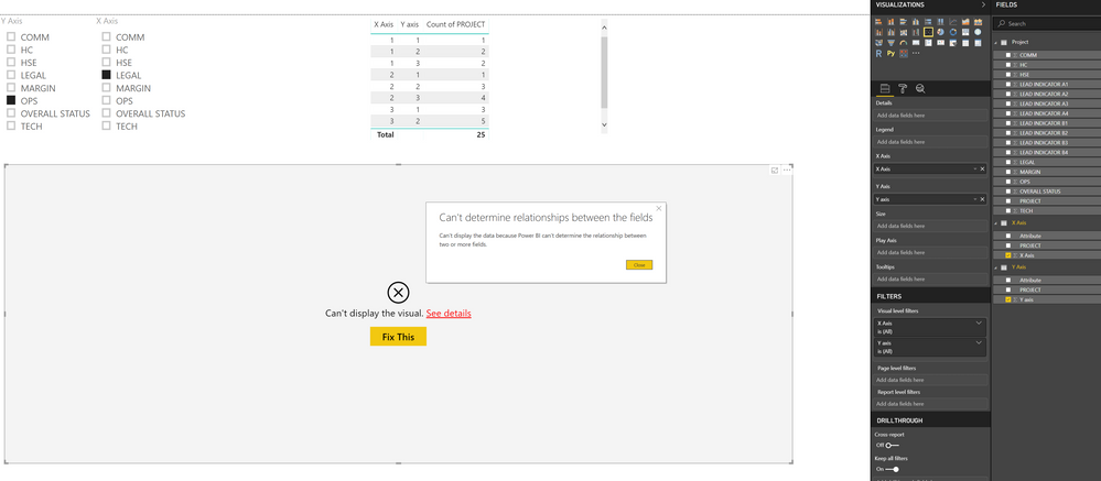
The slicer filter is working fine and data is represented correctly in a table.
The problem is I'm getting an error on the scatter chart when I drag the field "Y Axis" over to the Y Axis box on the scatter chart and set to "Don't Summarize" as I do not want to perform any summarization.
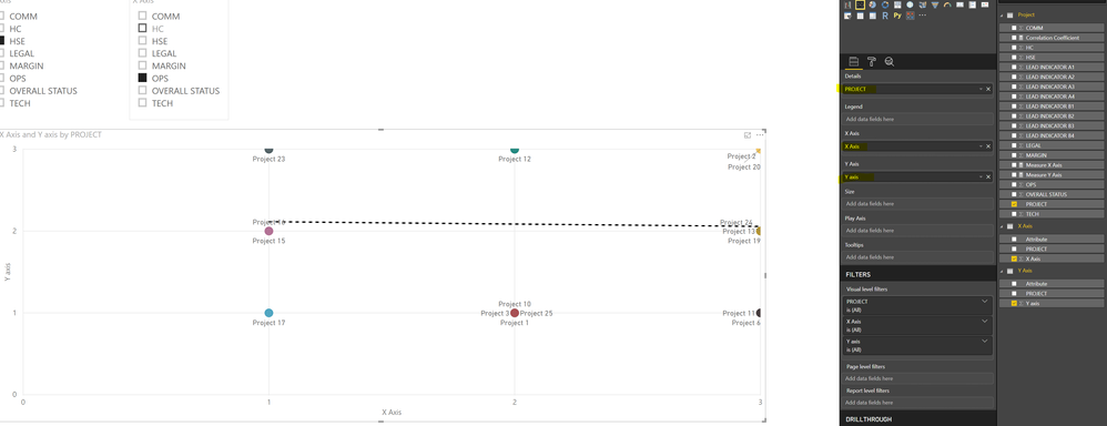
Ideally, what I should see is the following:
If there is any other way to perform this, please let me know.
Thankyou!
Solved! Go to Solution.
- Mark as New
- Bookmark
- Subscribe
- Mute
- Subscribe to RSS Feed
- Permalink
- Report Inappropriate Content
I've solved my own question..
I'm not sure why, but if I drag "PROJECT" to details and set the Y and X axis properties to SUM it displays correctly.
- Mark as New
- Bookmark
- Subscribe
- Mute
- Subscribe to RSS Feed
- Permalink
- Report Inappropriate Content
@Anonymous , refer if this can help
https://www.youtube.com/watch?v=6jeSIRpjv0M
Actually, on the Scatter chart, we take measure/column on-axis. See if this measure slicer approach can help. You need to have two of them
Microsoft Power BI Learning Resources, 2023 !!
Learn Power BI - Full Course with Dec-2022, with Window, Index, Offset, 100+ Topics !!
Did I answer your question? Mark my post as a solution! Appreciate your Kudos !! Proud to be a Super User! !!
- Mark as New
- Bookmark
- Subscribe
- Mute
- Subscribe to RSS Feed
- Permalink
- Report Inappropriate Content
Hi @amitchandak ,
Firstly, I'm already unpivoting the columns as shown in the video from your first link.
I don't quite understand what you mean by "scatter chart we take measure/column on-axis". I've tried plotting on a scatter chart with original table (before duplicating/unpivoting) and it works even without summarising the values on x and y axis, as shown in my last screenshot.
In my example, I can not take an aggregate of the columns because I want to plot each individual attribute point on the chart. Essentially each point on the chart will be a "project" and both the X and Y axis will have a value range from 1 to 3.
- Mark as New
- Bookmark
- Subscribe
- Mute
- Subscribe to RSS Feed
- Permalink
- Report Inappropriate Content
I've solved my own question..
I'm not sure why, but if I drag "PROJECT" to details and set the Y and X axis properties to SUM it displays correctly.
Helpful resources

Microsoft Fabric Learn Together
Covering the world! 9:00-10:30 AM Sydney, 4:00-5:30 PM CET (Paris/Berlin), 7:00-8:30 PM Mexico City

Power BI Monthly Update - April 2024
Check out the April 2024 Power BI update to learn about new features.

| User | Count |
|---|---|
| 113 | |
| 103 | |
| 76 | |
| 66 | |
| 63 |
| User | Count |
|---|---|
| 142 | |
| 105 | |
| 102 | |
| 81 | |
| 68 |


