- Power BI forums
- Updates
- News & Announcements
- Get Help with Power BI
- Desktop
- Service
- Report Server
- Power Query
- Mobile Apps
- Developer
- DAX Commands and Tips
- Custom Visuals Development Discussion
- Health and Life Sciences
- Power BI Spanish forums
- Translated Spanish Desktop
- Power Platform Integration - Better Together!
- Power Platform Integrations (Read-only)
- Power Platform and Dynamics 365 Integrations (Read-only)
- Training and Consulting
- Instructor Led Training
- Dashboard in a Day for Women, by Women
- Galleries
- Community Connections & How-To Videos
- COVID-19 Data Stories Gallery
- Themes Gallery
- Data Stories Gallery
- R Script Showcase
- Webinars and Video Gallery
- Quick Measures Gallery
- 2021 MSBizAppsSummit Gallery
- 2020 MSBizAppsSummit Gallery
- 2019 MSBizAppsSummit Gallery
- Events
- Ideas
- Custom Visuals Ideas
- Issues
- Issues
- Events
- Upcoming Events
- Community Blog
- Power BI Community Blog
- Custom Visuals Community Blog
- Community Support
- Community Accounts & Registration
- Using the Community
- Community Feedback
Earn a 50% discount on the DP-600 certification exam by completing the Fabric 30 Days to Learn It challenge.
- Power BI forums
- Forums
- Get Help with Power BI
- Desktop
- Re: Conditional Format Background, bad results on ...
- Subscribe to RSS Feed
- Mark Topic as New
- Mark Topic as Read
- Float this Topic for Current User
- Bookmark
- Subscribe
- Printer Friendly Page
- Mark as New
- Bookmark
- Subscribe
- Mute
- Subscribe to RSS Feed
- Permalink
- Report Inappropriate Content
Conditional Format Background, bad results on Drill Down
Hello,
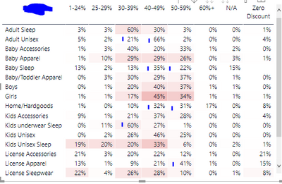
I have a table that I'm trying to "heat map" with background conditional formatting. The Value is a $ Sales shown as % to Row Total. The Results are as expected until I Drill Down.
Here it is, looks good while on I'm on the first set of Rows:
If I drill down to the second set of Rows, I can't figure out what it's doing. Based on my knowledge of the data, where it's highlighting makes sense in the context of the entire table, but not the row.
Marked a few areas in Blue where there should be an obvious background fill.
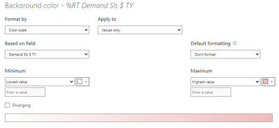
Here are my settings:
Solved! Go to Solution.
- Mark as New
- Bookmark
- Subscribe
- Mute
- Subscribe to RSS Feed
- Permalink
- Report Inappropriate Content
@cassidy actually on second thought, I think I see what's happening. The conditional formatting is not being applied to the %, it's being applied to the actual $ value. So my guess is those areas you've marked in blue which don't have formatting are the lowest $ value rows.
- Mark as New
- Bookmark
- Subscribe
- Mute
- Subscribe to RSS Feed
- Permalink
- Report Inappropriate Content
what is the formula that you use in field 'Demand Sls $ TY' in the conditional formatting ?
- Mark as New
- Bookmark
- Subscribe
- Mute
- Subscribe to RSS Feed
- Permalink
- Report Inappropriate Content
@themistoklis I'm connected live to a large dataset, that measure in the dataset is SUM of a single Sales column.
- Mark as New
- Bookmark
- Subscribe
- Mute
- Subscribe to RSS Feed
- Permalink
- Report Inappropriate Content
@cassidy actually on second thought, I think I see what's happening. The conditional formatting is not being applied to the %, it's being applied to the actual $ value. So my guess is those areas you've marked in blue which don't have formatting are the lowest $ value rows.
- Mark as New
- Bookmark
- Subscribe
- Mute
- Subscribe to RSS Feed
- Permalink
- Report Inappropriate Content
@cassidy just as a first troubleshooting step, what happens when you change the "Minimum" and "Maximum" settings from "Lowest value" and "Highest Value" to hard-coded values of 0 and 1, respectively?
- Mark as New
- Bookmark
- Subscribe
- Mute
- Subscribe to RSS Feed
- Permalink
- Report Inappropriate Content
@ebeery It colors the entire thing dark pink...which I'm realizing it's because these are not actual perctanges, PowerBI is just displaying it as a % to Row Total. It's formatting based on the underlying Sales $ which are far greater than 1.
Can we not conditional format individual rows? I think that's what's happening, I'm just getting lucky on the first screenshot that it appears to be based on rows, but it's really based on the Total Sales $.
- Mark as New
- Bookmark
- Subscribe
- Mute
- Subscribe to RSS Feed
- Permalink
- Report Inappropriate Content
@cassidy I agree, I think it's just formatting based on the total sales $, not the %.
One option (which I'm thinking might be your best bet), would be to create a measure that actually calculates the % and use that in the visual and also in the conditional formatting rules, instead of relying on the "show values as" functionality.
- Mark as New
- Bookmark
- Subscribe
- Mute
- Subscribe to RSS Feed
- Permalink
- Report Inappropriate Content
I think i'm still going to run into the inablity to conditional format each row. Whether it's $ or %, I believe it's going to look at the whole table and then format, whereas I wan't each row to be indepently formatted. It would be like defining each row as a format range in Excel, very tedious...not surprised BI is not allowing it.
- Mark as New
- Bookmark
- Subscribe
- Mute
- Subscribe to RSS Feed
- Permalink
- Report Inappropriate Content
@cassidy ahh I see what you're saying. The measure would be able to calculate the % of row total, but to your point, the formatting would be applied for the entire matrix, not for each row separately.


