- Power BI forums
- Updates
- News & Announcements
- Get Help with Power BI
- Desktop
- Service
- Report Server
- Power Query
- Mobile Apps
- Developer
- DAX Commands and Tips
- Custom Visuals Development Discussion
- Health and Life Sciences
- Power BI Spanish forums
- Translated Spanish Desktop
- Power Platform Integration - Better Together!
- Power Platform Integrations (Read-only)
- Power Platform and Dynamics 365 Integrations (Read-only)
- Training and Consulting
- Instructor Led Training
- Dashboard in a Day for Women, by Women
- Galleries
- Community Connections & How-To Videos
- COVID-19 Data Stories Gallery
- Themes Gallery
- Data Stories Gallery
- R Script Showcase
- Webinars and Video Gallery
- Quick Measures Gallery
- 2021 MSBizAppsSummit Gallery
- 2020 MSBizAppsSummit Gallery
- 2019 MSBizAppsSummit Gallery
- Events
- Ideas
- Custom Visuals Ideas
- Issues
- Issues
- Events
- Upcoming Events
- Community Blog
- Power BI Community Blog
- Custom Visuals Community Blog
- Community Support
- Community Accounts & Registration
- Using the Community
- Community Feedback
Register now to learn Fabric in free live sessions led by the best Microsoft experts. From Apr 16 to May 9, in English and Spanish.
- Power BI forums
- Forums
- Get Help with Power BI
- Service
- Tooltips in overlapping charts
- Subscribe to RSS Feed
- Mark Topic as New
- Mark Topic as Read
- Float this Topic for Current User
- Bookmark
- Subscribe
- Printer Friendly Page
- Mark as New
- Bookmark
- Subscribe
- Mute
- Subscribe to RSS Feed
- Permalink
- Report Inappropriate Content
Tooltips in overlapping charts
Hi,
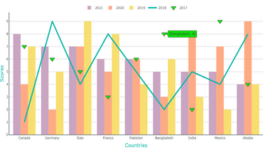
I have one combo chart (line and clustered column chart) and on top of the chart I have a scatter plot .
I want to show tooltips on both the charts but can only see tooltip of the scatter plot(the black traingles) and not of the combo chart.
Does someone have an idea, how both tooltips can be made visible.
Thanks in advance.
Solved! Go to Solution.
- Mark as New
- Bookmark
- Subscribe
- Mute
- Subscribe to RSS Feed
- Permalink
- Report Inappropriate Content
Hi @shreyag12
I don't think this can be done with standard visualisations. When you stack two visualisations on top of one another tooltips are only shows for the topmost visualisation (the top of the z-order). You can adjust the order with the selection pane in Power BI Desktop. This may work if both visualisations don't completely overlap one another, alternatively you could do something by setting a bookmark with one visualisation on top and another bookmark with the other visualisation on top. These bookmarks could them be switched between with a button, to alternate which tooltips are seen. But unless you use a single visualisation (probably in this instance a custom visualisation like charticulator or debeb) you won't get tooltips from two overlapping visualisations shown at once.
Hope this helps
Stuart
- Mark as New
- Bookmark
- Subscribe
- Mute
- Subscribe to RSS Feed
- Permalink
- Report Inappropriate Content
Hi @shreyag12,
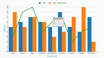
Since you are really trying to achieve display of multiple chart types (clustered columns, line and triangle marker) in a single chart, you can do that by using custom visuals.
Below link shows multiple combinations for charts like the one you seek:
https://appsource.microsoft.com/en-us/marketplace/apps?exp=ubp8&search=pbivizedit.com&page=1


In case, the visuals in the link do not solve your query, you can try PBIVizedit custom editor which is a GUI based click/select (no coding) tool and create your desired visual.
Thanks,
Team PBIVizEdit
- Mark as New
- Bookmark
- Subscribe
- Mute
- Subscribe to RSS Feed
- Permalink
- Report Inappropriate Content
Hi @shreyag12
I don't think this can be done with standard visualisations. When you stack two visualisations on top of one another tooltips are only shows for the topmost visualisation (the top of the z-order). You can adjust the order with the selection pane in Power BI Desktop. This may work if both visualisations don't completely overlap one another, alternatively you could do something by setting a bookmark with one visualisation on top and another bookmark with the other visualisation on top. These bookmarks could them be switched between with a button, to alternate which tooltips are seen. But unless you use a single visualisation (probably in this instance a custom visualisation like charticulator or debeb) you won't get tooltips from two overlapping visualisations shown at once.
Hope this helps
Stuart
Helpful resources

Microsoft Fabric Learn Together
Covering the world! 9:00-10:30 AM Sydney, 4:00-5:30 PM CET (Paris/Berlin), 7:00-8:30 PM Mexico City

Power BI Monthly Update - April 2024
Check out the April 2024 Power BI update to learn about new features.

| User | Count |
|---|---|
| 49 | |
| 18 | |
| 17 | |
| 16 | |
| 9 |

