- Power BI forums
- Updates
- News & Announcements
- Get Help with Power BI
- Desktop
- Service
- Report Server
- Power Query
- Mobile Apps
- Developer
- DAX Commands and Tips
- Custom Visuals Development Discussion
- Health and Life Sciences
- Power BI Spanish forums
- Translated Spanish Desktop
- Power Platform Integration - Better Together!
- Power Platform Integrations (Read-only)
- Power Platform and Dynamics 365 Integrations (Read-only)
- Training and Consulting
- Instructor Led Training
- Dashboard in a Day for Women, by Women
- Galleries
- Community Connections & How-To Videos
- COVID-19 Data Stories Gallery
- Themes Gallery
- Data Stories Gallery
- R Script Showcase
- Webinars and Video Gallery
- Quick Measures Gallery
- 2021 MSBizAppsSummit Gallery
- 2020 MSBizAppsSummit Gallery
- 2019 MSBizAppsSummit Gallery
- Events
- Ideas
- Custom Visuals Ideas
- Issues
- Issues
- Events
- Upcoming Events
- Community Blog
- Power BI Community Blog
- Custom Visuals Community Blog
- Community Support
- Community Accounts & Registration
- Using the Community
- Community Feedback
Register now to learn Fabric in free live sessions led by the best Microsoft experts. From Apr 16 to May 9, in English and Spanish.
- Power BI forums
- Forums
- Get Help with Power BI
- Service
- Re: Dashboard Visual Not Showing Axis Label in Sta...
- Subscribe to RSS Feed
- Mark Topic as New
- Mark Topic as Read
- Float this Topic for Current User
- Bookmark
- Subscribe
- Printer Friendly Page
- Mark as New
- Bookmark
- Subscribe
- Mute
- Subscribe to RSS Feed
- Permalink
- Report Inappropriate Content
Dashboard Visual Not Showing Axis Label in Stack Column Chart
Dear all,
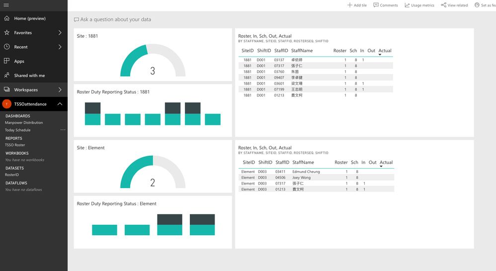
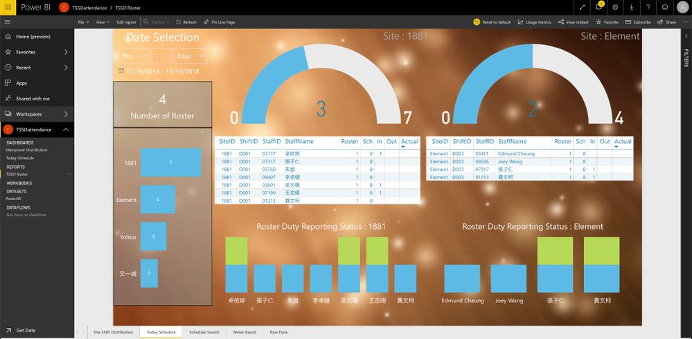
I have a stack column chart in the report published from the PowerBI Desktop. After I pin the report visual to the dashboard, all the Axis label is gone. Is it the way supposed to be?
The data source of the report is from the PowerBI Streaming Dataset.
Attached please find the screen dumps for your reference.
Many thanks!
Eddy


Solved! Go to Solution.
- Mark as New
- Bookmark
- Subscribe
- Mute
- Subscribe to RSS Feed
- Permalink
- Report Inappropriate Content
Hi @EddyLam
I think is see the problem. In the report the color of the axis is white. When pinning the visual to a dashboard the axis is not visable because the background of the dashboard is white. Changing the color in the report will solve the problem.
Regards,
Lajenda
- Mark as New
- Bookmark
- Subscribe
- Mute
- Subscribe to RSS Feed
- Permalink
- Report Inappropriate Content
- Mark as New
- Bookmark
- Subscribe
- Mute
- Subscribe to RSS Feed
- Permalink
- Report Inappropriate Content
Hi @EddyLam
Which web browser do you use? How about Chrome?
Could you try another report (not from the PowerBI Streaming Dataset) to see if the error happens?
According to this article, unfortunately, it is not available to connect to push or streaming datasets in Power BI Desktop at this time.
Please read this article to learn how to use real time streaming in power bi.
If you have any question, please let me know.
Best Regards
Maggie
- Mark as New
- Bookmark
- Subscribe
- Mute
- Subscribe to RSS Feed
- Permalink
- Report Inappropriate Content
Dear Maggie,
I tried Safari in OSX and Edge & Chrome in Windows 10. All browers do not show the axis labels. I managed to build a mechanism to filter out the unwanted records in the streaming dataset. Since I needed to demonstrate the ability to show realtime attendance status, I have no other choice but using the streaming dataset. I just wanted to confirm if this is an limitation of the dashboard with the streaming dataset. Fortunately, the attendance data can still show in the dashboard realtime.
Thanks
Eddy
Helpful resources

Microsoft Fabric Learn Together
Covering the world! 9:00-10:30 AM Sydney, 4:00-5:30 PM CET (Paris/Berlin), 7:00-8:30 PM Mexico City

Power BI Monthly Update - April 2024
Check out the April 2024 Power BI update to learn about new features.

| User | Count |
|---|---|
| 56 | |
| 19 | |
| 18 | |
| 18 | |
| 9 |
