- Power BI forums
- Updates
- News & Announcements
- Get Help with Power BI
- Desktop
- Service
- Report Server
- Power Query
- Mobile Apps
- Developer
- DAX Commands and Tips
- Custom Visuals Development Discussion
- Health and Life Sciences
- Power BI Spanish forums
- Translated Spanish Desktop
- Power Platform Integration - Better Together!
- Power Platform Integrations (Read-only)
- Power Platform and Dynamics 365 Integrations (Read-only)
- Training and Consulting
- Instructor Led Training
- Dashboard in a Day for Women, by Women
- Galleries
- Community Connections & How-To Videos
- COVID-19 Data Stories Gallery
- Themes Gallery
- Data Stories Gallery
- R Script Showcase
- Webinars and Video Gallery
- Quick Measures Gallery
- 2021 MSBizAppsSummit Gallery
- 2020 MSBizAppsSummit Gallery
- 2019 MSBizAppsSummit Gallery
- Events
- Ideas
- Custom Visuals Ideas
- Issues
- Issues
- Events
- Upcoming Events
- Community Blog
- Power BI Community Blog
- Custom Visuals Community Blog
- Community Support
- Community Accounts & Registration
- Using the Community
- Community Feedback
Register now to learn Fabric in free live sessions led by the best Microsoft experts. From Apr 16 to May 9, in English and Spanish.
- Power BI forums
- Forums
- Get Help with Power BI
- Developer
- Re: Custom visual with aggregated values
- Subscribe to RSS Feed
- Mark Topic as New
- Mark Topic as Read
- Float this Topic for Current User
- Bookmark
- Subscribe
- Printer Friendly Page
- Mark as New
- Bookmark
- Subscribe
- Mute
- Subscribe to RSS Feed
- Permalink
- Report Inappropriate Content
Custom visual with aggregated values
Hello!
I'm trying to create a custom Histogram visual. I need the custom visual to take a data measure and a category, calculate aggregated sums of the measure by the category, and draw a histogram of the aggregated sum values. All this needs to be compatible with an interactive date filter. My data table looks like this:
Date Category Measure
2022-01-01 1
2022-01-01 2
...
2022-01-02 1
2022-01-02 2
...
I've tried adapting these two examples, but I have not achieved any good results:
https://github.com/microsoft/PowerBI-visuals-sampleBarChart
https://github.com/microsoft/powerbi-visuals-histogram
Can anybody give me a hint of how to do this?
Thanks!
- Mark as New
- Bookmark
- Subscribe
- Mute
- Subscribe to RSS Feed
- Permalink
- Report Inappropriate Content
Hi @dm-p
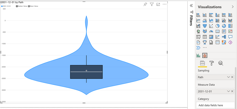
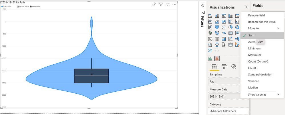
Thanks a lot for your answer. That was really helpful! Actually, I can get the aggregation that I need with your Violin Plot visual.
Also, since it shows the distribution, it may be a good alternative to the Histogram that I need to develop.
However, if I still needed to create a Histogram, how should I define the data roles and data view mappings in order to have this aggregation? And how do I get the visual to use these calculated values instead of the input fields?
Thanks!
- Mark as New
- Bookmark
- Subscribe
- Mute
- Subscribe to RSS Feed
- Permalink
- Report Inappropriate Content
Hi @ana-pierola,
For any visuals that need to calculate statistics over values and aggregate them, all underlying values need to be provided to the visual dataset so that they can be computed internally. Visuals are not able to know more about the model than what is supplied to the visual data roles and data view mapping (dataset).
In the case of a histogram, you will need to also supply a grouping column/field to your dataset that ensures each row is unique, such as an identify column, otherwise you will not be able to derive the correct values. Note that if you supply lots of data you may need to ensure that you can work with the row limits.
The Violin Plot visual uses this approach also, and I've written a post to explain thy this is necessary here, which may help you to understand how visuals need their data to be able to aggregate it themselves.
Regards,
Daniel
Did I answer your question? Mark my post as a solution!
Proud to be a Super User!
My course: Introduction to Developing Power BI Visuals
On how to ask a technical question, if you really want an answer (courtesy of SQLBI)
Helpful resources

Microsoft Fabric Learn Together
Covering the world! 9:00-10:30 AM Sydney, 4:00-5:30 PM CET (Paris/Berlin), 7:00-8:30 PM Mexico City

Power BI Monthly Update - April 2024
Check out the April 2024 Power BI update to learn about new features.

| User | Count |
|---|---|
| 15 | |
| 1 | |
| 1 | |
| 1 | |
| 1 |
| User | Count |
|---|---|
| 27 | |
| 3 | |
| 2 | |
| 2 | |
| 2 |


