- Power BI forums
- Updates
- News & Announcements
- Get Help with Power BI
- Desktop
- Service
- Report Server
- Power Query
- Mobile Apps
- Developer
- DAX Commands and Tips
- Custom Visuals Development Discussion
- Health and Life Sciences
- Power BI Spanish forums
- Translated Spanish Desktop
- Power Platform Integration - Better Together!
- Power Platform Integrations (Read-only)
- Power Platform and Dynamics 365 Integrations (Read-only)
- Training and Consulting
- Instructor Led Training
- Dashboard in a Day for Women, by Women
- Galleries
- Community Connections & How-To Videos
- COVID-19 Data Stories Gallery
- Themes Gallery
- Data Stories Gallery
- R Script Showcase
- Webinars and Video Gallery
- Quick Measures Gallery
- 2021 MSBizAppsSummit Gallery
- 2020 MSBizAppsSummit Gallery
- 2019 MSBizAppsSummit Gallery
- Events
- Ideas
- Custom Visuals Ideas
- Issues
- Issues
- Events
- Upcoming Events
- Community Blog
- Power BI Community Blog
- Custom Visuals Community Blog
- Community Support
- Community Accounts & Registration
- Using the Community
- Community Feedback
Register now to learn Fabric in free live sessions led by the best Microsoft experts. From Apr 16 to May 9, in English and Spanish.
- Power BI forums
- Forums
- Get Help with Power BI
- Developer
- Create comparison chart using two Date Slicer in s...
- Subscribe to RSS Feed
- Mark Topic as New
- Mark Topic as Read
- Float this Topic for Current User
- Bookmark
- Subscribe
- Printer Friendly Page
- Mark as New
- Bookmark
- Subscribe
- Mute
- Subscribe to RSS Feed
- Permalink
- Report Inappropriate Content
Create comparison chart using two Date Slicer in single Line Chart
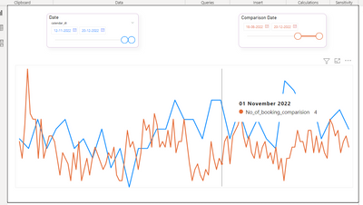
Compare two custom date slicers into a single visual for line chart.
Also tried as below steps:
1) Created two Date slicer for Comparision Date and Custom Date.
2) Overlapped two line charts in the below screenshot.
3) Gave interaction to the respected line charts. So while selecting Dates from Comparison Date slicer only the Red line chart will be synchronised. And same way while selecting Dates from Date Slicer only the Blue line chart will be synchronised.
Now, we want to show tooltip for the both lines at same point on hover.
- Mark as New
- Bookmark
- Subscribe
- Mute
- Subscribe to RSS Feed
- Permalink
- Report Inappropriate Content
Hi @v-rzhou-msft,
Thanks for quick response.
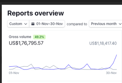
We want to achieve below in Power BI
Dark Blue Line : Represents Nov Month Data
Light Blue Line : Represents Oct Month Data
Range we can compare : Pre. Month
Pre Year
Pre Quarter
Last 7 Days and custom date
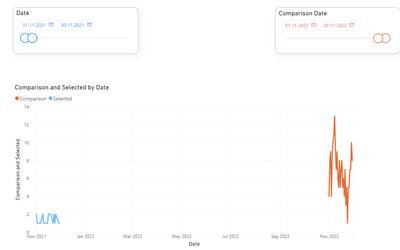
Solution you have provided is giving continue line for both the period instead of overlapping lines for both periods we are trying to compare. Please find the chart below based on your solution.
If you can help us with the solution where we can compare the two custom periods on a line chart.
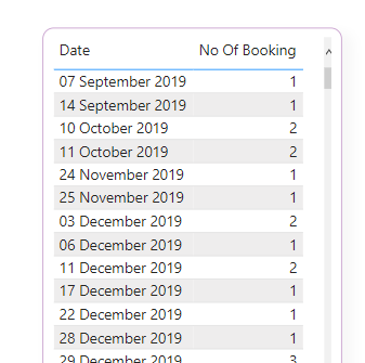
Please find attached sample data set below:
- Mark as New
- Bookmark
- Subscribe
- Mute
- Subscribe to RSS Feed
- Permalink
- Report Inappropriate Content
Hi @Shloka_Lakhani ,
Power BI only support us to show tooltips from one visual. As far as I know, you don't need to overlap two line charts to achieve your goal. Here Iauggest you to calculate two lined by measures and create two unrelated date tables for slicer.
Line 1 =
VAR _SelectDate =
    VALUES ( 'Date'[Date] )
RETURN
    CALCULATE (
        SUM ( 'TableName'[Value] ),
        FILTER ( 'TableName', 'TableName'[Date] IN _SelectDate )
    )
Line 2 =
VAR _SelectDate =
VALUES ( 'Comparison Date'[Date] )
RETURN
CALCULATE (
SUM ( 'TableName'[Value] ),
FILTER ( 'TableName', 'TableName'[Date] IN _SelectDate )
)Add these measures into Y axis and then you can see tooltips at the same time.
Best Regards,
Rico Zhou
If this post helps, then please consider Accept it as the solution to help the other members find it more quickly.
Helpful resources

Microsoft Fabric Learn Together
Covering the world! 9:00-10:30 AM Sydney, 4:00-5:30 PM CET (Paris/Berlin), 7:00-8:30 PM Mexico City

Power BI Monthly Update - April 2024
Check out the April 2024 Power BI update to learn about new features.

| User | Count |
|---|---|
| 14 | |
| 2 | |
| 1 | |
| 1 | |
| 1 |


