- Power BI forums
- Updates
- News & Announcements
- Get Help with Power BI
- Desktop
- Service
- Report Server
- Power Query
- Mobile Apps
- Developer
- DAX Commands and Tips
- Custom Visuals Development Discussion
- Health and Life Sciences
- Power BI Spanish forums
- Translated Spanish Desktop
- Power Platform Integration - Better Together!
- Power Platform Integrations (Read-only)
- Power Platform and Dynamics 365 Integrations (Read-only)
- Training and Consulting
- Instructor Led Training
- Dashboard in a Day for Women, by Women
- Galleries
- Community Connections & How-To Videos
- COVID-19 Data Stories Gallery
- Themes Gallery
- Data Stories Gallery
- R Script Showcase
- Webinars and Video Gallery
- Quick Measures Gallery
- 2021 MSBizAppsSummit Gallery
- 2020 MSBizAppsSummit Gallery
- 2019 MSBizAppsSummit Gallery
- Events
- Ideas
- Custom Visuals Ideas
- Issues
- Issues
- Events
- Upcoming Events
- Community Blog
- Power BI Community Blog
- Custom Visuals Community Blog
- Community Support
- Community Accounts & Registration
- Using the Community
- Community Feedback
Register now to learn Fabric in free live sessions led by the best Microsoft experts. From Apr 16 to May 9, in English and Spanish.
- Power BI forums
- Forums
- Get Help with Power BI
- Desktop
- Re: line chart help
- Subscribe to RSS Feed
- Mark Topic as New
- Mark Topic as Read
- Float this Topic for Current User
- Bookmark
- Subscribe
- Printer Friendly Page
- Mark as New
- Bookmark
- Subscribe
- Mute
- Subscribe to RSS Feed
- Permalink
- Report Inappropriate Content
line chart help
I need a bit of help plotting a line graph. Not sure its how i have my data or how i'm using the graph settings
I have 10 sites with finance data over 5 years for each site.
I want to plot the year over the x axis. Each site is a line on the graph. Y is the value. We can then see growth over time or not growth over time.
Excel looks like
| site | 18/19 | 19/20 | 20/21 |
| 1 | 456465 | 56776 | 88990 |
| 2 | 435345 | 67567 | 80978 |
| 3 | 656345 | 67674 | 70077 |
Solved! Go to Solution.
- Mark as New
- Bookmark
- Subscribe
- Mute
- Subscribe to RSS Feed
- Permalink
- Report Inappropriate Content
Hi, @jblackburnHWGA
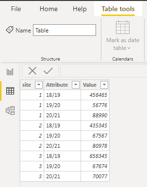
According to your description and sample data, I think you can use the “Unpiovit columns” operation in the Power Query to get the correct data model to achieve your requirement, you can try my steps:
- Go to the Power Query and click like this:
Then you can get the correct data model like this:
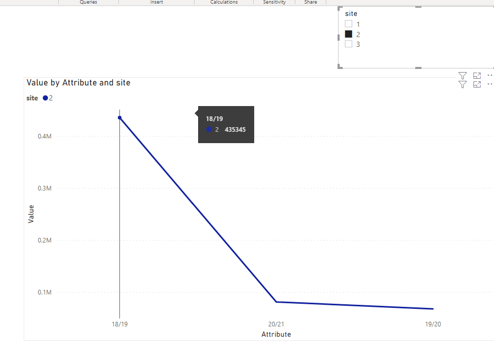
- Click on “Close and apply” and create a line chart and place it like this:
You can also create a slicer for the [Site] to slice the chart by site id, like this:
And you can get what you want.
You can download my test pbix file below
Thank you very much!
Best Regards,
Community Support Team _Robert Qin
If this post helps, then please consider Accept it as the solution to help the other members find it more quickly.
- Mark as New
- Bookmark
- Subscribe
- Mute
- Subscribe to RSS Feed
- Permalink
- Report Inappropriate Content
Yes all working. Many thanks
- Mark as New
- Bookmark
- Subscribe
- Mute
- Subscribe to RSS Feed
- Permalink
- Report Inappropriate Content
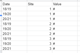
You need to structure your data differently to work with that scenario.
Here is the best way for that:
Then put the data in your line chart feilds as follows:
Axis : `Date`
Legend : `Site`
Values : `Value`
- Mark as New
- Bookmark
- Subscribe
- Mute
- Subscribe to RSS Feed
- Permalink
- Report Inappropriate Content
Did this work for you?
- Mark as New
- Bookmark
- Subscribe
- Mute
- Subscribe to RSS Feed
- Permalink
- Report Inappropriate Content
my table didn't come out well lol hope you get the idea
Helpful resources

Microsoft Fabric Learn Together
Covering the world! 9:00-10:30 AM Sydney, 4:00-5:30 PM CET (Paris/Berlin), 7:00-8:30 PM Mexico City

Power BI Monthly Update - April 2024
Check out the April 2024 Power BI update to learn about new features.

| User | Count |
|---|---|
| 113 | |
| 103 | |
| 77 | |
| 66 | |
| 63 |
| User | Count |
|---|---|
| 142 | |
| 105 | |
| 102 | |
| 81 | |
| 68 |


