Jumpstart your career with the Fabric Career Hub
Find everything you need to get certified on Fabric—skills challenges, live sessions, exam prep, role guidance, and a 50 percent discount on exams.
Get started- Power BI forums
- Updates
- News & Announcements
- Get Help with Power BI
- Desktop
- Service
- Report Server
- Power Query
- Mobile Apps
- Developer
- DAX Commands and Tips
- Custom Visuals Development Discussion
- Health and Life Sciences
- Power BI Spanish forums
- Translated Spanish Desktop
- Power Platform Integration - Better Together!
- Power Platform Integrations (Read-only)
- Power Platform and Dynamics 365 Integrations (Read-only)
- Training and Consulting
- Instructor Led Training
- Dashboard in a Day for Women, by Women
- Galleries
- Community Connections & How-To Videos
- COVID-19 Data Stories Gallery
- Themes Gallery
- Data Stories Gallery
- R Script Showcase
- Webinars and Video Gallery
- Quick Measures Gallery
- 2021 MSBizAppsSummit Gallery
- 2020 MSBizAppsSummit Gallery
- 2019 MSBizAppsSummit Gallery
- Events
- Ideas
- Custom Visuals Ideas
- Issues
- Issues
- Events
- Upcoming Events
- Community Blog
- Power BI Community Blog
- Custom Visuals Community Blog
- Community Support
- Community Accounts & Registration
- Using the Community
- Community Feedback
Earn a 50% discount on the DP-600 certification exam by completing the Fabric 30 Days to Learn It challenge.
- Power BI forums
- Forums
- Get Help with Power BI
- Desktop
- Re: horizontal stacked bar/line chart with multipl...
- Subscribe to RSS Feed
- Mark Topic as New
- Mark Topic as Read
- Float this Topic for Current User
- Bookmark
- Subscribe
- Printer Friendly Page
- Mark as New
- Bookmark
- Subscribe
- Mute
- Subscribe to RSS Feed
- Permalink
- Report Inappropriate Content
horizontal stacked bar/line chart with multiple measures
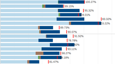
I am looking for a visual, that is something like this:
Different colors on the bar are from different measures (so stack the measure on one bar) while the red line is the target. The use case is something like: the actual is part of the bar, then the prediction, the the additional open opportunities, add the 3 pieces to see if the total will hit/miss the quota (goal, the red line).
Thanks!
NM
- Mark as New
- Bookmark
- Subscribe
- Mute
- Subscribe to RSS Feed
- Permalink
- Report Inappropriate Content
Hi @NanPowerBI ,
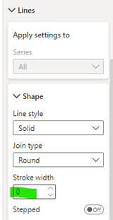
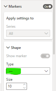
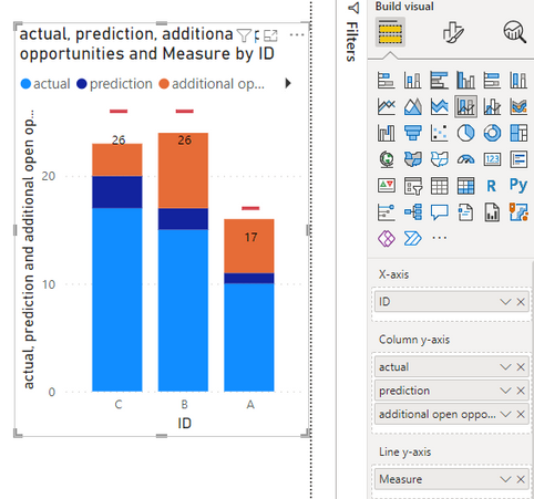
Perhaps you could consider using the line and stacked column chart, showing the target values as a line, then setting the line width to 0 and changing the markers to line segments.

Best Regards,
Winniz
If this post helps, then please consider Accept it as the solution to help the other members find it more quickly.
- Mark as New
- Bookmark
- Subscribe
- Mute
- Subscribe to RSS Feed
- Permalink
- Report Inappropriate Content
@NanPowerBI , The standard visual does not have horizontal stacked like bar
You can check the bullet visual https://appsource.microsoft.com/en-us/product/power-bi-visuals/wa104380755?tab=overview
You can check other custom visuals too https://appsource.microsoft.com/en-us/marketplace/apps?product=power-bi-visuals&search=line%20stacke...
Microsoft Power BI Learning Resources, 2023 !!
Learn Power BI - Full Course with Dec-2022, with Window, Index, Offset, 100+ Topics !!
Did I answer your question? Mark my post as a solution! Appreciate your Kudos !! Proud to be a Super User! !!
Helpful resources
| User | Count |
|---|---|
| 94 | |
| 90 | |
| 79 | |
| 77 | |
| 71 |
| User | Count |
|---|---|
| 116 | |
| 106 | |
| 88 | |
| 64 | |
| 63 |


