- Power BI forums
- Updates
- News & Announcements
- Get Help with Power BI
- Desktop
- Service
- Report Server
- Power Query
- Mobile Apps
- Developer
- DAX Commands and Tips
- Custom Visuals Development Discussion
- Health and Life Sciences
- Power BI Spanish forums
- Translated Spanish Desktop
- Power Platform Integration - Better Together!
- Power Platform Integrations (Read-only)
- Power Platform and Dynamics 365 Integrations (Read-only)
- Training and Consulting
- Instructor Led Training
- Dashboard in a Day for Women, by Women
- Galleries
- Community Connections & How-To Videos
- COVID-19 Data Stories Gallery
- Themes Gallery
- Data Stories Gallery
- R Script Showcase
- Webinars and Video Gallery
- Quick Measures Gallery
- 2021 MSBizAppsSummit Gallery
- 2020 MSBizAppsSummit Gallery
- 2019 MSBizAppsSummit Gallery
- Events
- Ideas
- Custom Visuals Ideas
- Issues
- Issues
- Events
- Upcoming Events
- Community Blog
- Power BI Community Blog
- Custom Visuals Community Blog
- Community Support
- Community Accounts & Registration
- Using the Community
- Community Feedback
Register now to learn Fabric in free live sessions led by the best Microsoft experts. From Apr 16 to May 9, in English and Spanish.
- Power BI forums
- Forums
- Get Help with Power BI
- Desktop
- Year over Year Bubble map
- Subscribe to RSS Feed
- Mark Topic as New
- Mark Topic as Read
- Float this Topic for Current User
- Bookmark
- Subscribe
- Printer Friendly Page
- Mark as New
- Bookmark
- Subscribe
- Mute
- Subscribe to RSS Feed
- Permalink
- Report Inappropriate Content
Year over Year Bubble map
I'm trying to create a map of year over year values with a bubble map. I want last years values one color bubble and this years values a different color bubble. How do I accomplish this? Currently, when I click on last years and this years values, the bubbles take in the SUM of those values rather than plotting them distincly.
Anyone know how this can be accomplished?
Solved! Go to Solution.
- Mark as New
- Bookmark
- Subscribe
- Mute
- Subscribe to RSS Feed
- Permalink
- Report Inappropriate Content
By default, Scatter Charts (I"m assuming your bubble map) doesn't like dates on the X or Y axis. This link helped me create your solution:
https://community.powerbi.com/t5/Desktop/Scatter-with-date-on-X-and-time-on-Y/m-p/19030
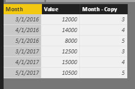
Copy your Month colum and Right Click 'Transform' Month - Month to get just the month. Make this a Whole Number data type.
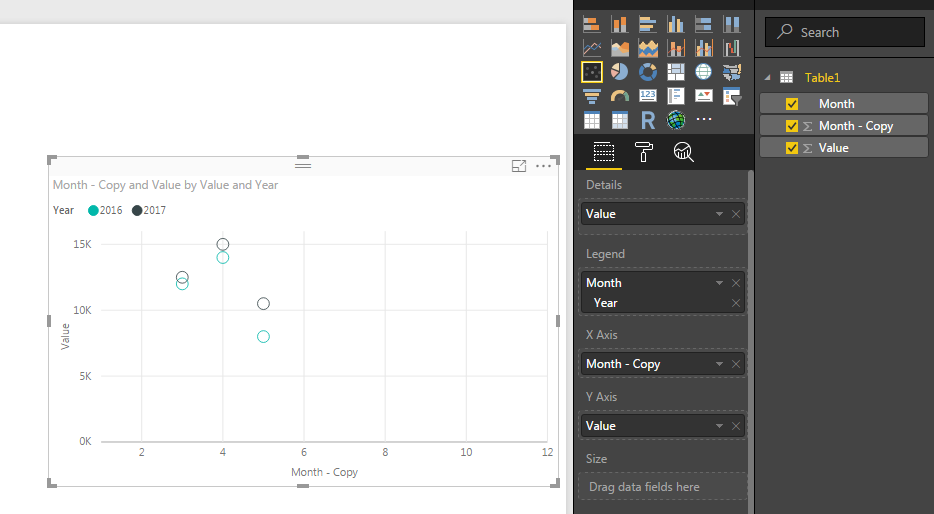
Now use the '1-12' numbers as your X axis and your values as the Y axis AND put value in Details. On the Legend, you can 'Date Hierarchy' your original Date (assuming in Date format) to just the year to get your Colored cirles.
** FYI - I had to play with the X & Y Axis Start / End values to make it look better, but that's easy to do under formatting. You can also turn on 'Fill Point' to make the bubbles solid in color! (Looks much better!)
Thank You,
FOrrest
Please give Kudos or Mark as a Solution!
https://www.linkedin.com/in/forrest-hill-04480730/
Proud to give back to the community!
Thank You!
Helpful resources

Microsoft Fabric Learn Together
Covering the world! 9:00-10:30 AM Sydney, 4:00-5:30 PM CET (Paris/Berlin), 7:00-8:30 PM Mexico City

Power BI Monthly Update - April 2024
Check out the April 2024 Power BI update to learn about new features.

| User | Count |
|---|---|
| 107 | |
| 98 | |
| 83 | |
| 76 | |
| 65 |
| User | Count |
|---|---|
| 120 | |
| 112 | |
| 94 | |
| 84 | |
| 75 |


