Jumpstart your career with the Fabric Career Hub
Find everything you need to get certified on Fabric—skills challenges, live sessions, exam prep, role guidance, and more.
Get started- Power BI forums
- Updates
- News & Announcements
- Get Help with Power BI
- Desktop
- Service
- Report Server
- Power Query
- Mobile Apps
- Developer
- DAX Commands and Tips
- Custom Visuals Development Discussion
- Health and Life Sciences
- Power BI Spanish forums
- Translated Spanish Desktop
- Power Platform Integration - Better Together!
- Power Platform Integrations (Read-only)
- Power Platform and Dynamics 365 Integrations (Read-only)
- Training and Consulting
- Instructor Led Training
- Dashboard in a Day for Women, by Women
- Galleries
- Community Connections & How-To Videos
- COVID-19 Data Stories Gallery
- Themes Gallery
- Data Stories Gallery
- R Script Showcase
- Webinars and Video Gallery
- Quick Measures Gallery
- 2021 MSBizAppsSummit Gallery
- 2020 MSBizAppsSummit Gallery
- 2019 MSBizAppsSummit Gallery
- Events
- Ideas
- Custom Visuals Ideas
- Issues
- Issues
- Events
- Upcoming Events
- Community Blog
- Power BI Community Blog
- Custom Visuals Community Blog
- Community Support
- Community Accounts & Registration
- Using the Community
- Community Feedback
Grow your Fabric skills and prepare for the DP-600 certification exam by completing the latest Microsoft Fabric challenge.
- Power BI forums
- Forums
- Get Help with Power BI
- Desktop
- Re: Year Month Comparision Clustered Column Chart ...
- Subscribe to RSS Feed
- Mark Topic as New
- Mark Topic as Read
- Float this Topic for Current User
- Bookmark
- Subscribe
- Printer Friendly Page
- Mark as New
- Bookmark
- Subscribe
- Mute
- Subscribe to RSS Feed
- Permalink
- Report Inappropriate Content
Year Month Comparision Clustered Column Chart in Power BI
Dear Uesrs,
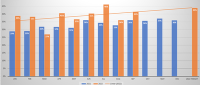
Could you please guide me how to create 2 or 3 year data with Month comparison as per graph below.
Do I need DAX or any other option can do it. please help.
- Mark as New
- Bookmark
- Subscribe
- Mute
- Subscribe to RSS Feed
- Permalink
- Report Inappropriate Content
Whatever your date hiearchy field is, take the "year" and put that in the "Legend" of the visual and put "month" in the "x-axis" of a clustered column chart.
- Mark as New
- Bookmark
- Subscribe
- Mute
- Subscribe to RSS Feed
- Permalink
- Report Inappropriate Content
Hi , @ktkpatra
Can you explain what is " 2 or 3 year data with Month comparison as per graph below"?
In your cisual , it shows the "2021-2022" Month comparsion, and what is you really want ?
If you want to make a slicer , you can refer to :
Generate Year and Month Combinations in Power BI Report using DAX - RADACAD
Best Regards,
Aniya Zhang
If this post helps, then please consider Accept it as the solution to help the other members find it more quickly
Helpful resources

Europe’s largest Microsoft Fabric Community Conference
Join the community in Stockholm for expert Microsoft Fabric learning including a very exciting keynote from Arun Ulag, Corporate Vice President, Azure Data.

New forum boards available in Real-Time Intelligence.
Ask questions in Eventhouse and KQL, Eventstream, and Reflex.

| User | Count |
|---|---|
| 84 | |
| 84 | |
| 65 | |
| 62 | |
| 55 |
| User | Count |
|---|---|
| 179 | |
| 108 | |
| 104 | |
| 71 | |
| 70 |

