- Power BI forums
- Updates
- News & Announcements
- Get Help with Power BI
- Desktop
- Service
- Report Server
- Power Query
- Mobile Apps
- Developer
- DAX Commands and Tips
- Custom Visuals Development Discussion
- Health and Life Sciences
- Power BI Spanish forums
- Translated Spanish Desktop
- Power Platform Integration - Better Together!
- Power Platform Integrations (Read-only)
- Power Platform and Dynamics 365 Integrations (Read-only)
- Training and Consulting
- Instructor Led Training
- Dashboard in a Day for Women, by Women
- Galleries
- Community Connections & How-To Videos
- COVID-19 Data Stories Gallery
- Themes Gallery
- Data Stories Gallery
- R Script Showcase
- Webinars and Video Gallery
- Quick Measures Gallery
- 2021 MSBizAppsSummit Gallery
- 2020 MSBizAppsSummit Gallery
- 2019 MSBizAppsSummit Gallery
- Events
- Ideas
- Custom Visuals Ideas
- Issues
- Issues
- Events
- Upcoming Events
- Community Blog
- Power BI Community Blog
- Custom Visuals Community Blog
- Community Support
- Community Accounts & Registration
- Using the Community
- Community Feedback
Register now to learn Fabric in free live sessions led by the best Microsoft experts. From Apr 16 to May 9, in English and Spanish.
- Power BI forums
- Forums
- Get Help with Power BI
- Desktop
- Re: YTD graph until selected month
- Subscribe to RSS Feed
- Mark Topic as New
- Mark Topic as Read
- Float this Topic for Current User
- Bookmark
- Subscribe
- Printer Friendly Page
- Mark as New
- Bookmark
- Subscribe
- Mute
- Subscribe to RSS Feed
- Permalink
- Report Inappropriate Content
YTD graph until selected month
Hi,
I could really use your help with the following measure.
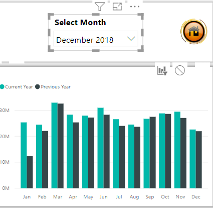
I made a graph showing the total sales up to the selected month.
So if I select Dec 2018, I see jan - dec 2018.
If I select jan 2019, I see only jan 2019.
I used the following formula:
The slicer is based on Date[Date], the axis is based on Billing[Date]. But both are linked.
Now I would like to add a YTD line in this graph or in another graph if this is easier.
The import thing is that 'Current Year' depends on the selected month.
If jan 2019 is selected, then Current Year is 2019. If Dec 2018 is selected, Current Year is 2018.
Really appreciate your help!
Valérie
Solved! Go to Solution.
- Mark as New
- Bookmark
- Subscribe
- Mute
- Subscribe to RSS Feed
- Permalink
- Report Inappropriate Content
@Anonymous,
Please create a new date table using dax below. Please note that there is no relationship between the new date table and other table.
Calendar = CALENDARAUTO()
Then create the following measures in your table.
YTD = TOTALYTD([Total Turnover MSCI];'Date'[Date])
NewMeasure= var Ldate = MAX('Calendar'[Date])//Last date

return

         if(min('Date'[Date])<=Ldate;
                   [YTD])
At last, use date field of the new date table('Calendar'[Date]) to create slicer, create a line chart using 'Date'[Date] field and NewMeasure.
Regards,
Lydia
If this post helps, then please consider Accept it as the solution to help the other members find it more quickly.
- Mark as New
- Bookmark
- Subscribe
- Mute
- Subscribe to RSS Feed
- Permalink
- Report Inappropriate Content
@v-yuezhe-msft i tried your solution and i do get a dynamic chart that displays data up to the month selected in the slicer but the displayed data points are filtered based on the context ie every month i see the total not the cumulative amount as it builds up month by month. is there a way to do this and have a dynamic line chart that builds up month by month?
Helpful resources

Microsoft Fabric Learn Together
Covering the world! 9:00-10:30 AM Sydney, 4:00-5:30 PM CET (Paris/Berlin), 7:00-8:30 PM Mexico City

Power BI Monthly Update - April 2024
Check out the April 2024 Power BI update to learn about new features.

| User | Count |
|---|---|
| 114 | |
| 105 | |
| 78 | |
| 67 | |
| 63 |
| User | Count |
|---|---|
| 148 | |
| 107 | |
| 106 | |
| 83 | |
| 70 |

