- Power BI forums
- Updates
- News & Announcements
- Get Help with Power BI
- Desktop
- Service
- Report Server
- Power Query
- Mobile Apps
- Developer
- DAX Commands and Tips
- Custom Visuals Development Discussion
- Health and Life Sciences
- Power BI Spanish forums
- Translated Spanish Desktop
- Power Platform Integration - Better Together!
- Power Platform Integrations (Read-only)
- Power Platform and Dynamics 365 Integrations (Read-only)
- Training and Consulting
- Instructor Led Training
- Dashboard in a Day for Women, by Women
- Galleries
- Community Connections & How-To Videos
- COVID-19 Data Stories Gallery
- Themes Gallery
- Data Stories Gallery
- R Script Showcase
- Webinars and Video Gallery
- Quick Measures Gallery
- 2021 MSBizAppsSummit Gallery
- 2020 MSBizAppsSummit Gallery
- 2019 MSBizAppsSummit Gallery
- Events
- Ideas
- Custom Visuals Ideas
- Issues
- Issues
- Events
- Upcoming Events
- Community Blog
- Power BI Community Blog
- Custom Visuals Community Blog
- Community Support
- Community Accounts & Registration
- Using the Community
- Community Feedback
Earn a 50% discount on the DP-600 certification exam by completing the Fabric 30 Days to Learn It challenge.
- Power BI forums
- Forums
- Get Help with Power BI
- Desktop
- Re: X Axis baseline highlight
- Subscribe to RSS Feed
- Mark Topic as New
- Mark Topic as Read
- Float this Topic for Current User
- Bookmark
- Subscribe
- Printer Friendly Page
- Mark as New
- Bookmark
- Subscribe
- Mute
- Subscribe to RSS Feed
- Permalink
- Report Inappropriate Content
X Axis baseline highlight
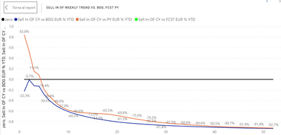
I have a weekly cumulated variance chart and lines go from positive to negative. I'd like to highlight the 0% line in order to get a quick visual view of the trend. Is it possible to format the X axis in order to highlight it @ a specific Y axis value (in this case @ 0%)?
Solved! Go to Solution.
- Mark as New
- Bookmark
- Subscribe
- Mute
- Subscribe to RSS Feed
- Permalink
- Report Inappropriate Content
Hi @Moaibob
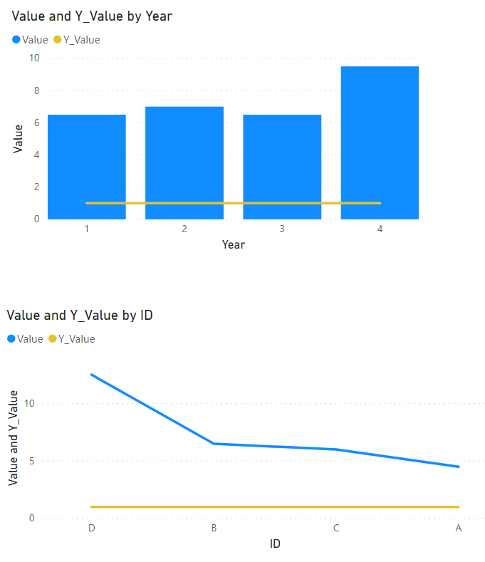
Create a measure for the value in question and plot that?
In these images I've just used this measure
Y_Value = 1
Regards
Phil
Did I answer your question? Then please mark my post as the solution.
If I helped you, click on the Thumbs Up to give Kudos.
Blog :: YouTube Channel :: Connect on Linkedin
Proud to be a Super User!
- Mark as New
- Bookmark
- Subscribe
- Mute
- Subscribe to RSS Feed
- Permalink
- Report Inappropriate Content
Great. That's working. Not very stylish (Can't hide the fake measure from the legenda), but at least i have the baseline clearly displayed.
Thank you
- Mark as New
- Bookmark
- Subscribe
- Mute
- Subscribe to RSS Feed
- Permalink
- Report Inappropriate Content
Hi @Moaibob
Create a measure for the value in question and plot that?
In these images I've just used this measure
Y_Value = 1
Regards
Phil
Did I answer your question? Then please mark my post as the solution.
If I helped you, click on the Thumbs Up to give Kudos.
Blog :: YouTube Channel :: Connect on Linkedin
Proud to be a Super User!
Helpful resources
| User | Count |
|---|---|
| 106 | |
| 89 | |
| 81 | |
| 76 | |
| 73 |
| User | Count |
|---|---|
| 112 | |
| 104 | |
| 96 | |
| 74 | |
| 66 |


