- Power BI forums
- Updates
- News & Announcements
- Get Help with Power BI
- Desktop
- Service
- Report Server
- Power Query
- Mobile Apps
- Developer
- DAX Commands and Tips
- Custom Visuals Development Discussion
- Health and Life Sciences
- Power BI Spanish forums
- Translated Spanish Desktop
- Power Platform Integration - Better Together!
- Power Platform Integrations (Read-only)
- Power Platform and Dynamics 365 Integrations (Read-only)
- Training and Consulting
- Instructor Led Training
- Dashboard in a Day for Women, by Women
- Galleries
- Community Connections & How-To Videos
- COVID-19 Data Stories Gallery
- Themes Gallery
- Data Stories Gallery
- R Script Showcase
- Webinars and Video Gallery
- Quick Measures Gallery
- 2021 MSBizAppsSummit Gallery
- 2020 MSBizAppsSummit Gallery
- 2019 MSBizAppsSummit Gallery
- Events
- Ideas
- Custom Visuals Ideas
- Issues
- Issues
- Events
- Upcoming Events
- Community Blog
- Power BI Community Blog
- Custom Visuals Community Blog
- Community Support
- Community Accounts & Registration
- Using the Community
- Community Feedback
Register now to learn Fabric in free live sessions led by the best Microsoft experts. From Apr 16 to May 9, in English and Spanish.
- Power BI forums
- Forums
- Get Help with Power BI
- Desktop
- Visuals won't be showing "Actual Value" even if ty...
- Subscribe to RSS Feed
- Mark Topic as New
- Mark Topic as Read
- Float this Topic for Current User
- Bookmark
- Subscribe
- Printer Friendly Page
- Mark as New
- Bookmark
- Subscribe
- Mute
- Subscribe to RSS Feed
- Permalink
- Report Inappropriate Content
Visuals won't be showing "Actual Value" even if type=number
Hello everybody,
For my current project I am fetching my data through an API (I dont know if this could be causing the issue)
I just want to plot a Y value with a name on the X axis.
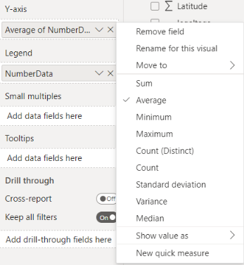
Even if the Y value is actually number, the plot will only propose sum/average/count etc.
I think I've seen lots of unresolved cases for this problem so I'll try my luck.
Is there something I am missing ?
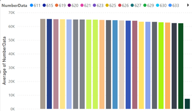
Intead of just having the value for each X element...
Thanks a lot, have a good day
Solved! Go to Solution.
- Mark as New
- Bookmark
- Subscribe
- Mute
- Subscribe to RSS Feed
- Permalink
- Report Inappropriate Content
Hi @ThoVez
Thanks for your reply.
That is by design, when you have multiple duplicate values on the x-axis, the line chart will aggregate their corresponding values. As a workaround, you can try the solution shared by Bapaknyaanak2 who have asked the same question.
"
I think i've found how to make Power BI shows the actual value, instead of aggregate in line chart. In my case, it's solved by creating a slicer, and i just need to drag the column that I interested in seeing it as an actual value to it. Then, my line chart will show the actual value.
In @v-haibl-msft's example, he can make it like that because it only has one value and once the X-axis data appear twice in the column (which is my case), then power bi started to show it as aggregate.
"
link: Solved: How to show value instead of aggregate - Microsoft Power BI Community
Best Regards,
Community Support Team _Tang
If this post helps, please consider Accept it as the solution to help the other members find it more quickly.
- Mark as New
- Bookmark
- Subscribe
- Mute
- Subscribe to RSS Feed
- Permalink
- Report Inappropriate Content
If someone can have a look at this issue
- Mark as New
- Bookmark
- Subscribe
- Mute
- Subscribe to RSS Feed
- Permalink
- Report Inappropriate Content
Hi @ThoVez
Thanks for reaching out to us.
What chart are you using? and I'll check it later
Best Regards,
Community Support Team _Tang
If this post helps, please consider Accept it as the solution to help the other members find it more quickly.
- Mark as New
- Bookmark
- Subscribe
- Mute
- Subscribe to RSS Feed
- Permalink
- Report Inappropriate Content
Hi Xiao,
Basically any bar chart won't be displaying the right values.
Thanks for taking care!
- Mark as New
- Bookmark
- Subscribe
- Mute
- Subscribe to RSS Feed
- Permalink
- Report Inappropriate Content
Hi @ThoVez
Thanks for your reply.
That is by design, when you have multiple duplicate values on the x-axis, the line chart will aggregate their corresponding values. As a workaround, you can try the solution shared by Bapaknyaanak2 who have asked the same question.
"
I think i've found how to make Power BI shows the actual value, instead of aggregate in line chart. In my case, it's solved by creating a slicer, and i just need to drag the column that I interested in seeing it as an actual value to it. Then, my line chart will show the actual value.
In @v-haibl-msft's example, he can make it like that because it only has one value and once the X-axis data appear twice in the column (which is my case), then power bi started to show it as aggregate.
"
link: Solved: How to show value instead of aggregate - Microsoft Power BI Community
Best Regards,
Community Support Team _Tang
If this post helps, please consider Accept it as the solution to help the other members find it more quickly.
Helpful resources

Microsoft Fabric Learn Together
Covering the world! 9:00-10:30 AM Sydney, 4:00-5:30 PM CET (Paris/Berlin), 7:00-8:30 PM Mexico City

Power BI Monthly Update - April 2024
Check out the April 2024 Power BI update to learn about new features.

| User | Count |
|---|---|
| 100 | |
| 99 | |
| 80 | |
| 77 | |
| 66 |
| User | Count |
|---|---|
| 134 | |
| 106 | |
| 104 | |
| 85 | |
| 73 |


