- Power BI forums
- Updates
- News & Announcements
- Get Help with Power BI
- Desktop
- Service
- Report Server
- Power Query
- Mobile Apps
- Developer
- DAX Commands and Tips
- Custom Visuals Development Discussion
- Health and Life Sciences
- Power BI Spanish forums
- Translated Spanish Desktop
- Power Platform Integration - Better Together!
- Power Platform Integrations (Read-only)
- Power Platform and Dynamics 365 Integrations (Read-only)
- Training and Consulting
- Instructor Led Training
- Dashboard in a Day for Women, by Women
- Galleries
- Community Connections & How-To Videos
- COVID-19 Data Stories Gallery
- Themes Gallery
- Data Stories Gallery
- R Script Showcase
- Webinars and Video Gallery
- Quick Measures Gallery
- 2021 MSBizAppsSummit Gallery
- 2020 MSBizAppsSummit Gallery
- 2019 MSBizAppsSummit Gallery
- Events
- Ideas
- Custom Visuals Ideas
- Issues
- Issues
- Events
- Upcoming Events
- Community Blog
- Power BI Community Blog
- Custom Visuals Community Blog
- Community Support
- Community Accounts & Registration
- Using the Community
- Community Feedback
Register now to learn Fabric in free live sessions led by the best Microsoft experts. From Apr 16 to May 9, in English and Spanish.
- Power BI forums
- Forums
- Get Help with Power BI
- Desktop
- Re: Visualization to show survey ranking results
- Subscribe to RSS Feed
- Mark Topic as New
- Mark Topic as Read
- Float this Topic for Current User
- Bookmark
- Subscribe
- Printer Friendly Page
- Mark as New
- Bookmark
- Subscribe
- Mute
- Subscribe to RSS Feed
- Permalink
- Report Inappropriate Content
Visualization to show survey ranking results
I'm wondering how to show a visualization for the following data and coming up with nothing useful!
In a survey, we asked people to rank 6 different things in terms of importance from 1-6. Below is an example; is there a good visualization to show this, or would you reccommend maniupulating the data first in some way. Thanks!
| Sizes | Colors | Price | Shipping Cost | Shipping Speed | Return Policy |
| 1 | 2 | 3 | 4 | 5 | 6 |
| 6 | 5 | 4 | 3 | 2 | 1 |
| 6 | 1 | 5 | 2 | 4 | 3 |
| 4 | 2 | 3 | 1 | 6 | 5 |
| 3 | 6 | 1 | 2 | 4 | 5 |
| 1 | 2 | 3 | 4 | 5 | 6 |
| 6 | 5 | 4 | 3 | 2 | 1 |
| 5 | 2 | 6 | 3 | 1 | 4 |
| 6 | 1 | 5 | 2 | 4 | 3 |
| 4 | 2 | 3 | 1 | 6 | 5 |
| 3 | 6 | 1 | 2 | 4 | 5 |
Solved! Go to Solution.
- Mark as New
- Bookmark
- Subscribe
- Mute
- Subscribe to RSS Feed
- Permalink
- Report Inappropriate Content
Hi @tktmastr
Download example PBIX file with these visuals
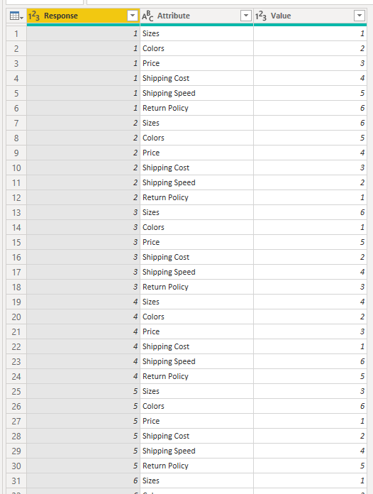
What I would do is add an Index column in Power Query just so you can identify each individual respondent's answers, then unpivot the columns containing the responses (scores) to give this (this isn't the entire table)
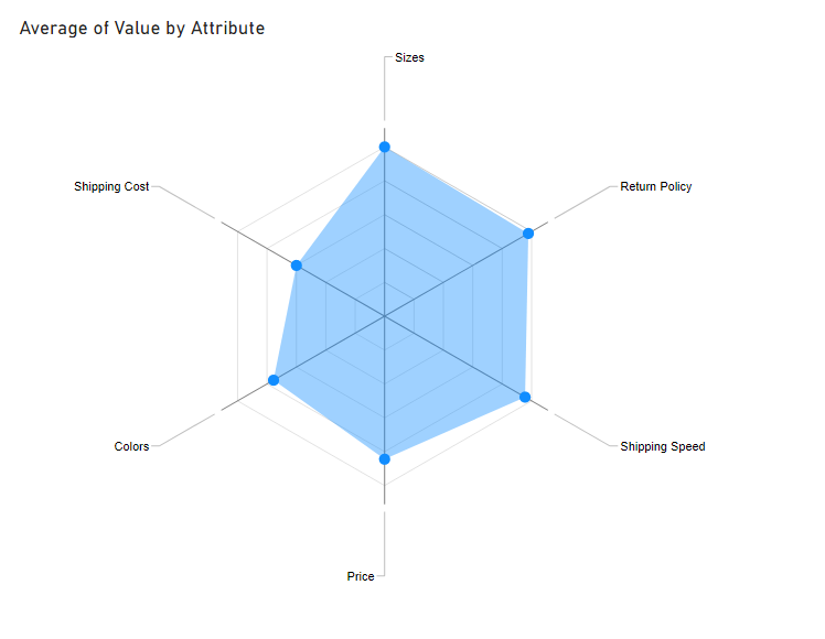
You can then use a radar chart (from Microsoft) Radar Chart (microsoft.com) to plot the average (or max, whatever you are interested in) of these responses for each attribute (Category). You could even plot the Avg, Max and Min all together. This plot just shows Avg.
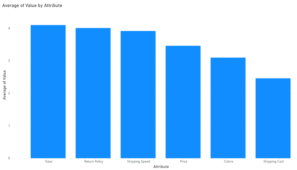
You could plot the same data using a Clustered Column (see Page2 of my file for this)
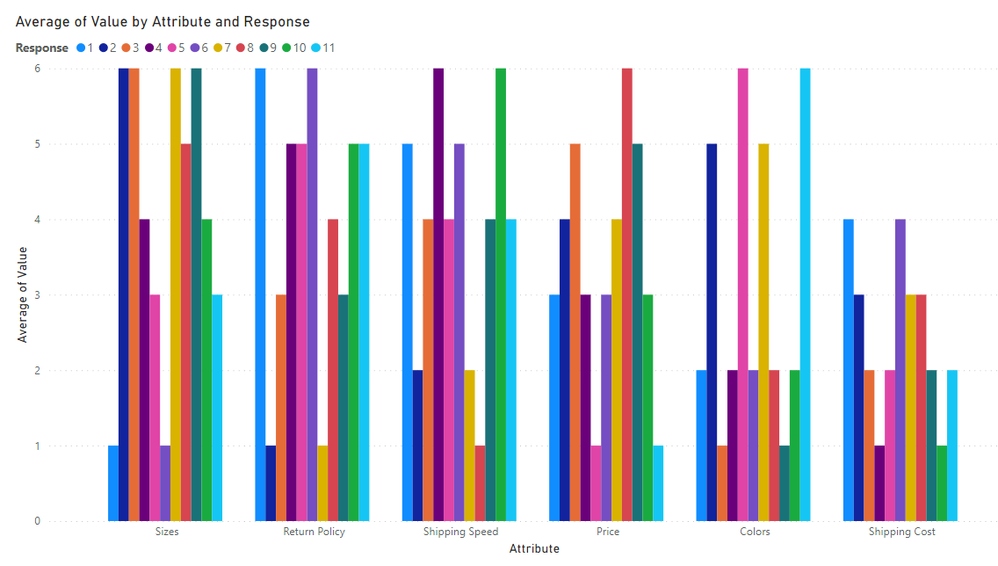
If you want to induce a headache you could add the Respondents to the Legend - you will need sunglasses to look at the default colors. You could manually change each color so they are easier on the eye but that'll be a lot of work if you have a lot of responses.
Regards
Phil
Did I answer your question? Then please mark my post as the solution.
If I helped you, click on the Thumbs Up to give Kudos.
Blog :: YouTube Channel :: Connect on Linkedin
Proud to be a Super User!
- Mark as New
- Bookmark
- Subscribe
- Mute
- Subscribe to RSS Feed
- Permalink
- Report Inappropriate Content
I think the radar chart is very helpful in my case. Thank you!
Helpful resources

Microsoft Fabric Learn Together
Covering the world! 9:00-10:30 AM Sydney, 4:00-5:30 PM CET (Paris/Berlin), 7:00-8:30 PM Mexico City

Power BI Monthly Update - April 2024
Check out the April 2024 Power BI update to learn about new features.

| User | Count |
|---|---|
| 100 | |
| 99 | |
| 80 | |
| 77 | |
| 66 |
| User | Count |
|---|---|
| 134 | |
| 108 | |
| 104 | |
| 83 | |
| 73 |


