- Power BI forums
- Updates
- News & Announcements
- Get Help with Power BI
- Desktop
- Service
- Report Server
- Power Query
- Mobile Apps
- Developer
- DAX Commands and Tips
- Custom Visuals Development Discussion
- Health and Life Sciences
- Power BI Spanish forums
- Translated Spanish Desktop
- Power Platform Integration - Better Together!
- Power Platform Integrations (Read-only)
- Power Platform and Dynamics 365 Integrations (Read-only)
- Training and Consulting
- Instructor Led Training
- Dashboard in a Day for Women, by Women
- Galleries
- Community Connections & How-To Videos
- COVID-19 Data Stories Gallery
- Themes Gallery
- Data Stories Gallery
- R Script Showcase
- Webinars and Video Gallery
- Quick Measures Gallery
- 2021 MSBizAppsSummit Gallery
- 2020 MSBizAppsSummit Gallery
- 2019 MSBizAppsSummit Gallery
- Events
- Ideas
- Custom Visuals Ideas
- Issues
- Issues
- Events
- Upcoming Events
- Community Blog
- Power BI Community Blog
- Custom Visuals Community Blog
- Community Support
- Community Accounts & Registration
- Using the Community
- Community Feedback
Register now to learn Fabric in free live sessions led by the best Microsoft experts. From Apr 16 to May 9, in English and Spanish.
- Power BI forums
- Forums
- Get Help with Power BI
- Desktop
- Using a measure in Y axis
- Subscribe to RSS Feed
- Mark Topic as New
- Mark Topic as Read
- Float this Topic for Current User
- Bookmark
- Subscribe
- Printer Friendly Page
- Mark as New
- Bookmark
- Subscribe
- Mute
- Subscribe to RSS Feed
- Permalink
- Report Inappropriate Content
Using a measure in Y axis
Hello everyone, I need some help.
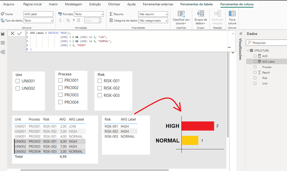
I have a database with a hierarchy of Units, Processes, and Risks. Each Risk can have a different Result outcome according to its hierarchy, and I classify it as LOW, NORMAL, and HIGH (measure "AVG Label") based on the filter defined by the user.
What I need is a chart (similar to the example in the image), showing distinct count risks and their classification, according to the selected filter. However, I'm not finding a way to create this chart.
Solved! Go to Solution.
- Mark as New
- Bookmark
- Subscribe
- Mute
- Subscribe to RSS Feed
- Permalink
- Report Inappropriate Content
Hi @Interact ,
Here some steps that I want to share, you can check them if they suitable for your requirement.
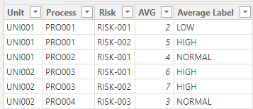
Here is my test data:
Create a measure
Average by Risk =
VAR _count =
CALCULATE(
    COUNT('Table'[Risk]),
    ALLEXCEPT(
        'Table',
        'Table'[Risk]
    )
)
VAR _sum =
CALCULATE(
    SUM('Table'[AVG]),
    ALLEXCEPT(
        'Table',
        'Table'[Risk]
    )
)
RETURN
_sum/_count
Create two columns
Average Label risk = SWITCH(TRUE(),
                    [Average by Risk]>0 && [Average by Risk]<=2, "LOW",
                    [Average by Risk]>2 && [Average by Risk]<=4, "NORMAL",
                    [Average by Risk]>4,"HIGH"
)
Count =
VAR _distinctcount =
CALCULATE(
DISTINCTCOUNT('Table'[Risk]),
FILTER(
'Table',
'Table'[Average Label risk] = EARLIER('Table'[Average Label risk])
)
)
VAR _count =
CALCULATE(
COUNT('Table'[Average Label risk]),
ALLEXCEPT(
'Table',
'Table'[Average Label risk]
)
)
RETURN
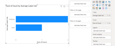
_distinctcount/_countFinal output
Because neither the x-axis nor the y-axis can be categorized in power bi using MEASURE as a value, but only COLUMN
Best regards,
Albert He
If this post helps, then please consider Accept it as the solution to help the other members find it more quickly
- Mark as New
- Bookmark
- Subscribe
- Mute
- Subscribe to RSS Feed
- Permalink
- Report Inappropriate Content
Create a Count measure - HighLowCount = Count(tablename[columnname]) and place on the same visual as the High Low measure.
- Mark as New
- Bookmark
- Subscribe
- Mute
- Subscribe to RSS Feed
- Permalink
- Report Inappropriate Content
Hello, thanks for your help!
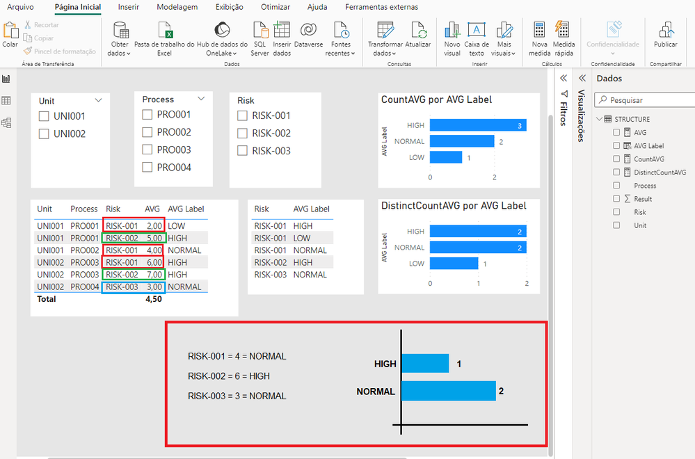
But there's one more point, in the chart I need to count each Risk only once, and its classification should be the average of its Results.
In the example, RISK-001 should be 4 = NORMAL ((2 + 4 + 6)/3 = 4).
Helpful resources

Microsoft Fabric Learn Together
Covering the world! 9:00-10:30 AM Sydney, 4:00-5:30 PM CET (Paris/Berlin), 7:00-8:30 PM Mexico City

Power BI Monthly Update - April 2024
Check out the April 2024 Power BI update to learn about new features.

| User | Count |
|---|---|
| 114 | |
| 104 | |
| 77 | |
| 67 | |
| 63 |
| User | Count |
|---|---|
| 144 | |
| 107 | |
| 105 | |
| 82 | |
| 69 |


