- Power BI forums
- Updates
- News & Announcements
- Get Help with Power BI
- Desktop
- Service
- Report Server
- Power Query
- Mobile Apps
- Developer
- DAX Commands and Tips
- Custom Visuals Development Discussion
- Health and Life Sciences
- Power BI Spanish forums
- Translated Spanish Desktop
- Power Platform Integration - Better Together!
- Power Platform Integrations (Read-only)
- Power Platform and Dynamics 365 Integrations (Read-only)
- Training and Consulting
- Instructor Led Training
- Dashboard in a Day for Women, by Women
- Galleries
- Community Connections & How-To Videos
- COVID-19 Data Stories Gallery
- Themes Gallery
- Data Stories Gallery
- R Script Showcase
- Webinars and Video Gallery
- Quick Measures Gallery
- 2021 MSBizAppsSummit Gallery
- 2020 MSBizAppsSummit Gallery
- 2019 MSBizAppsSummit Gallery
- Events
- Ideas
- Custom Visuals Ideas
- Issues
- Issues
- Events
- Upcoming Events
- Community Blog
- Power BI Community Blog
- Custom Visuals Community Blog
- Community Support
- Community Accounts & Registration
- Using the Community
- Community Feedback
Register now to learn Fabric in free live sessions led by the best Microsoft experts. From Apr 16 to May 9, in English and Spanish.
- Power BI forums
- Forums
- Get Help with Power BI
- Desktop
- Re: Total column to clustered chart
- Subscribe to RSS Feed
- Mark Topic as New
- Mark Topic as Read
- Float this Topic for Current User
- Bookmark
- Subscribe
- Printer Friendly Page
- Mark as New
- Bookmark
- Subscribe
- Mute
- Subscribe to RSS Feed
- Permalink
- Report Inappropriate Content
Total column to clustered chart
I am trying to create a column chart that contains the separate values for my series and one column that contains the total value of all my series summed together.
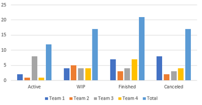
My data is a project table containing the project name, status and a team it belongs to. Now I want to create a column chart that counts the amount of projects per status per team, but at the same time also show a column with the total of all the projects for this status. It should look like this:
Does anybody know how to do this?
Thanks in advance!
Solved! Go to Solution.
- Mark as New
- Bookmark
- Subscribe
- Mute
- Subscribe to RSS Feed
- Permalink
- Report Inappropriate Content
Hi @MaxSchrijen23 ,
I think you are going to add a total column to the clustered column chart.
Here's my solution.
Sample data
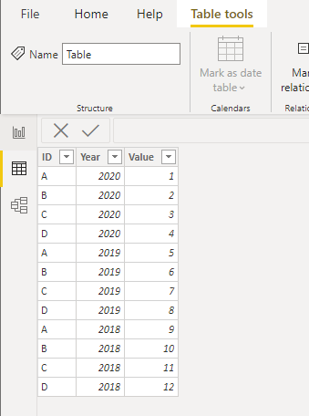
1.Create a table as follows(Enter data). If you have a lot of values and it is not convenient to enter them directly, please let me know.
There's no relationship.
2.Create a measure.
Measure =
IF (
    MAX ( 'Table (2)'[ID] ) = "Total",
    CALCULATE (
        SUM ( 'Table'[Value] ),
        FILTER ( ALLSELECTED ( 'Table' ), [Year] = MAX ( 'Table'[Year] ) )
    ),
    CALCULATE (
        SUM ( 'Table'[Value] ),
        FILTER ( 'Table', [ID] = MAX ( 'Table (2)'[ID] ) )
    )
)
3.Results.
Best Regards,
Stephen Tao
If this post helps, then please consider Accept it as the solution to help the other members find it more quickly.
- Mark as New
- Bookmark
- Subscribe
- Mute
- Subscribe to RSS Feed
- Permalink
- Report Inappropriate Content
Thanks for your answer, this helped!
- Mark as New
- Bookmark
- Subscribe
- Mute
- Subscribe to RSS Feed
- Permalink
- Report Inappropriate Content
You may need to use the Charticulator visual for this one, but should be doable (and free).
(15) Austin Power BI User Group - Charticulator 101 - YouTube
But even easier would be to use a line and clustered column chart (one of the native visuals) and put your measure also as the line values too.
Pat
Did I answer your question? Mark my post as a solution! Kudos are also appreciated!
To learn more about Power BI, follow me on Twitter or subscribe on YouTube.
@mahoneypa HoosierBI on YouTube
- Mark as New
- Bookmark
- Subscribe
- Mute
- Subscribe to RSS Feed
- Permalink
- Report Inappropriate Content
Hi @MaxSchrijen23 ,
I am not sure you can do that in Power BI. Please check.
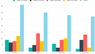
In case you fail to create it with the native power bi visuals, you can try custom visual that I am able to create with https://pbivizedit.com visual generation service. You can download pbix and custom visual file from the below link to verify if this satisfies you need:
https://pbivizedit.com/gallery/2255098
Given the data
| Team | Status | Count | Color (this is calculated Field based on team) |
| Team 1 | Active | 9 | #01b8aa |
| Team 1 | WIP | 3 | #01b8aa |
| Team 1 | Finished | 6 | #01b8aa |
| Team 1 | Canceled | 2 | #01b8aa |
| Team 2 | Active | 7 | #374649 |
...
with the above visual, I am able to generate following chart:
Thanks,
-R
Helpful resources

Microsoft Fabric Learn Together
Covering the world! 9:00-10:30 AM Sydney, 4:00-5:30 PM CET (Paris/Berlin), 7:00-8:30 PM Mexico City

Power BI Monthly Update - April 2024
Check out the April 2024 Power BI update to learn about new features.

| User | Count |
|---|---|
| 114 | |
| 105 | |
| 79 | |
| 68 | |
| 63 |
| User | Count |
|---|---|
| 148 | |
| 107 | |
| 106 | |
| 84 | |
| 70 |


