- Power BI forums
- Updates
- News & Announcements
- Get Help with Power BI
- Desktop
- Service
- Report Server
- Power Query
- Mobile Apps
- Developer
- DAX Commands and Tips
- Custom Visuals Development Discussion
- Health and Life Sciences
- Power BI Spanish forums
- Translated Spanish Desktop
- Power Platform Integration - Better Together!
- Power Platform Integrations (Read-only)
- Power Platform and Dynamics 365 Integrations (Read-only)
- Training and Consulting
- Instructor Led Training
- Dashboard in a Day for Women, by Women
- Galleries
- Community Connections & How-To Videos
- COVID-19 Data Stories Gallery
- Themes Gallery
- Data Stories Gallery
- R Script Showcase
- Webinars and Video Gallery
- Quick Measures Gallery
- 2021 MSBizAppsSummit Gallery
- 2020 MSBizAppsSummit Gallery
- 2019 MSBizAppsSummit Gallery
- Events
- Ideas
- Custom Visuals Ideas
- Issues
- Issues
- Events
- Upcoming Events
- Community Blog
- Power BI Community Blog
- Custom Visuals Community Blog
- Community Support
- Community Accounts & Registration
- Using the Community
- Community Feedback
Register now to learn Fabric in free live sessions led by the best Microsoft experts. From Apr 16 to May 9, in English and Spanish.
- Power BI forums
- Forums
- Get Help with Power BI
- Desktop
- Re: TopN + Others not working with Legend
- Subscribe to RSS Feed
- Mark Topic as New
- Mark Topic as Read
- Float this Topic for Current User
- Bookmark
- Subscribe
- Printer Friendly Page
- Mark as New
- Bookmark
- Subscribe
- Mute
- Subscribe to RSS Feed
- Permalink
- Report Inappropriate Content
TopN + Others not working with Legend
Hi,
The goal is to get a dynamic TopN of products based on the selection in TopN slicer.
All the products not in TopN, will be aggregated under ‘Others’. For that I created the table Pseudo Product, where I added the row ‘Others’. I took this as example:
https://goodly.co.in/top-n-and-others-power-bi/
Based on the selection in the Measure slicer, products must be aggregated on Amount or Quantity.
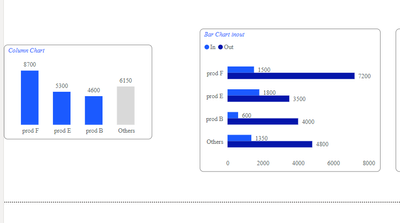
It all works fine for the Column Chart.
But if you look at the Bar Charts you see things going wrong. I presume it all has to do with adding the legend.
How can I fix this ? It would be nice if ‘Others’ in the Bar Charts can also be grey, but it is not mandatory.
I added Excel and pbix as attachment
Excel
Pbix
Thnx for the help
Ron
@MFelix
@lbendlin
Solved! Go to Solution.
- Mark as New
- Bookmark
- Subscribe
- Mute
- Subscribe to RSS Feed
- Permalink
- Report Inappropriate Content
Hi @PowerRon ,
I like your approach of separating the specific requirement in an own file and optimizing the solution there before integrating it in the production dataset. That's what I'm trying to teach my developers as well.
As long as performance is no issue you can keep the measure switching logic as it is and it will produce correct numbers. If you are planning to stack more calculations on top of these measures, like periods comparison, percentage of total etc., issues can add up, and if you already know of such requirements you might want to keep your model fast from the beginning.
I implemented the field parameters and calculation groups approach in your report and it showed some challenges:
- You cannot fully apply it to the visual level measure filter because you cannot use a field parameter to calculate a filter value (only to select the fields).
- You cannot use field parameters for custom sorting by the tooltip because as soon as you switch the measure (amount/quantity), the visual loses the sort configuration, because switching a field parameter behaves like removing the previous fields from the visual and adding the new ones. In this case the visual would also lose the sort settings on the removed field. So each time you switch the measure, sorting defaults to by sales.
You could overcome (1.) by moving the filter logic into the measures/calculation items that produce the values, sales and rank. You cannot completely overcome (2.) without changing the behavior of the report. But, nevertheless, the approach already showed its performance potential, even in your small dataset, and with room for improvement left: Calculation of top 5 was reduced from 700ms to 250ms on my machine (keeping the sort behavior functional!). So if performance becomes an issue, this would be an option.
You are welcome to ask if you need additional support, but I can't promise to respond immediately.
Kind regards,
Martin
- Mark as New
- Bookmark
- Subscribe
- Mute
- Subscribe to RSS Feed
- Permalink
- Report Inappropriate Content
hello ,
i check the file, and check the bar chart per in/out
the numbers seems valid .
like, it is showing the top n products, and segemented by in/out .
isnt that what you want ?
can you please point to the issue that you want tor resolve ?
best regards
- Mark as New
- Bookmark
- Subscribe
- Mute
- Subscribe to RSS Feed
- Permalink
- Report Inappropriate Content
Hi @Daniel29195 that was a lucky strike then.
Play around with the slicers and you will see that almost always it goes wrong.
- Mark as New
- Bookmark
- Subscribe
- Mute
- Subscribe to RSS Feed
- Permalink
- Report Inappropriate Content
Hi Ron,
I agree with @Daniel29195 that you didn't provide a clear definiton of your expectations, what is your definition of "wrong", and what is your definion of "right". So I'm just guessing aloud:
I assume you want to select top N products by total sales, not per split, e.g. not Top N Sales In, Top N Sales Out or Top N Sales Wholesale, Top N Sales Retail. Practically speaking, the top N selection of products should be as in the column chart, then for these products you want to show the splits.
If this is the case, then this must be a two step process: Selecting the products ignoring the split, not after the split, then for each selected product and others calculate the sales per split.
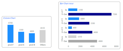
The attached solution puts a visual level filter on the bar charts to select top N products as in the column chart, then within the selected products + others the sales are calculated per split.
Important: If you want to add a product filter or slicer in this sample report or your production report, it must use fields from your product dimension table, not from the pseudo products table. The pseudo products table serves ONLY as a helper for visulaization putposes. (If you want to filter on the pseudo products table you can choose a different implementation, without visual level filter and more logic in the measures, but I'd decide for one table to be used in filters.) In you production solution, I'd also recommend to turn off cross-filtering/cross-highlighting if not properly implemented. This would require additional changes.
Regarding the colors, the only way to show others in grey in your charts with legend would be to change from legend to hierarchy as shown below.
Other recommended changes:
Your IF/SWITCH metric switch approach kills performance. In case your production report suffers from performance degradation you might want to switch to a field paramter and calculation item approach. This would also simplify the measure code.
I added dimensions Channel and Movement in order to prevent filtering directly on the fact table. You can also continue filtering the fact table until your report suffers from auto-exist problems as described here. That's why I prefer using dimension tables right away.
All measures are in the Key Measures table.
Kind regards,
Martin
- Mark as New
- Bookmark
- Subscribe
- Mute
- Subscribe to RSS Feed
- Permalink
- Report Inappropriate Content
HI @Martin_D
Thnx for you long answer. Let me try to answer it.
The column chart is just for testing purposes. The bar chart as shown by @Daniel29195 should be the end result. You already mentioned that correct: "the top N selection of products should be as in the column chart, then for these products you want to show the splits"
I understand the grey color is not possible with a legend. So be it.
Regarding the dimensions, I agree and that will be done in production. I am now testing with a self created Excel.
I shall replace the If/Switch with a field parameter. How the calculation item approach looks like, that's new for me/not much experience. Maybe you can explain?
The coming days I will work on this. Hope I can ask questions if necessary.
Thnx very much, I really appreciate it
Ron
- Mark as New
- Bookmark
- Subscribe
- Mute
- Subscribe to RSS Feed
- Permalink
- Report Inappropriate Content
Hi @PowerRon ,
I like your approach of separating the specific requirement in an own file and optimizing the solution there before integrating it in the production dataset. That's what I'm trying to teach my developers as well.
As long as performance is no issue you can keep the measure switching logic as it is and it will produce correct numbers. If you are planning to stack more calculations on top of these measures, like periods comparison, percentage of total etc., issues can add up, and if you already know of such requirements you might want to keep your model fast from the beginning.
I implemented the field parameters and calculation groups approach in your report and it showed some challenges:
- You cannot fully apply it to the visual level measure filter because you cannot use a field parameter to calculate a filter value (only to select the fields).
- You cannot use field parameters for custom sorting by the tooltip because as soon as you switch the measure (amount/quantity), the visual loses the sort configuration, because switching a field parameter behaves like removing the previous fields from the visual and adding the new ones. In this case the visual would also lose the sort settings on the removed field. So each time you switch the measure, sorting defaults to by sales.
You could overcome (1.) by moving the filter logic into the measures/calculation items that produce the values, sales and rank. You cannot completely overcome (2.) without changing the behavior of the report. But, nevertheless, the approach already showed its performance potential, even in your small dataset, and with room for improvement left: Calculation of top 5 was reduced from 700ms to 250ms on my machine (keeping the sort behavior functional!). So if performance becomes an issue, this would be an option.
You are welcome to ask if you need additional support, but I can't promise to respond immediately.
Kind regards,
Martin
- Mark as New
- Bookmark
- Subscribe
- Mute
- Subscribe to RSS Feed
- Permalink
- Report Inappropriate Content
Please see this video for another way to get dynamic TopN/Others functionality with the Deneb visual, instead of making model changes.
https://www.youtube.com/watch?v=-F_k284kO64&t=3s
Pat
- Mark as New
- Bookmark
- Subscribe
- Mute
- Subscribe to RSS Feed
- Permalink
- Report Inappropriate Content
Helpful resources

Microsoft Fabric Learn Together
Covering the world! 9:00-10:30 AM Sydney, 4:00-5:30 PM CET (Paris/Berlin), 7:00-8:30 PM Mexico City

Power BI Monthly Update - April 2024
Check out the April 2024 Power BI update to learn about new features.

| User | Count |
|---|---|
| 97 | |
| 96 | |
| 81 | |
| 74 | |
| 66 |
| User | Count |
|---|---|
| 129 | |
| 106 | |
| 106 | |
| 86 | |
| 72 |


