- Power BI forums
- Updates
- News & Announcements
- Get Help with Power BI
- Desktop
- Service
- Report Server
- Power Query
- Mobile Apps
- Developer
- DAX Commands and Tips
- Custom Visuals Development Discussion
- Health and Life Sciences
- Power BI Spanish forums
- Translated Spanish Desktop
- Power Platform Integration - Better Together!
- Power Platform Integrations (Read-only)
- Power Platform and Dynamics 365 Integrations (Read-only)
- Training and Consulting
- Instructor Led Training
- Dashboard in a Day for Women, by Women
- Galleries
- Community Connections & How-To Videos
- COVID-19 Data Stories Gallery
- Themes Gallery
- Data Stories Gallery
- R Script Showcase
- Webinars and Video Gallery
- Quick Measures Gallery
- 2021 MSBizAppsSummit Gallery
- 2020 MSBizAppsSummit Gallery
- 2019 MSBizAppsSummit Gallery
- Events
- Ideas
- Custom Visuals Ideas
- Issues
- Issues
- Events
- Upcoming Events
- Community Blog
- Power BI Community Blog
- Custom Visuals Community Blog
- Community Support
- Community Accounts & Registration
- Using the Community
- Community Feedback
Register now to learn Fabric in free live sessions led by the best Microsoft experts. From Apr 16 to May 9, in English and Spanish.
- Power BI forums
- Forums
- Get Help with Power BI
- Desktop
- Stacked Bar Chart with Duration
- Subscribe to RSS Feed
- Mark Topic as New
- Mark Topic as Read
- Float this Topic for Current User
- Bookmark
- Subscribe
- Printer Friendly Page
- Mark as New
- Bookmark
- Subscribe
- Mute
- Subscribe to RSS Feed
- Permalink
- Report Inappropriate Content
Stacked Bar Chart with Duration
Hi all,
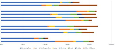
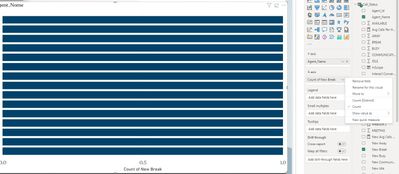
I am looking at creating a stacked bar graph in PBI for each agent using duration (similar to the excel screenshot below). However when I do add duration to the x-axis, count is my only display option.
What I am trying to recreate:
Excel:
Y-Axis = Agent Name, X-Axis = Status by duration.
PBI:
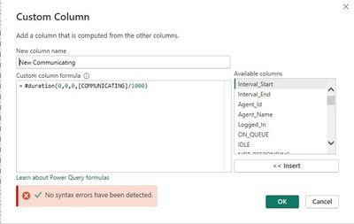
In the source data, I have converted each field from milliseconds to duration using the following custom column.
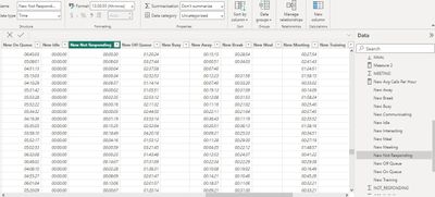
And ensured the format is in time format
What I am getting:
I'm assuming it's possible, but it's obviously not quite as simple as my brain would like.
Any help here would be amazing! Sorry, I'm unable to share data.
Thanks so much
Solved! Go to Solution.
- Mark as New
- Bookmark
- Subscribe
- Mute
- Subscribe to RSS Feed
- Permalink
- Report Inappropriate Content
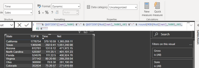
@Auski , Have time in second. Use new dynamic string format and give this format and use
""""& QUOTIENT([net],3600) &":" & QUOTIENT(Mod([net],3600),60) &":" & round(MOD(Mod([net],3600),60),0) &""""
Here net is measure in second I converted for format time
Microsoft Power BI Learning Resources, 2023 !!
Learn Power BI - Full Course with Dec-2022, with Window, Index, Offset, 100+ Topics !!
Did I answer your question? Mark my post as a solution! Appreciate your Kudos !! Proud to be a Super User! !!
- Mark as New
- Bookmark
- Subscribe
- Mute
- Subscribe to RSS Feed
- Permalink
- Report Inappropriate Content
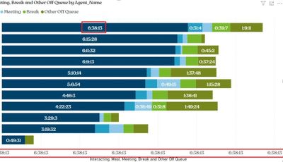
@amitchandak You my friend are a genius. Thank you very much for that. I doubt I would have even considered dynamic string format as a solution as it wasn't even activated in the settings.
So, this is undoubtably the solution as per screenshot below, however the x-axis doesn't like the format. Do you know if there is a work around here.... or do you think I might have done something wrong down the line?
Of course I can simply turn off the axis and get a satisfactory result, but might be helpful for anyone in future.
Thank you again!!
Helpful resources

Microsoft Fabric Learn Together
Covering the world! 9:00-10:30 AM Sydney, 4:00-5:30 PM CET (Paris/Berlin), 7:00-8:30 PM Mexico City

Power BI Monthly Update - April 2024
Check out the April 2024 Power BI update to learn about new features.

| User | Count |
|---|---|
| 99 | |
| 99 | |
| 80 | |
| 77 | |
| 66 |
| User | Count |
|---|---|
| 134 | |
| 106 | |
| 105 | |
| 86 | |
| 72 |
