- Power BI forums
- Updates
- News & Announcements
- Get Help with Power BI
- Desktop
- Service
- Report Server
- Power Query
- Mobile Apps
- Developer
- DAX Commands and Tips
- Custom Visuals Development Discussion
- Health and Life Sciences
- Power BI Spanish forums
- Translated Spanish Desktop
- Power Platform Integration - Better Together!
- Power Platform Integrations (Read-only)
- Power Platform and Dynamics 365 Integrations (Read-only)
- Training and Consulting
- Instructor Led Training
- Dashboard in a Day for Women, by Women
- Galleries
- Community Connections & How-To Videos
- COVID-19 Data Stories Gallery
- Themes Gallery
- Data Stories Gallery
- R Script Showcase
- Webinars and Video Gallery
- Quick Measures Gallery
- 2021 MSBizAppsSummit Gallery
- 2020 MSBizAppsSummit Gallery
- 2019 MSBizAppsSummit Gallery
- Events
- Ideas
- Custom Visuals Ideas
- Issues
- Issues
- Events
- Upcoming Events
- Community Blog
- Power BI Community Blog
- Custom Visuals Community Blog
- Community Support
- Community Accounts & Registration
- Using the Community
- Community Feedback
Register now to learn Fabric in free live sessions led by the best Microsoft experts. From Apr 16 to May 9, in English and Spanish.
- Power BI forums
- Forums
- Get Help with Power BI
- Desktop
- Split line(yaxis) in Line and Stacked column chart...
- Subscribe to RSS Feed
- Mark Topic as New
- Mark Topic as Read
- Float this Topic for Current User
- Bookmark
- Subscribe
- Printer Friendly Page
- Mark as New
- Bookmark
- Subscribe
- Mute
- Subscribe to RSS Feed
- Permalink
- Report Inappropriate Content
Split line(yaxis) in Line and Stacked column chart based on date(x axis) column
I have a Line and Stacked column chart constructed from a dataset which has four significant columns :- Commodity Price, Forecast Week and two other columns depicting different levels of Commodity Prices .Commodity price is a series having actual prices till certain date and forecast price after that date.
I have tried below approach to construct the Line and Stacked Column chart :-
X axis :- Forecast Week
Column Y axis :- columns with different levels for Commodity Prices.
Line Y axis :- Commodity Prices.
This has resulted in a Line and Stacked Column chart Representation with the line Y axis showing the whole Commodity Prices distribution.
I want to split the Line into two parts based on actual prices and forecast prices represented with separate styles.
Please help.
- Mark as New
- Bookmark
- Subscribe
- Mute
- Subscribe to RSS Feed
- Permalink
- Report Inappropriate Content
Thanks for your quick reply.
I was able to solve this.
The forecast prices were below the actual prices. For your example, the commodity price column has actual values till let's say nth row(till today) and the forecast prices from (n+1)th row till end of column. I just split the column into two columns(DAX based) : Actuals and Forecasts in line y axis included them using separate measures. The line got split into separate representations based on the measures. This is how I solved this.
- Mark as New
- Bookmark
- Subscribe
- Mute
- Subscribe to RSS Feed
- Permalink
- Report Inappropriate Content
Hi @ArghyaGanguly ,
According to your description, I made a sample and here is my solution.
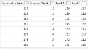
Sample data:
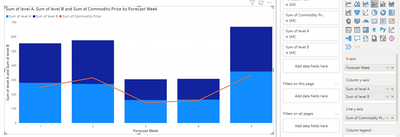
Put them into a Line and Stacked Column chart.
But, could you tell me how you want to split the Line into two parts based on actual prices and forecast prices represented with separate styles? Do you mean if actual prices is below the forecast prices, it will show a part and if is above, show another part? You can provide a expected output in order that we can help you further more.
Best Regards,
Community Support Team _ xiaosun
If this post helps, then please consider Accept it as the solution to help the other members find it more quickly.
Helpful resources

Microsoft Fabric Learn Together
Covering the world! 9:00-10:30 AM Sydney, 4:00-5:30 PM CET (Paris/Berlin), 7:00-8:30 PM Mexico City

Power BI Monthly Update - April 2024
Check out the April 2024 Power BI update to learn about new features.

| User | Count |
|---|---|
| 98 | |
| 95 | |
| 83 | |
| 70 | |
| 66 |
| User | Count |
|---|---|
| 118 | |
| 106 | |
| 93 | |
| 79 | |
| 72 |


