- Power BI forums
- Updates
- News & Announcements
- Get Help with Power BI
- Desktop
- Service
- Report Server
- Power Query
- Mobile Apps
- Developer
- DAX Commands and Tips
- Custom Visuals Development Discussion
- Health and Life Sciences
- Power BI Spanish forums
- Translated Spanish Desktop
- Power Platform Integration - Better Together!
- Power Platform Integrations (Read-only)
- Power Platform and Dynamics 365 Integrations (Read-only)
- Training and Consulting
- Instructor Led Training
- Dashboard in a Day for Women, by Women
- Galleries
- Community Connections & How-To Videos
- COVID-19 Data Stories Gallery
- Themes Gallery
- Data Stories Gallery
- R Script Showcase
- Webinars and Video Gallery
- Quick Measures Gallery
- 2021 MSBizAppsSummit Gallery
- 2020 MSBizAppsSummit Gallery
- 2019 MSBizAppsSummit Gallery
- Events
- Ideas
- Custom Visuals Ideas
- Issues
- Issues
- Events
- Upcoming Events
- Community Blog
- Power BI Community Blog
- Custom Visuals Community Blog
- Community Support
- Community Accounts & Registration
- Using the Community
- Community Feedback
Register now to learn Fabric in free live sessions led by the best Microsoft experts. From Apr 16 to May 9, in English and Spanish.
- Power BI forums
- Forums
- Get Help with Power BI
- Desktop
- Re: Small Multiple Text Cards in Power BI
- Subscribe to RSS Feed
- Mark Topic as New
- Mark Topic as Read
- Float this Topic for Current User
- Bookmark
- Subscribe
- Printer Friendly Page
- Mark as New
- Bookmark
- Subscribe
- Mute
- Subscribe to RSS Feed
- Permalink
- Report Inappropriate Content
Small Multiple Text Cards in Power BI
Hi All,
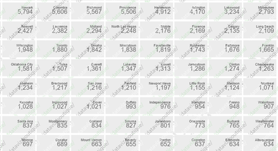
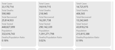
I need a verified power bi visual or a method I can use to get text stacked under one another for each category like this in power bi. Multi row card isn't an option because it isn't a verified visual.
Thanks in advance
- Mark as New
- Bookmark
- Subscribe
- Mute
- Subscribe to RSS Feed
- Permalink
- Report Inappropriate Content
Hi @ENGFAKAYODE
Please try this:
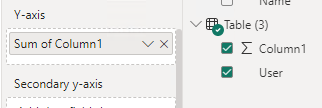
I create a set of sample and a line chart:
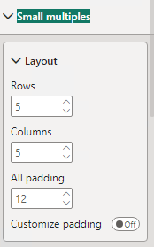
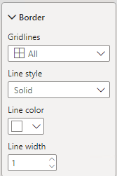
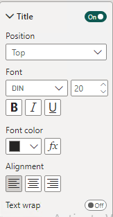
Then adjust the layout, Border and so on in small multiples:
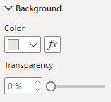
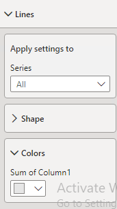
Make the color of the line same as the background:
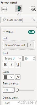
Then adjust the settings of Data labels
Then turn off all the other options.
The result is as follow:
Best Regards,
Zhengdong Xu
If this post helps, then please consider Accept it as the solution to help the other members find it more quickly.
- Mark as New
- Bookmark
- Subscribe
- Mute
- Subscribe to RSS Feed
- Permalink
- Report Inappropriate Content
I have tried this method already but I can add multiple texts stacked under one another like this
A string cant be added because the data label has to be aggregated
- Mark as New
- Bookmark
- Subscribe
- Mute
- Subscribe to RSS Feed
- Permalink
- Report Inappropriate Content
Hello @ENGFAKAYODE ,
multi-row card is from the main power bi visual, it comes with the software. its not a custom visual to be verified, it is in the power bi from the first release.
Proud to be a Super User! |  |
- Mark as New
- Bookmark
- Subscribe
- Mute
- Subscribe to RSS Feed
- Permalink
- Report Inappropriate Content
Good day ENGFAKAYODE,
The chart below is a small multiples line chart, in disguise. The multiple is "Country". Each small multiple contains a single point at co-ordinate (1,1). Each co-ordinate is taken from a column I added to the data. Each row in the column contains the value 1. I used the "Detail" section of the "Data Labels" formatting to add data - the data being the measure which returns the number you wish to display. The rest is formatting. I removed values and titles from the axes. I removed the title from the chart. I applied a light background to the small multiples and set the line colour to the same colour. I right-justified the small multiples titles and adjusted their size and colour. I adjusted the size and colour of the labels.
Hope this helps.
- Mark as New
- Bookmark
- Subscribe
- Mute
- Subscribe to RSS Feed
- Permalink
- Report Inappropriate Content
Wow
What visual did you use?
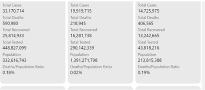
How can I stack multiple dimensions under each other like this below?
Helpful resources

Microsoft Fabric Learn Together
Covering the world! 9:00-10:30 AM Sydney, 4:00-5:30 PM CET (Paris/Berlin), 7:00-8:30 PM Mexico City

Power BI Monthly Update - April 2024
Check out the April 2024 Power BI update to learn about new features.

| User | Count |
|---|---|
| 106 | |
| 105 | |
| 79 | |
| 69 | |
| 62 |
| User | Count |
|---|---|
| 143 | |
| 104 | |
| 103 | |
| 82 | |
| 70 |
