- Power BI forums
- Updates
- News & Announcements
- Get Help with Power BI
- Desktop
- Service
- Report Server
- Power Query
- Mobile Apps
- Developer
- DAX Commands and Tips
- Custom Visuals Development Discussion
- Health and Life Sciences
- Power BI Spanish forums
- Translated Spanish Desktop
- Power Platform Integration - Better Together!
- Power Platform Integrations (Read-only)
- Power Platform and Dynamics 365 Integrations (Read-only)
- Training and Consulting
- Instructor Led Training
- Dashboard in a Day for Women, by Women
- Galleries
- Community Connections & How-To Videos
- COVID-19 Data Stories Gallery
- Themes Gallery
- Data Stories Gallery
- R Script Showcase
- Webinars and Video Gallery
- Quick Measures Gallery
- 2021 MSBizAppsSummit Gallery
- 2020 MSBizAppsSummit Gallery
- 2019 MSBizAppsSummit Gallery
- Events
- Ideas
- Custom Visuals Ideas
- Issues
- Issues
- Events
- Upcoming Events
- Community Blog
- Power BI Community Blog
- Custom Visuals Community Blog
- Community Support
- Community Accounts & Registration
- Using the Community
- Community Feedback
Register now to learn Fabric in free live sessions led by the best Microsoft experts. From Apr 16 to May 9, in English and Spanish.
- Power BI forums
- Forums
- Get Help with Power BI
- Desktop
- Shape Map Visual Question
- Subscribe to RSS Feed
- Mark Topic as New
- Mark Topic as Read
- Float this Topic for Current User
- Bookmark
- Subscribe
- Printer Friendly Page
- Mark as New
- Bookmark
- Subscribe
- Mute
- Subscribe to RSS Feed
- Permalink
- Report Inappropriate Content
Shape Map Visual Question
Hello,
I am trying to use a shape map to show the highest sales channel category by order quantity when the location is selected in a slicer. The other visuals I have on the page seem to be working correctly but the shape map is not making sense to me.
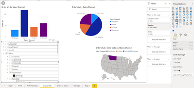
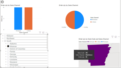
In the first image attached I have selected Billings, Montana which has an Online Order quantity of 118 Units making it the highest Sales Channel for that city. However when just the city is selected in the slicer the shape map shows the Distributor color and amount.
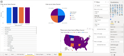
When nothing is selected it 'sort of' works. As shown in the second image Montana is the right color but there are other states/cities that are not.
I have tried creating a DAX formula for a MAXX column but have not had any luck as of yet.
Please let me know if you need any additional information from me.
Thank you in advance
- Mark as New
- Bookmark
- Subscribe
- Mute
- Subscribe to RSS Feed
- Permalink
- Report Inappropriate Content
@DGID So then how are the Region, State and Location related to the Sales table?
@ me in replies or I'll lose your thread!!!
Instead of a Kudo, please vote for this idea
Become an expert!: Enterprise DNA
External Tools: MSHGQM
YouTube Channel!: Microsoft Hates Greg
Latest book!: The Definitive Guide to Power Query (M)
DAX is easy, CALCULATE makes DAX hard...
- Mark as New
- Bookmark
- Subscribe
- Mute
- Subscribe to RSS Feed
- Permalink
- Report Inappropriate Content
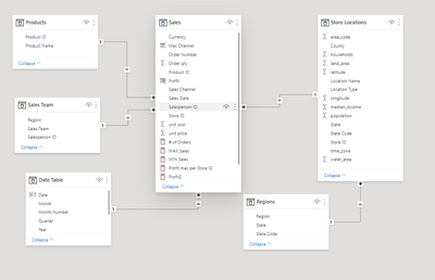
@Greg_Deckler I pulled the State and Location Name from the Store Locations Table. Region has it's own table. The connection to the Sales from the Store Location table is the Store ID and the Regions Table is connected to the Store Locations Table by State code.
Not sure if it is directly related but there was a region column in the Sales Team Table. I feel that it should be connected to the Regions table but it creates a many to many relationship. I was not sure what would be the best way to create a bridging table to handle that situation so I left it alone.
Below is a screenshot of my Model tab for reference.
- Mark as New
- Bookmark
- Subscribe
- Mute
- Subscribe to RSS Feed
- Permalink
- Report Inappropriate Content
@DGID So you don't have any states that have multiple sales channels?
@ me in replies or I'll lose your thread!!!
Instead of a Kudo, please vote for this idea
Become an expert!: Enterprise DNA
External Tools: MSHGQM
YouTube Channel!: Microsoft Hates Greg
Latest book!: The Definitive Guide to Power Query (M)
DAX is easy, CALCULATE makes DAX hard...
- Mark as New
- Bookmark
- Subscribe
- Mute
- Subscribe to RSS Feed
- Permalink
- Report Inappropriate Content
@Greg_Deckler from what I can see yes, the states for the most part have orders from each of the sales channels. There are very few that do not have at least one for each particular channel category.
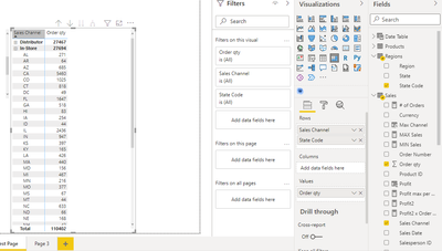
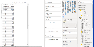
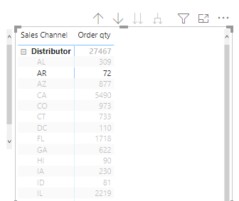
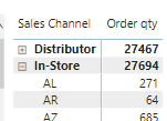
In the two screenshots below I have created a matrix with order qantity and sales channel by state code. The InStore channel and Online channel both share states.
- Mark as New
- Bookmark
- Subscribe
- Mute
- Subscribe to RSS Feed
- Permalink
- Report Inappropriate Content
@DGID So then what is the "right" color for a state??
@ me in replies or I'll lose your thread!!!
Instead of a Kudo, please vote for this idea
Become an expert!: Enterprise DNA
External Tools: MSHGQM
YouTube Channel!: Microsoft Hates Greg
Latest book!: The Definitive Guide to Power Query (M)
DAX is easy, CALCULATE makes DAX hard...
- Mark as New
- Bookmark
- Subscribe
- Mute
- Subscribe to RSS Feed
- Permalink
- Report Inappropriate Content
@Greg_Deckler I would like for it to show whichever channel has the highest orders for that state. The it seems that the states change colors when they themselves are selected in the splicer; not showing the max either but just the first out of the categories, I think.
- Mark as New
- Bookmark
- Subscribe
- Mute
- Subscribe to RSS Feed
- Permalink
- Report Inappropriate Content
@DGID Yeah, probably not really possible? Not really how that is designed to work.
@ me in replies or I'll lose your thread!!!
Instead of a Kudo, please vote for this idea
Become an expert!: Enterprise DNA
External Tools: MSHGQM
YouTube Channel!: Microsoft Hates Greg
Latest book!: The Definitive Guide to Power Query (M)
DAX is easy, CALCULATE makes DAX hard...
- Mark as New
- Bookmark
- Subscribe
- Mute
- Subscribe to RSS Feed
- Permalink
- Report Inappropriate Content
Ok @Greg_Deckler thank you for looking into this. I really wonder what is causing it to change color to begin with. For example the distibutor channel is not even represented in this state however when it's selected in the slicer it shows data?
Actually I went to my test matrix and saw that there were 72 orders in that same state for the distributor channel (compared to the much smaller amounts shown by the splicer) so I think somthing is wrong with my setup. Also the In-store amount is showing as 64 on the matrix?
- Mark as New
- Bookmark
- Subscribe
- Mute
- Subscribe to RSS Feed
- Permalink
- Report Inappropriate Content
@DGID Not sure this question can be answered with the information provided. The color is coming from the Legend field which is Sales Channel column or measure? Would have to understand the underlying data.
@ me in replies or I'll lose your thread!!!
Instead of a Kudo, please vote for this idea
Become an expert!: Enterprise DNA
External Tools: MSHGQM
YouTube Channel!: Microsoft Hates Greg
Latest book!: The Definitive Guide to Power Query (M)
DAX is easy, CALCULATE makes DAX hard...
- Mark as New
- Bookmark
- Subscribe
- Mute
- Subscribe to RSS Feed
- Permalink
- Report Inappropriate Content
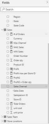
@Greg_Deckler Yes you are correct. The color is coming from the Legend field which is currently the Sales Channel, which is a column. I am still pretty new to Power BI so please let me know if you need more background information on the data.
Thank you
Helpful resources

Microsoft Fabric Learn Together
Covering the world! 9:00-10:30 AM Sydney, 4:00-5:30 PM CET (Paris/Berlin), 7:00-8:30 PM Mexico City

Power BI Monthly Update - April 2024
Check out the April 2024 Power BI update to learn about new features.

| User | Count |
|---|---|
| 109 | |
| 105 | |
| 88 | |
| 74 | |
| 67 |
| User | Count |
|---|---|
| 123 | |
| 112 | |
| 95 | |
| 83 | |
| 73 |
