- Power BI forums
- Updates
- News & Announcements
- Get Help with Power BI
- Desktop
- Service
- Report Server
- Power Query
- Mobile Apps
- Developer
- DAX Commands and Tips
- Custom Visuals Development Discussion
- Health and Life Sciences
- Power BI Spanish forums
- Translated Spanish Desktop
- Power Platform Integration - Better Together!
- Power Platform Integrations (Read-only)
- Power Platform and Dynamics 365 Integrations (Read-only)
- Training and Consulting
- Instructor Led Training
- Dashboard in a Day for Women, by Women
- Galleries
- Community Connections & How-To Videos
- COVID-19 Data Stories Gallery
- Themes Gallery
- Data Stories Gallery
- R Script Showcase
- Webinars and Video Gallery
- Quick Measures Gallery
- 2021 MSBizAppsSummit Gallery
- 2020 MSBizAppsSummit Gallery
- 2019 MSBizAppsSummit Gallery
- Events
- Ideas
- Custom Visuals Ideas
- Issues
- Issues
- Events
- Upcoming Events
- Community Blog
- Power BI Community Blog
- Custom Visuals Community Blog
- Community Support
- Community Accounts & Registration
- Using the Community
- Community Feedback
Register now to learn Fabric in free live sessions led by the best Microsoft experts. From Apr 16 to May 9, in English and Spanish.
- Power BI forums
- Forums
- Get Help with Power BI
- Desktop
- Re: Sept 2022 Update Issue - Hierarchical axis
- Subscribe to RSS Feed
- Mark Topic as New
- Mark Topic as Read
- Float this Topic for Current User
- Bookmark
- Subscribe
- Printer Friendly Page
- Mark as New
- Bookmark
- Subscribe
- Mute
- Subscribe to RSS Feed
- Permalink
- Report Inappropriate Content
Sept 2022 Update Issue - Hierarchical axis
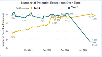
Since the Sept 2022 update I have issues with the X-axis of my line charts. Chart 1 shows what the chart looked like before the update. The chart is showing the results of testing conducted at multiple dates across the past year. It uses a legend which is the Test Summary. The data used in the chart is structured per the example in Table 1 (dummy data).
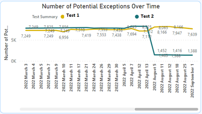
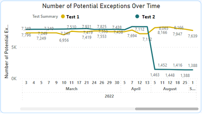
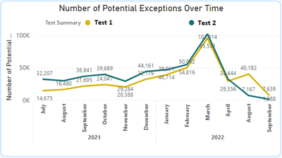
Since the Sept 2022 update, the chart instead looks like Chart 2 both in Power BI Desktop and the Service. I've tried turning on/off the "concatenate labels" option for the X-axis, adjusting drill down levels, etc. (see Charts 2 to 4) and I cannot recreate Chart 1. The chart appears as desired until I add the "Test Summary" field to the legend.
Is there any way I can recreate Chart 1 post Sept 2022 update? Is this a bug I can report somehow? Any help greatly appreciated, thank you!
Table 1 - Data Structure Example
Chart 1 - Prior to Sept 2022 Update:
Chart 2 - After Sept 2022 update (default behaviour - concatenate labels on)
Chart 3 - After Sept 2022 update (concatenate labels off)
Chart 4 - After Sept 2022 update (concatenate labels off, Month drill level)
Solved! Go to Solution.
- Mark as New
- Bookmark
- Subscribe
- Mute
- Subscribe to RSS Feed
- Permalink
- Report Inappropriate Content
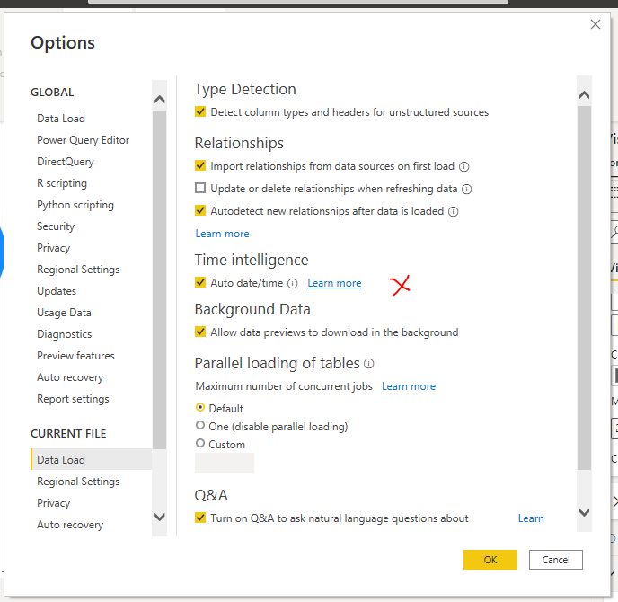
Oh, mabe in new version, the option does not exist. Try turn of "Auto to Date/Time" in Setting.
- Mark as New
- Bookmark
- Subscribe
- Mute
- Subscribe to RSS Feed
- Permalink
- Report Inappropriate Content
Hi
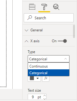
Try to select "Continous" in Type of X axis
- Mark as New
- Bookmark
- Subscribe
- Mute
- Subscribe to RSS Feed
- Permalink
- Report Inappropriate Content
Thanks for the reply. Unfortunately once I add in the "Test Summary" column into the Legend, the X-axis formatting options change from Continuous/Categorical to the below options:
- Mark as New
- Bookmark
- Subscribe
- Mute
- Subscribe to RSS Feed
- Permalink
- Report Inappropriate Content
Oh, mabe in new version, the option does not exist. Try turn of "Auto to Date/Time" in Setting.
- Mark as New
- Bookmark
- Subscribe
- Mute
- Subscribe to RSS Feed
- Permalink
- Report Inappropriate Content
Yes! Turning off "Auto date/time" seems to have worked. Thank you very much 🙂
Helpful resources

Microsoft Fabric Learn Together
Covering the world! 9:00-10:30 AM Sydney, 4:00-5:30 PM CET (Paris/Berlin), 7:00-8:30 PM Mexico City

Power BI Monthly Update - April 2024
Check out the April 2024 Power BI update to learn about new features.

| User | Count |
|---|---|
| 104 | |
| 95 | |
| 80 | |
| 67 | |
| 62 |
| User | Count |
|---|---|
| 147 | |
| 109 | |
| 107 | |
| 85 | |
| 63 |

