- Power BI forums
- Updates
- News & Announcements
- Get Help with Power BI
- Desktop
- Service
- Report Server
- Power Query
- Mobile Apps
- Developer
- DAX Commands and Tips
- Custom Visuals Development Discussion
- Health and Life Sciences
- Power BI Spanish forums
- Translated Spanish Desktop
- Power Platform Integration - Better Together!
- Power Platform Integrations (Read-only)
- Power Platform and Dynamics 365 Integrations (Read-only)
- Training and Consulting
- Instructor Led Training
- Dashboard in a Day for Women, by Women
- Galleries
- Community Connections & How-To Videos
- COVID-19 Data Stories Gallery
- Themes Gallery
- Data Stories Gallery
- R Script Showcase
- Webinars and Video Gallery
- Quick Measures Gallery
- 2021 MSBizAppsSummit Gallery
- 2020 MSBizAppsSummit Gallery
- 2019 MSBizAppsSummit Gallery
- Events
- Ideas
- Custom Visuals Ideas
- Issues
- Issues
- Events
- Upcoming Events
- Community Blog
- Power BI Community Blog
- Custom Visuals Community Blog
- Community Support
- Community Accounts & Registration
- Using the Community
- Community Feedback
Earn a 50% discount on the DP-600 certification exam by completing the Fabric 30 Days to Learn It challenge.
- Power BI forums
- Forums
- Get Help with Power BI
- Desktop
- Scale y axis based on legend selection
- Subscribe to RSS Feed
- Mark Topic as New
- Mark Topic as Read
- Float this Topic for Current User
- Bookmark
- Subscribe
- Printer Friendly Page
- Mark as New
- Bookmark
- Subscribe
- Mute
- Subscribe to RSS Feed
- Permalink
- Report Inappropriate Content
Scale y axis based on legend selection
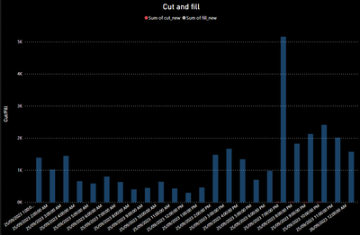
I have the following bar chart setup in PowerBI. Sum of cut is generally but not always much smaller than sum of fill. I'd like to be able to display them together but I'd also like the y axis to scale appropriately when I select just sum of cut in the legend. Is there a way to achieve this? Currently when I select sum of cut I get the below screenshot, sum of fill is greyed out but still present. Doesn't neccesarily have to be through the legend, I would be happy to have a slicer I am just not sure how to setup a slicer to pick variables to display.
Solved! Go to Solution.
- Mark as New
- Bookmark
- Subscribe
- Mute
- Subscribe to RSS Feed
- Permalink
- Report Inappropriate Content
Hi @ICTJZT
You can use field parameters to achieve the goal ( with a slicer not from legend) if the values are 2 different measures.
Please refer to the linked tutorial:
https://www.youtube.com/watch?v=V6WchPDZibI
if it is split by category that you put on legend, just create a simple slicer with these categories as a field.
If this post helps, then please consider Accepting it as the solution to help the other members find it more quickly.
Helpful resources
| User | Count |
|---|---|
| 93 | |
| 83 | |
| 77 | |
| 73 | |
| 66 |
| User | Count |
|---|---|
| 115 | |
| 104 | |
| 93 | |
| 64 | |
| 61 |


