- Power BI forums
- Updates
- News & Announcements
- Get Help with Power BI
- Desktop
- Service
- Report Server
- Power Query
- Mobile Apps
- Developer
- DAX Commands and Tips
- Custom Visuals Development Discussion
- Health and Life Sciences
- Power BI Spanish forums
- Translated Spanish Desktop
- Power Platform Integration - Better Together!
- Power Platform Integrations (Read-only)
- Power Platform and Dynamics 365 Integrations (Read-only)
- Training and Consulting
- Instructor Led Training
- Dashboard in a Day for Women, by Women
- Galleries
- Community Connections & How-To Videos
- COVID-19 Data Stories Gallery
- Themes Gallery
- Data Stories Gallery
- R Script Showcase
- Webinars and Video Gallery
- Quick Measures Gallery
- 2021 MSBizAppsSummit Gallery
- 2020 MSBizAppsSummit Gallery
- 2019 MSBizAppsSummit Gallery
- Events
- Ideas
- Custom Visuals Ideas
- Issues
- Issues
- Events
- Upcoming Events
- Community Blog
- Power BI Community Blog
- Custom Visuals Community Blog
- Community Support
- Community Accounts & Registration
- Using the Community
- Community Feedback
Earn a 50% discount on the DP-600 certification exam by completing the Fabric 30 Days to Learn It challenge.
- Power BI forums
- Forums
- Get Help with Power BI
- Desktop
- SORTING, DISPLAY CLUSTERED BAR CHART
- Subscribe to RSS Feed
- Mark Topic as New
- Mark Topic as Read
- Float this Topic for Current User
- Bookmark
- Subscribe
- Printer Friendly Page
- Mark as New
- Bookmark
- Subscribe
- Mute
- Subscribe to RSS Feed
- Permalink
- Report Inappropriate Content
SORTING, DISPLAY CLUSTERED BAR CHART
Hi,
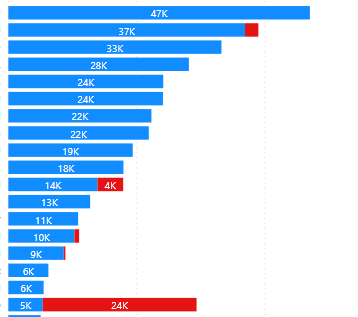
i have below clustered bar chart. I have few questions:
1.How can i sort it based on Total of blue + red value ? Right now i can only sort either blue or red value
2. How can i show percentage of blue over total for each bar? example 1st bar : 100%....
3. How can the graph only show the top bar that contribute up to 80% of total value ?
thanks,
Solved! Go to Solution.
- Mark as New
- Bookmark
- Subscribe
- Mute
- Subscribe to RSS Feed
- Permalink
- Report Inappropriate Content
please see the attachment below.
Did I answer your question? Mark my post as a solution!
Proud to be a Super User!
- Mark as New
- Bookmark
- Subscribe
- Mute
- Subscribe to RSS Feed
- Permalink
- Report Inappropriate Content
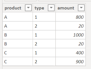
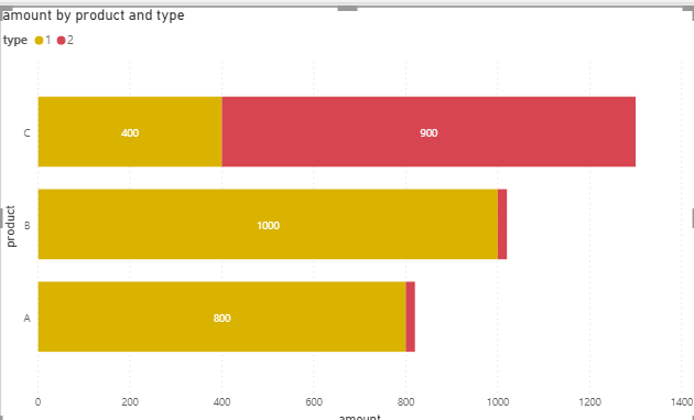
since you don't provide the sample data , I created some simple data.
1. did you create a measure to calculate the value? what's your measure? it should sort by total by default
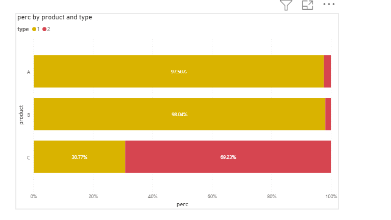
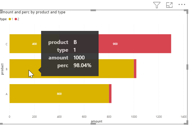
2.you can create a measure
perc = sum('Table (3)'[amount])/CALCULATE(SUM('Table (3)'[amount]),ALLEXCEPT('Table (3)','Table (3)'[product]))
or add that measure to tooltips
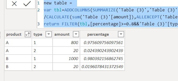
3. I think the workaround is to create a new table
new table =
var tbl=ADDCOLUMNS(SUMMARIZE('Table (3)','Table (3)'[product],'Table (3)'[type],"amount",sum('Table (3)'[amount])),"percentage",[amount]/CALCULATE(sum('Table (3)'[amount]),ALLEXCEPT('Table (3)','Table (3)'[product])))
return FILTER(tbl,[percentage]>=0.8&&'Table (3)'[type]="1" || [percentage]<0.2 && 'Table (3)'[type]="2")
Did I answer your question? Mark my post as a solution!
Proud to be a Super User!
- Mark as New
- Bookmark
- Subscribe
- Mute
- Subscribe to RSS Feed
- Permalink
- Report Inappropriate Content
thank you a lot.
Link to example file : https://1drv.ms/x/s!ApIDnMK2eKiFgRkOMv8RFE4QmD25?e=xcTQa9
Page 1: How to sort by total. Example 2019, Apple should be above Orange
How to create tooltip to show : Orange, Asia 40, 62% ( percentage of Asia in Orange type only)
PAge 2: How to create tooltip to show : China, Qty 74, 55.6 % ( percentage of China over 2019 total)
thanks
- Mark as New
- Bookmark
- Subscribe
- Mute
- Subscribe to RSS Feed
- Permalink
- Report Inappropriate Content
please see the attachment below.
Did I answer your question? Mark my post as a solution!
Proud to be a Super User!
Helpful resources
| User | Count |
|---|---|
| 102 | |
| 91 | |
| 87 | |
| 79 | |
| 71 |
| User | Count |
|---|---|
| 113 | |
| 105 | |
| 101 | |
| 75 | |
| 64 |
