- Power BI forums
- Updates
- News & Announcements
- Get Help with Power BI
- Desktop
- Service
- Report Server
- Power Query
- Mobile Apps
- Developer
- DAX Commands and Tips
- Custom Visuals Development Discussion
- Health and Life Sciences
- Power BI Spanish forums
- Translated Spanish Desktop
- Power Platform Integration - Better Together!
- Power Platform Integrations (Read-only)
- Power Platform and Dynamics 365 Integrations (Read-only)
- Training and Consulting
- Instructor Led Training
- Dashboard in a Day for Women, by Women
- Galleries
- Community Connections & How-To Videos
- COVID-19 Data Stories Gallery
- Themes Gallery
- Data Stories Gallery
- R Script Showcase
- Webinars and Video Gallery
- Quick Measures Gallery
- 2021 MSBizAppsSummit Gallery
- 2020 MSBizAppsSummit Gallery
- 2019 MSBizAppsSummit Gallery
- Events
- Ideas
- Custom Visuals Ideas
- Issues
- Issues
- Events
- Upcoming Events
- Community Blog
- Power BI Community Blog
- Custom Visuals Community Blog
- Community Support
- Community Accounts & Registration
- Using the Community
- Community Feedback
Register now to learn Fabric in free live sessions led by the best Microsoft experts. From Apr 16 to May 9, in English and Spanish.
- Power BI forums
- Forums
- Get Help with Power BI
- Desktop
- Regarding Line chart help !
- Subscribe to RSS Feed
- Mark Topic as New
- Mark Topic as Read
- Float this Topic for Current User
- Bookmark
- Subscribe
- Printer Friendly Page
- Mark as New
- Bookmark
- Subscribe
- Mute
- Subscribe to RSS Feed
- Permalink
- Report Inappropriate Content
Regarding Line chart help !
i have two columns,
deptno start date
10 31/01/2018 06:38:43
20 1/01/2018 06:38:43
10 2/01/2018 06:38:43
20 3/01/2018 06:38:43
20 1/01/2018 06:38:43
10 1/01/2018 06:38:43
30 3/01/2018 06:38:43
30 2/01/2018 06:38:43
30 2/01/2018 06:38:43
i want to draw a line chart.
the x-axis columns should be start date
y-axis coulmns should be dept-no
when i draw line chart,
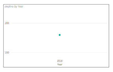
on x-axis i am not able to see date and time,it is displaying only year.
on y axis it is showing sum of dept count.
here is the screenshot
could you please help me how to avoid this. instead of sum just it should show dept no based on date and time.
Thanks in advance
Solved! Go to Solution.
- Mark as New
- Bookmark
- Subscribe
- Mute
- Subscribe to RSS Feed
- Permalink
- Report Inappropriate Content
Hi @Anonymous ,
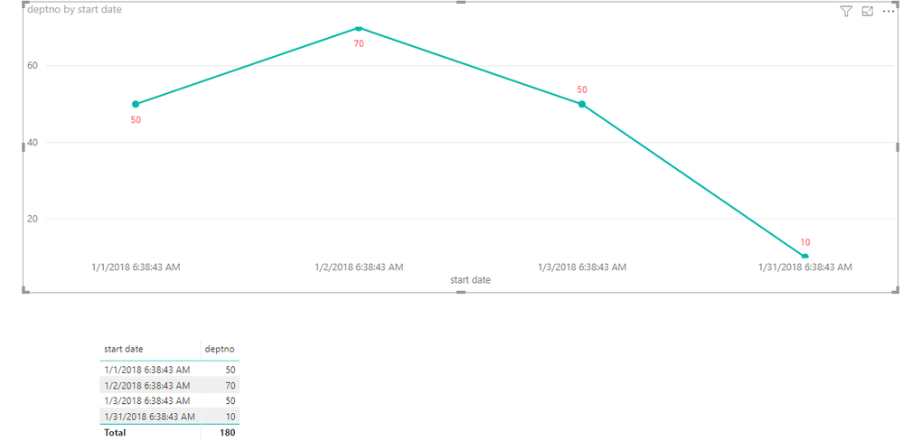
Do you want to create the line chart like below with your data?
If it is, please note the setting below.
1. Use StartDate not Date Hierarchy in Axis field.
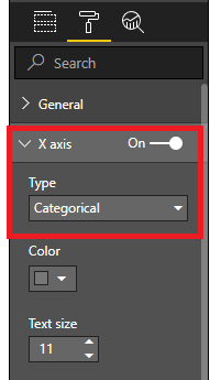
2. Set the X axis like this.
3. Show data lable and set Shape.
More details, please refer to my attachment.
Best Regards,
Cherry
If this post helps, then please consider Accept it as the solution to help the other members find it more quickly.
- Mark as New
- Bookmark
- Subscribe
- Mute
- Subscribe to RSS Feed
- Permalink
- Report Inappropriate Content
Hi @Anonymous ,
Have you solved your problem?
If you have solved, please accept the replies making sense as solution to your question so that people who may have the same question can get the solution directly.
If you still need help, please feel free to ask.
Best Regards,
Cherry
If this post helps, then please consider Accept it as the solution to help the other members find it more quickly.
- Mark as New
- Bookmark
- Subscribe
- Mute
- Subscribe to RSS Feed
- Permalink
- Report Inappropriate Content
Hi @Anonymous ,
Do you want to create the line chart like below with your data?
If it is, please note the setting below.
1. Use StartDate not Date Hierarchy in Axis field.
2. Set the X axis like this.
3. Show data lable and set Shape.
More details, please refer to my attachment.
Best Regards,
Cherry
If this post helps, then please consider Accept it as the solution to help the other members find it more quickly.
Helpful resources

Microsoft Fabric Learn Together
Covering the world! 9:00-10:30 AM Sydney, 4:00-5:30 PM CET (Paris/Berlin), 7:00-8:30 PM Mexico City

Power BI Monthly Update - April 2024
Check out the April 2024 Power BI update to learn about new features.

| User | Count |
|---|---|
| 97 | |
| 96 | |
| 82 | |
| 74 | |
| 66 |
| User | Count |
|---|---|
| 126 | |
| 105 | |
| 103 | |
| 81 | |
| 72 |


