- Power BI forums
- Updates
- News & Announcements
- Get Help with Power BI
- Desktop
- Service
- Report Server
- Power Query
- Mobile Apps
- Developer
- DAX Commands and Tips
- Custom Visuals Development Discussion
- Health and Life Sciences
- Power BI Spanish forums
- Translated Spanish Desktop
- Power Platform Integration - Better Together!
- Power Platform Integrations (Read-only)
- Power Platform and Dynamics 365 Integrations (Read-only)
- Training and Consulting
- Instructor Led Training
- Dashboard in a Day for Women, by Women
- Galleries
- Community Connections & How-To Videos
- COVID-19 Data Stories Gallery
- Themes Gallery
- Data Stories Gallery
- R Script Showcase
- Webinars and Video Gallery
- Quick Measures Gallery
- 2021 MSBizAppsSummit Gallery
- 2020 MSBizAppsSummit Gallery
- 2019 MSBizAppsSummit Gallery
- Events
- Ideas
- Custom Visuals Ideas
- Issues
- Issues
- Events
- Upcoming Events
- Community Blog
- Power BI Community Blog
- Custom Visuals Community Blog
- Community Support
- Community Accounts & Registration
- Using the Community
- Community Feedback
Register now to learn Fabric in free live sessions led by the best Microsoft experts. From Apr 16 to May 9, in English and Spanish.
- Power BI forums
- Forums
- Get Help with Power BI
- Desktop
- Adding new column into dashboard table
- Subscribe to RSS Feed
- Mark Topic as New
- Mark Topic as Read
- Float this Topic for Current User
- Bookmark
- Subscribe
- Printer Friendly Page
- Mark as New
- Bookmark
- Subscribe
- Mute
- Subscribe to RSS Feed
- Permalink
- Report Inappropriate Content
Adding new column into dashboard table
Hi,
I tried going through the forum to see if my question has been asked before and can't quite find what I am looking for.
I'm looking to include a variance $ and variance % column into the table below:
For the financials each month, I want to see the Actual and Forecast data next to each other to see how things are tracking moving forward (as above).
I also want to see for each month the Variance $ amount and Variance % between the actuals and forecasts for that particular amount. The image above shows where I would like these variance columns to be included - at the end of the monthly columns (where the red arrow is pointing down).
My source data looks something like this (the period is referencing the specific month of the year e.g. 2019007 = Jan 2019):
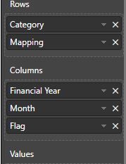
Table has been created like this:
(^Values = Local Amount)
What would be the best way to do this?
Thank you to anyone who can help!
- Mark as New
- Bookmark
- Subscribe
- Mute
- Subscribe to RSS Feed
- Permalink
- Report Inappropriate Content
Hi @Anonymous ,
It seems that you create a matrix visual.
I have a little confused about your requirement.
Do you have problems for calculating the variance $ and variance % column? Or you have problems for that you don't know how to get your desired output?
If it is convenient, please share a dummy pbix file which can reproduce the scenario and your desired output, so that we can help further investigate on it? You can upload it to OneDrive and post the link here. Do mask sensitive data before uploading.
Best Regards,
Cherry
If this post helps, then please consider Accept it as the solution to help the other members find it more quickly.
- Mark as New
- Bookmark
- Subscribe
- Mute
- Subscribe to RSS Feed
- Permalink
- Report Inappropriate Content
Hi Cherry (@v-piga-msft),
Below is a link to the dummy Power Bi file. Let me know if this works for you.
https://1drv.ms/u/s!AkPFTWzzwXBzhIpsEdXvOymtHgNoOw
I'm ok with creating the variance $/% measures (I think), but I'm just unsure how to add these into my table to get the visual I want.
I would like the data in the table to sit as follows for each month:
Month 1
Actual | Forecast | Variance $ | Variance %
Please let me know what might be the best way to do this.
Thank you very much for your help!
Cheers,
Aleksa
- Mark as New
- Bookmark
- Subscribe
- Mute
- Subscribe to RSS Feed
- Permalink
- Report Inappropriate Content
Hi @Anonymous ,
Really sorry for the delay.
It seems that the file you shared has expired. If it is convenient, could you share it again and I will check it as soon as possible.
Best Regards,
Cherry
If this post helps, then please consider Accept it as the solution to help the other members find it more quickly.
Helpful resources

Microsoft Fabric Learn Together
Covering the world! 9:00-10:30 AM Sydney, 4:00-5:30 PM CET (Paris/Berlin), 7:00-8:30 PM Mexico City

Power BI Monthly Update - April 2024
Check out the April 2024 Power BI update to learn about new features.

| User | Count |
|---|---|
| 112 | |
| 100 | |
| 80 | |
| 64 | |
| 57 |
| User | Count |
|---|---|
| 146 | |
| 110 | |
| 93 | |
| 84 | |
| 67 |


