- Power BI forums
- Updates
- News & Announcements
- Get Help with Power BI
- Desktop
- Service
- Report Server
- Power Query
- Mobile Apps
- Developer
- DAX Commands and Tips
- Custom Visuals Development Discussion
- Health and Life Sciences
- Power BI Spanish forums
- Translated Spanish Desktop
- Power Platform Integration - Better Together!
- Power Platform Integrations (Read-only)
- Power Platform and Dynamics 365 Integrations (Read-only)
- Training and Consulting
- Instructor Led Training
- Dashboard in a Day for Women, by Women
- Galleries
- Community Connections & How-To Videos
- COVID-19 Data Stories Gallery
- Themes Gallery
- Data Stories Gallery
- R Script Showcase
- Webinars and Video Gallery
- Quick Measures Gallery
- 2021 MSBizAppsSummit Gallery
- 2020 MSBizAppsSummit Gallery
- 2019 MSBizAppsSummit Gallery
- Events
- Ideas
- Custom Visuals Ideas
- Issues
- Issues
- Events
- Upcoming Events
- Community Blog
- Power BI Community Blog
- Custom Visuals Community Blog
- Community Support
- Community Accounts & Registration
- Using the Community
- Community Feedback
Register now to learn Fabric in free live sessions led by the best Microsoft experts. From Apr 16 to May 9, in English and Spanish.
- Power BI forums
- Forums
- Get Help with Power BI
- Desktop
- Question regarding conditional formatting in Line ...
- Subscribe to RSS Feed
- Mark Topic as New
- Mark Topic as Read
- Float this Topic for Current User
- Bookmark
- Subscribe
- Printer Friendly Page
- Mark as New
- Bookmark
- Subscribe
- Mute
- Subscribe to RSS Feed
- Permalink
- Report Inappropriate Content
Question regarding conditional formatting in Line clustered coloumn chart.
I have 2 different tables,
Table 1, with weight of the scrap in each month ,
Table 2, with total tonnage and target of each month.
For example, if my scrap total weight on Jan is X and tonnage of Jan is Y, then X/Y= Z%,
i would like to highlight the Z% value in Red if it is greater than Monthly Target else Green.
Table1
| Weight of Scrap in Kg | Week Num | Ref Month |
| 108.2 | 1 | 1 |
| 92 | 1 | 1 |
| 16.1 | 1 | 1 |
| 36.3 | 1 | 1 |
| 89.6 | 1 | 1 |
| 110 | 1 | 1 |
| 42.2 | 1 | 1 |
| 49.2 | 1 | 1 |
| 421.4 | 1 | 1 |
| 6.2 | 1 | 1 |
| 8 | 1 | 1 |
| 90.4 | 1 | 1 |
| 43 | 2 | 1 |
| 100.6 | 2 | 1 |
| 322.4 | 2 | 1 |
| 110 | 2 | 1 |
| 63.9 | 2 | 1 |
| 466.9 | 3 | 1 |
| 22.3 | 3 | 1 |
| 27.6 | 3 | 1 |
| 422 | 3 | 1 |
| 13.6 | 3 | 1 |
| 26.4 | 3 | 1 |
| 2.6 | 3 | 1 |
| 7 | 3 | 1 |
| 4.8 | 3 | 1 |
| 6.6 | 3 | 1 |
| 92.6 | 3 | 1 |
| 33.2 | 3 | 1 |
| 28 | 3 | 1 |
| 38.8 | 3 | 1 |
| 44.4 | 3 | 1 |
| 83.1 | 3 | 1 |
| 14.2 | 3 | 1 |
| 21.7 | 3 | 1 |
| 12 | 3 | 1 |
| 12 | 3 | 1 |
| 10.6 | 3 | 1 |
| 113.2 | 3 | 1 |
| 18.2 | 3 | 1 |
| 68.2 | 3 | 1 |
| 210 | 3 | 1 |
| 111 | 3 | 1 |
| 262.2 | 4 | 1 |
| 10 | 4 | 1 |
| 200 | 4 | 1 |
| 112.8 | 4 | 1 |
| 28.2 | 4 | 1 |
| 55 | 4 | 1 |
| 97.8 | 4 | 1 |
| 108 | 4 | 1 |
| 208 | 4 | 1 |
| 85.2 | 4 | 1 |
| 40 | 4 | 1 |
| 24 | 4 | 1 |
| 14 | 4 | 1 |
| 11.8 | 4 | 1 |
| 2.2 | 4 | 1 |
| 103 | 4 | 1 |
Table 2
| Month | Tonnage in Kg | YEAR | Target |
| 1 | 1373535 | 2021 | 0.32% |
| 2 | 1727260 | 2021 | 0.35% |
| 3 | 2078505 | 2021 | 0.34% |
| 4 | 2205560 | 2021 | 0.31% |
| 5 | 1436035 | 2021 | 0.36% |
| 6 | 1637310 | 2021 | 0.34% |
| 7 | 1768720 | 2021 | 0.33% |
| 8 | 1912140 | 2021 | 0.33% |
| 9 | 1912000 | 2021 | 0.35% |
| 10 | 2021 | 0.34% | |
| 11 | 2021 | 0.39% | |
| 12 | 2021 | 0.33% |
Solved! Go to Solution.
- Mark as New
- Bookmark
- Subscribe
- Mute
- Subscribe to RSS Feed
- Permalink
- Report Inappropriate Content
Hi, @Anonymous
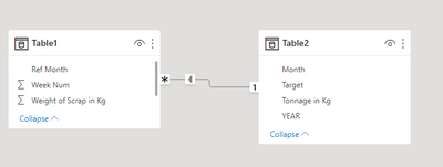
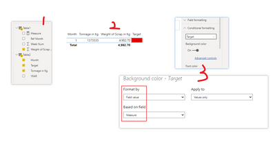
According to your description, I think you need to establish the relationship between months first, then you can put the two table fields in one table visual, and create a measure to mark red by using conditional format.
Like this:
Measure =
VAR a =
    SUMX (
        FILTER ( ALL ( Table1 ), [Ref Month] = SELECTEDVALUE ( Table2[Month] ) ),
        [Weight of Scrap in Kg ]
    )
RETURN
    IF (
        DIVIDE ( a, SELECTEDVALUE ( Table2[Tonnage in Kg] ) )
            > SELECTEDVALUE ( Table2[Target] ),
        "Red"
    )
Did I answer your question ? Please mark my reply as solution. Thank you very much.
If not, please upload some insensitive data samples and expected output.
Best Regards,
Community Support Team _ Janey
- Mark as New
- Bookmark
- Subscribe
- Mute
- Subscribe to RSS Feed
- Permalink
- Report Inappropriate Content
@Anonymous , I doubt clustered line visual if you are using only one measure on bar then you can use conditional formatting on bar. Not on line.
You can a measure based conditional formatting
example
Color sales = if(AVERAGE(Sales[Sales Amount])<170,"green","red")
Color Year = if(FIRSTNONBLANK('Table'[Year],2014) <=2016,"lightgreen",if(FIRSTNONBLANK('Table'[Year],2014)>2018,"red","yellow"))
Color = if(FIRSTNONBLANK('Table'[Year],2014) <=2016 && AVERAGE(Sales[Sales Amount])<170
,"lightgreen",if(FIRSTNONBLANK('Table'[Year],2014)>2018,"red","yellow"))
Color sales = if([Sales Today] -[sales yesterday]>0,"green","red")
refer if needed
PowerBI Abstract Thesis: How to do conditional formatting by measure and apply it on pie?: https://youtu.be/RqBb5eBf_I4
Microsoft Power BI Learning Resources, 2023 !!
Learn Power BI - Full Course with Dec-2022, with Window, Index, Offset, 100+ Topics !!
Did I answer your question? Mark my post as a solution! Appreciate your Kudos !! Proud to be a Super User! !!
Helpful resources

Microsoft Fabric Learn Together
Covering the world! 9:00-10:30 AM Sydney, 4:00-5:30 PM CET (Paris/Berlin), 7:00-8:30 PM Mexico City

Power BI Monthly Update - April 2024
Check out the April 2024 Power BI update to learn about new features.

| User | Count |
|---|---|
| 95 | |
| 94 | |
| 80 | |
| 71 | |
| 64 |
| User | Count |
|---|---|
| 120 | |
| 105 | |
| 99 | |
| 81 | |
| 72 |


