- Power BI forums
- Updates
- News & Announcements
- Get Help with Power BI
- Desktop
- Service
- Report Server
- Power Query
- Mobile Apps
- Developer
- DAX Commands and Tips
- Custom Visuals Development Discussion
- Health and Life Sciences
- Power BI Spanish forums
- Translated Spanish Desktop
- Power Platform Integration - Better Together!
- Power Platform Integrations (Read-only)
- Power Platform and Dynamics 365 Integrations (Read-only)
- Training and Consulting
- Instructor Led Training
- Dashboard in a Day for Women, by Women
- Galleries
- Community Connections & How-To Videos
- COVID-19 Data Stories Gallery
- Themes Gallery
- Data Stories Gallery
- R Script Showcase
- Webinars and Video Gallery
- Quick Measures Gallery
- 2021 MSBizAppsSummit Gallery
- 2020 MSBizAppsSummit Gallery
- 2019 MSBizAppsSummit Gallery
- Events
- Ideas
- Custom Visuals Ideas
- Issues
- Issues
- Events
- Upcoming Events
- Community Blog
- Power BI Community Blog
- Custom Visuals Community Blog
- Community Support
- Community Accounts & Registration
- Using the Community
- Community Feedback
Register now to learn Fabric in free live sessions led by the best Microsoft experts. From Apr 16 to May 9, in English and Spanish.
- Power BI forums
- Forums
- Get Help with Power BI
- Desktop
- Question on Data Cleaning/Pre-Work
- Subscribe to RSS Feed
- Mark Topic as New
- Mark Topic as Read
- Float this Topic for Current User
- Bookmark
- Subscribe
- Printer Friendly Page
- Mark as New
- Bookmark
- Subscribe
- Mute
- Subscribe to RSS Feed
- Permalink
- Report Inappropriate Content
Question on Data Cleaning/Pre-Work
I have a large wide data set (hundreds of columns and each row is a new batch or lot) with data from manufacturing runs and I am trying to set up the data in the most usable way. This is data over several days where many types of tests are run, I have basically the same data across several days for many different assays that come in different types like text, percentages, very small values (small decimals), very large values (billions).
I have been trying to just use the data from the source as is, but I am finding it much more difficult to use than I've seen in other similar programs (Tableau and Spotfire). For example, if I want to see how a particular assay shows across the entire manufacturing for each lot, I have no idea how to group all of the column from that particular assay so that they can be shown easily in a visualization.
So my question is, how can I organize the data in a way that makes this possible by either using the current data table in it's current shape/format or by transforming the data? My initial thoughts were:
1. Use the data as is and figure out how to group columns in a meaningful way that allows me to compare individual batches as well as create dynamic control charts. I have no idea how to do this at this point.
2. Create several tables including a dimension table with 1 row per lot and all of the text/date columns and then several unpivoted tables for each assay. My concern here is that I wouldn't really be able to create dynamic visualizations and that the columns may eventually change and I'm not sure how to go about ensuring issues don't arise.
Edit:
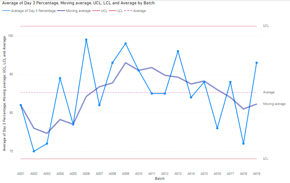
Here is an example of the first output I'd like to see. This is just a control chart based on one of the measures. What I've done in the past is create something like this below created a Parameter with Parameter Values (this is from Tableau) where I could have the y axis (along with the reference lines, moving average, and axis scale) change based on a drop down menu to any particular measure that I wanted.
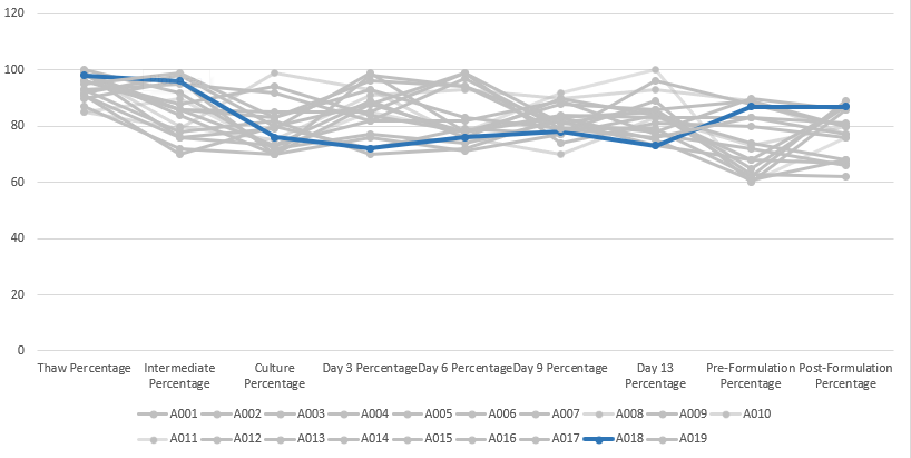
I also would like something like this where it's a line chart of different timepoints for the same measure and I have all of the lots plotted out, but only the one I have selected shows as a color and the rest are grey and have increased transparency. I did this in Tableau before but recreated it here in excel.

There are a lot more visualizations I will be working on, but I thought these two might give me a good base to work from. Here is the fake data I generated (I had to delete some columns and rows to make the character limit for the post):
| Batch | Study | Age | Date of Manufacturing Start | Thaw Time | Thaw Value | Thaw Percentage | Intermediate Value | Intermediate Percentage | Culture Pathway | Target Culture Volume | Culture Value | Culture Percentage | Culture Assay 1 | Culture Assay 2 | Culture Assay 3 | Culture Assay 4 | Culture Assay 5 | Culture Date | Culture Time | Day 3 Additive Lot | Day 3 Value | Day 3 Percentage | Day 6 Value | Day 6 Percentage | Day 9 Pathway | Day 9 Value | Day 9 Percentage | Day 13 Value | Day 13 Percentage | Pre-Formulation Value | Pre-Formulation Percentage | Post-Formulation Value | Post-Formulation Percentage |
| A001 | A | 38 | 1/1/2023 | 11 | 2.03E+09 | 93 | 1.13E+09 | 95 | A | 70 | 3.31E+08 | 92 | 0.964365 | 0.909911 | 0.9266 | 0.426843 | 9346 | 1/4/2023 | 3:43:00 PM | BC001 | 1.75E+08 | 82 | 3.77E+08 | 82 | X | 6.96E+08 | 89 | 3.42E+09 | 77 | 5.26E+09 | 72 | 5.88E+08 | 66 |
| A002 | B | 31 | 1/11/2023 | 17 | 3.22E+09 | 93 | 1.49E+09 | 78 | B | 200 | 2.24E+08 | 82 | 0.523873 | 0.496358 | 0.578401 | 0.825487 | 9544 | 1/14/2023 | 3:16:00 PM | BC001 | 1.81E+08 | 70 | 4.73E+08 | 72 | Y | 9.97E+08 | 83 | 3.34E+09 | 85 | 4.64E+09 | 63 | 5.54E+08 | 62 |
| A003 | C | 32 | 1/21/2023 | 20 | 3.28E+09 | 92 | 1.34E+09 | 98 | C | 30 | 3.16E+08 | 80 | 0.458282 | 0.991669 | 0.379554 | 0.502333 | 9946 | 1/24/2023 | 2:59:00 PM | BC001 | 2.25E+08 | 72 | 4.46E+08 | 79 | Z | 9.83E+08 | 77 | 3.05E+09 | 84 | 4.87E+09 | 68 | 5.85E+08 | 67 |
| A004 | A | 36 | 1/31/2023 | 18 | 3.95E+09 | 98 | 1.25E+09 | 86 | A | 70 | 2.20E+08 | 73 | 0.087441 | 0.078852 | 0.543915 | 0.618843 | 9072 | 2/3/2023 | 2:25:00 PM | BC001 | 1.94E+08 | 89 | 4.02E+08 | 76 | X | 7.69E+08 | 90 | 3.65E+09 | 84 | 5.57E+09 | 74 | 4.76E+08 | 68 |
| A005 | B | 41 | 2/10/2023 | 17 | 2.20E+09 | 100 | 1.24E+09 | 92 | A | 200 | 2.59E+08 | 72 | 0.687226 | 0.667037 | 0.099794 | 0.129018 | 9171 | 2/13/2023 | 3:15:00 PM | BC001 | 1.90E+08 | 77 | 4.10E+08 | 74 | X | 9.09E+08 | 82 | 2.83E+09 | 73 | 5.21E+09 | 68 | 4.69E+08 | 87 |
| A006 | C | 45 | 2/20/2023 | 19 | 2.21E+09 | 99 | 1.10E+09 | 76 | A | 70 | 2.23E+08 | 79 | 0.588223 | 0.572747 | 0.031049 | 0.244693 | 9468 | 2/23/2023 | 4:13:00 PM | BC002 | 1.98E+08 | 99 | 3.83E+08 | 78 | X | 9.72E+08 | 84 | 3.06E+09 | 83 | 4.28E+09 | 83 | 5.04E+08 | 81 |
| A007 | A | 56 | 3/2/2023 | 5 | 2.69E+09 | 91 | 1.37E+09 | 76 | C | 70 | 2.91E+08 | 73 | 0.98273 | 0.540128 | 0.004233 | 0.630269 | 9374 | 3/5/2023 | 4:53:00 PM | BC002 | 2.47E+08 | 82 | 3.77E+08 | 97 | X | 8.09E+08 | 79 | 2.74E+09 | 79 | 5.31E+09 | 62 | 5.06E+08 | 89 |
| A008 | B | 35 | 3/12/2023 | 16 | 2.10E+09 | 85 | 1.33E+09 | 79 | C | 200 | 3.29E+08 | 99 | 0.348866 | 0.599785 | 0.712597 | 0.268821 | 9851 | 3/15/2023 | 4:19:00 PM | BC002 | 1.58E+08 | 93 | 4.32E+08 | 76 | X | 9.33E+08 | 70 | 2.61E+09 | 83 | 4.58E+09 | 73 | 5.92E+08 | 80 |
| A009 | C | 49 | 3/22/2023 | 6 | 2.91E+09 | 87 | 1.03E+09 | 72 | B | 30 | 2.82E+08 | 70 | 0.845062 | 0.935355 | 0.576981 | 0.997446 | 9911 | 3/25/2023 | 3:30:00 PM | BC002 | 1.92E+08 | 98 | 3.73E+08 | 94 | Y | 7.65E+08 | 78 | 3.87E+09 | 89 | 5.06E+09 | 60 | 5.78E+08 | 86 |
- Mark as New
- Bookmark
- Subscribe
- Mute
- Subscribe to RSS Feed
- Permalink
- Report Inappropriate Content
@Janaya1 It is very tough to answer without looking at the data. The starting point and goal should be to work towards a star schema Understand star schema and the importance for Power BI - Power BI | Microsoft Learn
Maybe if you can share sample data (just create dummy data) with some expected outputs, it will help to provide some details.
Don't share any sensitive information.
Subscribe to the @PowerBIHowTo YT channel for an upcoming video on List and Record functions in Power Query!!
Learn Power BI and Fabric - subscribe to our YT channel - Click here: @PowerBIHowTo
If my solution proved useful, I'd be delighted to receive Kudos. When you put effort into asking a question, it's equally thoughtful to acknowledge and give Kudos to the individual who helped you solve the problem. It's a small gesture that shows appreciation and encouragement! ❤
Did I answer your question? Mark my post as a solution. Proud to be a Super User! Appreciate your Kudos 🙂
Feel free to email me with any of your BI needs.
- Mark as New
- Bookmark
- Subscribe
- Mute
- Subscribe to RSS Feed
- Permalink
- Report Inappropriate Content
Thank you! I created some fake data and visualizations I'm looking for. I had to end up deleting a bunch of the data to make the character limit for the post but it should still work.
Helpful resources

Microsoft Fabric Learn Together
Covering the world! 9:00-10:30 AM Sydney, 4:00-5:30 PM CET (Paris/Berlin), 7:00-8:30 PM Mexico City

Power BI Monthly Update - April 2024
Check out the April 2024 Power BI update to learn about new features.

| User | Count |
|---|---|
| 100 | |
| 100 | |
| 80 | |
| 77 | |
| 66 |
| User | Count |
|---|---|
| 134 | |
| 106 | |
| 104 | |
| 85 | |
| 73 |

