- Power BI forums
- Updates
- News & Announcements
- Get Help with Power BI
- Desktop
- Service
- Report Server
- Power Query
- Mobile Apps
- Developer
- DAX Commands and Tips
- Custom Visuals Development Discussion
- Health and Life Sciences
- Power BI Spanish forums
- Translated Spanish Desktop
- Power Platform Integration - Better Together!
- Power Platform Integrations (Read-only)
- Power Platform and Dynamics 365 Integrations (Read-only)
- Training and Consulting
- Instructor Led Training
- Dashboard in a Day for Women, by Women
- Galleries
- Community Connections & How-To Videos
- COVID-19 Data Stories Gallery
- Themes Gallery
- Data Stories Gallery
- R Script Showcase
- Webinars and Video Gallery
- Quick Measures Gallery
- 2021 MSBizAppsSummit Gallery
- 2020 MSBizAppsSummit Gallery
- 2019 MSBizAppsSummit Gallery
- Events
- Ideas
- Custom Visuals Ideas
- Issues
- Issues
- Events
- Upcoming Events
- Community Blog
- Power BI Community Blog
- Custom Visuals Community Blog
- Community Support
- Community Accounts & Registration
- Using the Community
- Community Feedback
Register now to learn Fabric in free live sessions led by the best Microsoft experts. From Apr 16 to May 9, in English and Spanish.
- Power BI forums
- Forums
- Get Help with Power BI
- Desktop
- Re: Problems modelling Excelfile for use in PBI
- Subscribe to RSS Feed
- Mark Topic as New
- Mark Topic as Read
- Float this Topic for Current User
- Bookmark
- Subscribe
- Printer Friendly Page
- Mark as New
- Bookmark
- Subscribe
- Mute
- Subscribe to RSS Feed
- Permalink
- Report Inappropriate Content
Problems modelling Excelfile for use in PBI
I have an Excel where I already took aggregated totals per sample date. I look at logs and divide the results in 7 columns then I add it up per day.

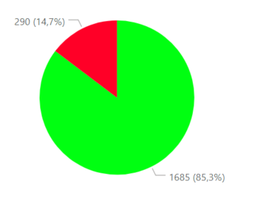
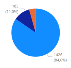
ABC = Right, DEFG = Wrong. In PBI I added a separate Table for Dates so I can make my own flavors of slicing. I have tried to use one unified table, two different for right / wrong separated and Hierarchies.
I am too stupid to figure out how to get a Pie chart that allows me to click on right 1685 (85,3%) and get a drill down to A 1426 B 185 C 74. My blood pressure is skyrocketing. I would have solved this with SQL / Report builder fast enough. Any help would be most welcome.
Solved! Go to Solution.
- Mark as New
- Bookmark
- Subscribe
- Mute
- Subscribe to RSS Feed
- Permalink
- Report Inappropriate Content
OK, here is how I would go about it. It is a different method to yours though...
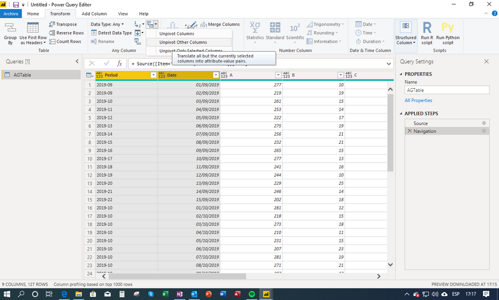
1) Unpivot the data on import: select the period and date columns and under unpivot choose "unpivot other columns"
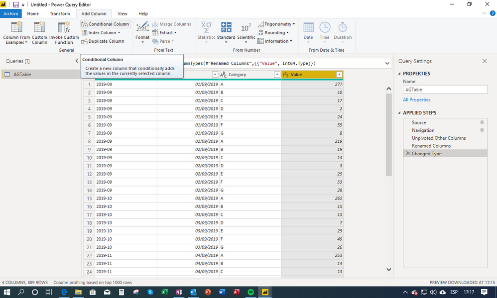
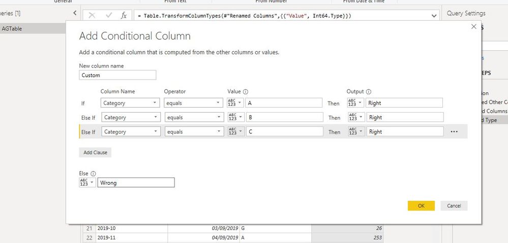
2) Add a conditional column to create a new column classifying categories as right or wrong:
and
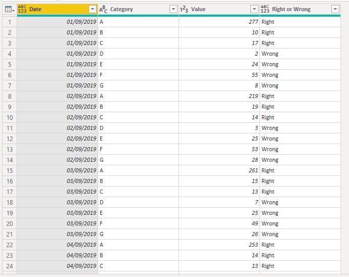
Your Fact table should now look like this (I´ve actually deleted the period column you had, since I always include it in my calendar table):
3) Create a Calendar Table
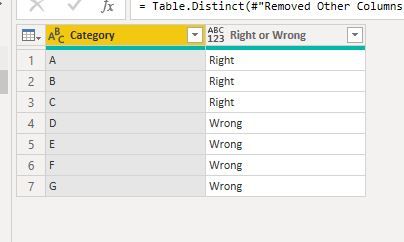
4) I've also created a Category Table by referencing from the fact table, deleting all columns except the Category and Right or Wrong Columns, and deleted duplicate values. The table looks like this:
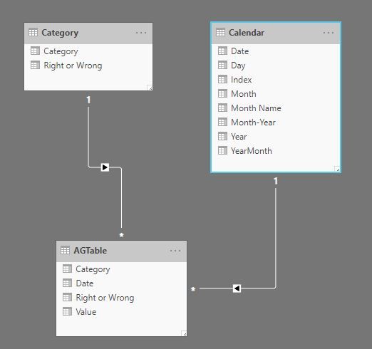
5) Load all into the model and create the relevant relationships between tables. The model should resemble this:
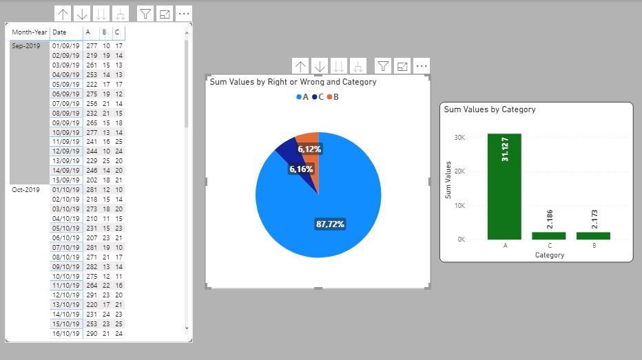
6) Create any measures you need for the pie chart; I've just made a simple sum of values.
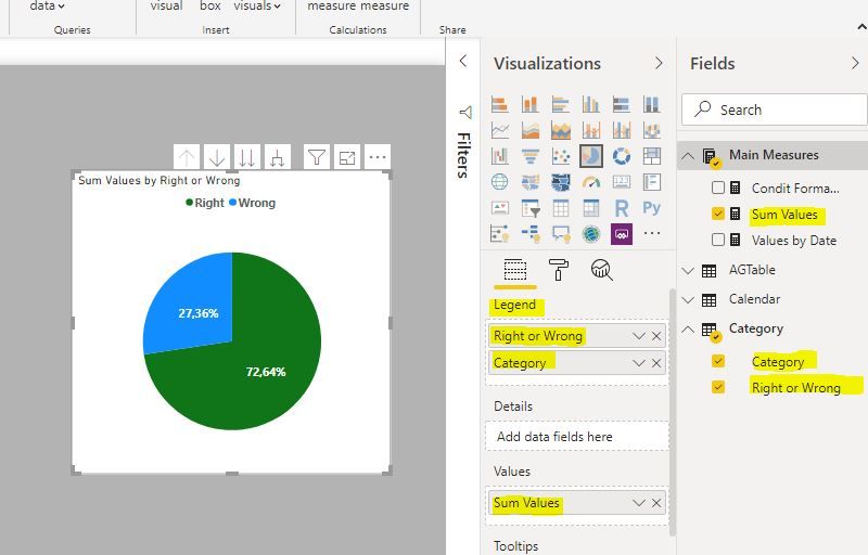
7) Create your pie chart using the "Right or Wrong" and "Category" fields from your Category Table as your legend and your measure as values:
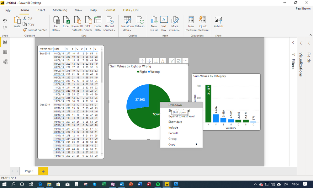
You can now drill down/up etc on your pie chart (by right-clicking on a segment or using the drill-triggers on the chart):
and once you have "drilled-down":
And here is the PBIX file if you're interested:
Pie Chart Example
Hope it helps, and let us know if something isn't working for you!
Did I answer your question? Mark my post as a solution!
In doing so, you are also helping me. Thank you!
Proud to be a Super User!
Paul on Linkedin.
- Mark as New
- Bookmark
- Subscribe
- Mute
- Subscribe to RSS Feed
- Permalink
- Report Inappropriate Content
- Mark as New
- Bookmark
- Subscribe
- Mute
- Subscribe to RSS Feed
- Permalink
- Report Inappropriate Content
PLease provide a sample of your data, data structure and model structure
Did I answer your question? Mark my post as a solution!
In doing so, you are also helping me. Thank you!
Proud to be a Super User!
Paul on Linkedin.
- Mark as New
- Bookmark
- Subscribe
- Mute
- Subscribe to RSS Feed
- Permalink
- Report Inappropriate Content
| Period | Date | A | B | C | D | E | F | G |
| 2019-09 | 2019-09-01 | 277 | 10 | 17 | 2 | 24 | 55 | 8 |
| 2019-09 | 2019-09-02 | 269 | 19 | 14 | 3 | 25 | 53 | 28 |
Above is Excel. I want to group Columns A, B and C. Group D,E,F and G
I have imported that Excel as it is and I made two separated sheets of the different groups as a laboration.
I dont know how to add files on this URL so I added a table and photos.
- Mark as New
- Bookmark
- Subscribe
- Mute
- Subscribe to RSS Feed
- Permalink
- Report Inappropriate Content
OK, here is how I would go about it. It is a different method to yours though...
1) Unpivot the data on import: select the period and date columns and under unpivot choose "unpivot other columns"
2) Add a conditional column to create a new column classifying categories as right or wrong:
and
Your Fact table should now look like this (I´ve actually deleted the period column you had, since I always include it in my calendar table):
3) Create a Calendar Table
4) I've also created a Category Table by referencing from the fact table, deleting all columns except the Category and Right or Wrong Columns, and deleted duplicate values. The table looks like this:
5) Load all into the model and create the relevant relationships between tables. The model should resemble this:
6) Create any measures you need for the pie chart; I've just made a simple sum of values.
7) Create your pie chart using the "Right or Wrong" and "Category" fields from your Category Table as your legend and your measure as values:
You can now drill down/up etc on your pie chart (by right-clicking on a segment or using the drill-triggers on the chart):
and once you have "drilled-down":
And here is the PBIX file if you're interested:
Pie Chart Example
Hope it helps, and let us know if something isn't working for you!
Did I answer your question? Mark my post as a solution!
In doing so, you are also helping me. Thank you!
Proud to be a Super User!
Paul on Linkedin.
- Mark as New
- Bookmark
- Subscribe
- Mute
- Subscribe to RSS Feed
- Permalink
- Report Inappropriate Content
Thank you for the feedback. It makes sense to unpivot and that I had to add the dimension right / wrong. From there on I will follow your instructions.
I get so frustrated by DAX and seem to lock up. Modeling an ordinary DB is no problems but I lack experience in modeling for BI. Those two facts makes this an excellent learning experience.
- Mark as New
- Bookmark
- Subscribe
- Mute
- Subscribe to RSS Feed
- Permalink
- Report Inappropriate Content
@PaulDBrownThank you. I had a good time solve all the little puzzles. I ran in to problems Copying table and Distinct it. I got an error message about the Date-columns I deleted so I created that table in Excel instead. Besides that I had no real problems. I Find it less frustrating working with Power Queary than with DAX. 😤
- Mark as New
- Bookmark
- Subscribe
- Mute
- Subscribe to RSS Feed
- Permalink
- Report Inappropriate Content
I'm glad you worked it out. Indeed, DAX is challenging, and the learning never stops!
It is good that you feel comfortable in Power Query and it is better to get as much done as possible before loading the data to the model (either at the data source or in Power Query) and start working on the DAX.
I recommed you spend some time looking at videos and reading a couple of books.
Also something which is often overlooked is the importance of setting up the model and the structure of the tables (data or fact tables and lookup or Dim tables).
And of course, come back here whenever you get stuck!
Did I answer your question? Mark my post as a solution!
In doing so, you are also helping me. Thank you!
Proud to be a Super User!
Paul on Linkedin.
- Mark as New
- Bookmark
- Subscribe
- Mute
- Subscribe to RSS Feed
- Permalink
- Report Inappropriate Content
One detail question about the Table Main Measures you created using DAX(?) or by right clicking. When I inspect yor table the header is blank. When I create a table I get Value1 rammed in my throat. I did an ugly wourk around. Your Table and code window is yellow mine is blue.
- Mark as New
- Bookmark
- Subscribe
- Mute
- Subscribe to RSS Feed
- Permalink
- Report Inappropriate Content
I created the Measures table using the "Enter Data" option in the ribbon on the Home tab.
1) once the "Enter Data" window opens up, just change its name (no need to add any values or content). Close the window
2) a new table is created under the Fields panel on the right of the screen. You will see that a column is created by default, but just ignore it for a second.
3) create a new measure within this table (or bring one in from another table).
4) Once the new table has a measure, you can delete the default column which was included when you created the table. You can delete this column by selecting the ellipsis on the right of the column name.
5) once you have deleted the default column, minimise the Field panel by clicking on the arrow ( " > " ) next to the Field header name. Now click on the expand arrow (" < " ) and voliá! There is your measure table, with its corresponding measure Icon and placed at the top of your tables list.
This is very useful to keep your Fields content tidy: measures on top, tables below.
If your "Value1" field in the table you created is empty, follow the steps from 4) onwards and you should get the measure table configured.
Does it work?
Did I answer your question? Mark my post as a solution!
In doing so, you are also helping me. Thank you!
Proud to be a Super User!
Paul on Linkedin.
- Mark as New
- Bookmark
- Subscribe
- Mute
- Subscribe to RSS Feed
- Permalink
- Report Inappropriate Content
Now it looks pretty.
- Mark as New
- Bookmark
- Subscribe
- Mute
- Subscribe to RSS Feed
- Permalink
- Report Inappropriate Content
So far so good. Thank you for spending your precious time on me. I picked up a lot of things from you.
Helpful resources

Microsoft Fabric Learn Together
Covering the world! 9:00-10:30 AM Sydney, 4:00-5:30 PM CET (Paris/Berlin), 7:00-8:30 PM Mexico City

Power BI Monthly Update - April 2024
Check out the April 2024 Power BI update to learn about new features.

| User | Count |
|---|---|
| 113 | |
| 104 | |
| 77 | |
| 67 | |
| 63 |
| User | Count |
|---|---|
| 144 | |
| 107 | |
| 105 | |
| 82 | |
| 69 |
