- Power BI forums
- Updates
- News & Announcements
- Get Help with Power BI
- Desktop
- Service
- Report Server
- Power Query
- Mobile Apps
- Developer
- DAX Commands and Tips
- Custom Visuals Development Discussion
- Health and Life Sciences
- Power BI Spanish forums
- Translated Spanish Desktop
- Power Platform Integration - Better Together!
- Power Platform Integrations (Read-only)
- Power Platform and Dynamics 365 Integrations (Read-only)
- Training and Consulting
- Instructor Led Training
- Dashboard in a Day for Women, by Women
- Galleries
- Community Connections & How-To Videos
- COVID-19 Data Stories Gallery
- Themes Gallery
- Data Stories Gallery
- R Script Showcase
- Webinars and Video Gallery
- Quick Measures Gallery
- 2021 MSBizAppsSummit Gallery
- 2020 MSBizAppsSummit Gallery
- 2019 MSBizAppsSummit Gallery
- Events
- Ideas
- Custom Visuals Ideas
- Issues
- Issues
- Events
- Upcoming Events
- Community Blog
- Power BI Community Blog
- Custom Visuals Community Blog
- Community Support
- Community Accounts & Registration
- Using the Community
- Community Feedback
Register now to learn Fabric in free live sessions led by the best Microsoft experts. From Apr 16 to May 9, in English and Spanish.
- Power BI forums
- Forums
- Get Help with Power BI
- Desktop
- PBI present irrelevant information when a visualis...
- Subscribe to RSS Feed
- Mark Topic as New
- Mark Topic as Read
- Float this Topic for Current User
- Bookmark
- Subscribe
- Printer Friendly Page
- Mark as New
- Bookmark
- Subscribe
- Mute
- Subscribe to RSS Feed
- Permalink
- Report Inappropriate Content
PBI present irrelevant information when a visualisation bar is selected
Hi all,
I have a question and am wondering if my DAX having problem. Hope you can help. Thanks.
BACKGROUND -
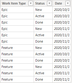
I have a table consists of all work item objects (EPIC, Feature, etc.) classified by 3 status (NEW, ACTIVE and DONE)
My data modelling consists only one table dataset with link to Time Intelligent Date table.
Next, I have another section consists of three visualization to shown the story points for last three months categorized by status NEW, ACTIVE and DONE and each of the 3 visualizations are further classified into work item objects (i.e. EPIC, Feature, Story, etc.)
PROBLEMS -
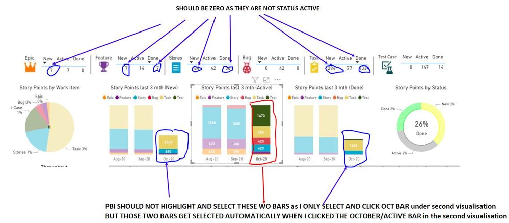
The problem arises when I clicks my cursor on the second visualization (i.e. Story Points last 3 mth (Active). When I click the October 2020 bar (refer to screen below circled in red), Power BI strangely present all the non-relevant information in other visualization (circled in blue).
When I clicked the bar, it is related to all story points fall under October 2020 and belong to Active status. Hence, I would expect other visualization only show the relevant information. In this case the two October bar which are status NEW and DONE get highlighted automatically and all the above visualization presents the NEW and DONE status for each object.
QUESTION - How to achieve the following outcome indicated in the figure below?
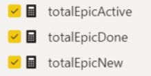
The following are the DAX on the top Six visualization:
totalEpicActive = Calculate(count('Work Items - All history'[Work Item Type]),
filter(ALL('Work Items - All history'[Work Item Type],
'Work Items - All history'[Status]),
AND('Work Items - All history'[Work Item Type] = "Epic",
'Work Items - All history'[Status] = "Active")
)
)
Each of the table visualization have similar criteria filtered by work item type and status. The Dax for all 6 visualization is similar except the filtering piece
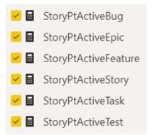
The following are the DAX on the three visualization:
StoryPtActiveStory = Calculate('Work Items - All history'[totalStoryPointAllstatus],
filter(ALL('Work Items - All history'[Work Item Type],
'Work Items - All history'[Status]),
AND('Work Items - All history'[Work Item Type] = "Stories",
'Work Items - All history'[Status] = "Active")
)
)
Each of the Work items has its own measure with the criteria filtered by work item type and status. The Dax for all the 3 visualization is similar except the filtering piece
Solved! Go to Solution.
- Mark as New
- Bookmark
- Subscribe
- Mute
- Subscribe to RSS Feed
- Permalink
- Report Inappropriate Content
Hi @ANNING
Your measure use All function in Status column, so your visuals will return to all Status even if you select the Stack column visual(Active). You may try to avoid using all.
IF your Data model is like this you don't need to build measures to achieve your goal.
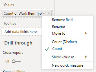
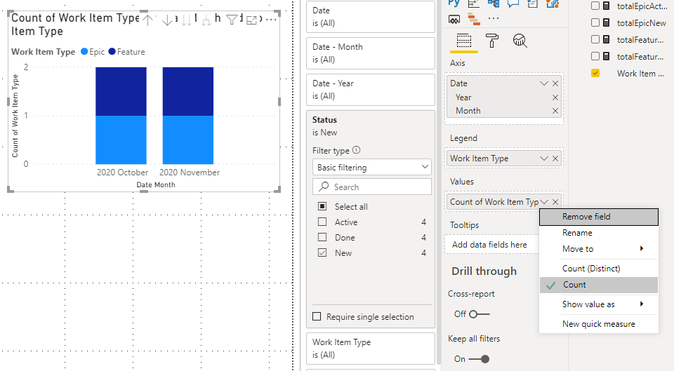
You can build visuals directly and use count in Values.
And add Status in Filers to filter Active, New or Done for each visual.
Result:
You can download the pbix file from this link: PBI present irrelevant information when a visualisation bar is selected
Best Regards,
Rico Zhou
If this post helps, then please consider Accept it as the solution to help the other members find it more quickly.
- Mark as New
- Bookmark
- Subscribe
- Mute
- Subscribe to RSS Feed
- Permalink
- Report Inappropriate Content
Hi @ANNING
Could you tell me if your problem has been solved? If it is, kindly Accept it as the solution. More people will benefit from it. Or you are still confused about it, please provide me with more details about your table and your problem or share me with your pbix file from your Onedrive for Business.
Best Regards,
Rico Zhou
- Mark as New
- Bookmark
- Subscribe
- Mute
- Subscribe to RSS Feed
- Permalink
- Report Inappropriate Content
Hi @ANNING
Your measure use All function in Status column, so your visuals will return to all Status even if you select the Stack column visual(Active). You may try to avoid using all.
IF your Data model is like this you don't need to build measures to achieve your goal.
You can build visuals directly and use count in Values.
And add Status in Filers to filter Active, New or Done for each visual.
Result:
You can download the pbix file from this link: PBI present irrelevant information when a visualisation bar is selected
Best Regards,
Rico Zhou
If this post helps, then please consider Accept it as the solution to help the other members find it more quickly.
- Mark as New
- Bookmark
- Subscribe
- Mute
- Subscribe to RSS Feed
- Permalink
- Report Inappropriate Content
Have a look at your data model view, specifically the direction of the search filters. Maybe somewhere you have inadvertently set a filter to bidirectional when you wanted to make it unidirectional. "Normally" filters should flow from the "dimensions" to the "facts".
Helpful resources

Microsoft Fabric Learn Together
Covering the world! 9:00-10:30 AM Sydney, 4:00-5:30 PM CET (Paris/Berlin), 7:00-8:30 PM Mexico City

Power BI Monthly Update - April 2024
Check out the April 2024 Power BI update to learn about new features.

| User | Count |
|---|---|
| 106 | |
| 105 | |
| 79 | |
| 68 | |
| 61 |
| User | Count |
|---|---|
| 143 | |
| 104 | |
| 103 | |
| 82 | |
| 70 |


