- Power BI forums
- Updates
- News & Announcements
- Get Help with Power BI
- Desktop
- Service
- Report Server
- Power Query
- Mobile Apps
- Developer
- DAX Commands and Tips
- Custom Visuals Development Discussion
- Health and Life Sciences
- Power BI Spanish forums
- Translated Spanish Desktop
- Power Platform Integration - Better Together!
- Power Platform Integrations (Read-only)
- Power Platform and Dynamics 365 Integrations (Read-only)
- Training and Consulting
- Instructor Led Training
- Dashboard in a Day for Women, by Women
- Galleries
- Community Connections & How-To Videos
- COVID-19 Data Stories Gallery
- Themes Gallery
- Data Stories Gallery
- R Script Showcase
- Webinars and Video Gallery
- Quick Measures Gallery
- 2021 MSBizAppsSummit Gallery
- 2020 MSBizAppsSummit Gallery
- 2019 MSBizAppsSummit Gallery
- Events
- Ideas
- Custom Visuals Ideas
- Issues
- Issues
- Events
- Upcoming Events
- Community Blog
- Power BI Community Blog
- Custom Visuals Community Blog
- Community Support
- Community Accounts & Registration
- Using the Community
- Community Feedback
Register now to learn Fabric in free live sessions led by the best Microsoft experts. From Apr 16 to May 9, in English and Spanish.
- Power BI forums
- Forums
- Get Help with Power BI
- Desktop
- Need help
- Subscribe to RSS Feed
- Mark Topic as New
- Mark Topic as Read
- Float this Topic for Current User
- Bookmark
- Subscribe
- Printer Friendly Page
- Mark as New
- Bookmark
- Subscribe
- Mute
- Subscribe to RSS Feed
- Permalink
- Report Inappropriate Content
Need help
Hi Guys,,
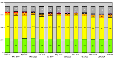
I am trying to replicate a web report in power bi. There is a graph which is shows the overall equipment rating based on tests done every month, rating being Legend here. Now the problem is, not all equipment are tested every month and when i plot, i just get some number of tests done on equipment in a month. I need record against all equipment every month corresponding to the rating. at that time. Any leads?
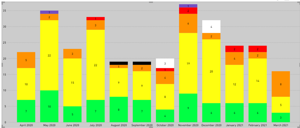
need something like this
TIA!
Solved! Go to Solution.
- Mark as New
- Bookmark
- Subscribe
- Mute
- Subscribe to RSS Feed
- Permalink
- Report Inappropriate Content
Hi,
I hope the below is what you are looking for.
I created a measure that gives The LATEST Rating result of the equipment among the current or from before until the current month. I also considered if one Equipment has two Ratings on the same day, then give the maximum result of Ratings, because "selectedvalue(Data[Rating])" gives blank value if it has two results.


If this post helps, then please consider accepting it as the solution to help other members find it faster, and give a big thumbs up.
- Mark as New
- Bookmark
- Subscribe
- Mute
- Subscribe to RSS Feed
- Permalink
- Report Inappropriate Content
Hi,
The best way to solve this problem is to show the expected result in a Table. Once the Table is ready, we can always switch the visualisation to any other that you want.
Regards,
Ashish Mathur
http://www.ashishmathur.com
https://www.linkedin.com/in/excelenthusiasts/
- Mark as New
- Bookmark
- Subscribe
- Mute
- Subscribe to RSS Feed
- Permalink
- Report Inappropriate Content
Thanks Ashish.
I tried this. Table is fine but when i switch visual to stacked column, it doesnt work.
- Mark as New
- Bookmark
- Subscribe
- Mute
- Subscribe to RSS Feed
- Permalink
- Report Inappropriate Content
I'll try to explain.
I have 100 equipment. Every equipment has different test frequency. In a given month, not every equipment is tested but I still have last known rating of the equipment for which there is no test in that specific month. Now what I want to show (as in Picture 3 in my original post) is that for each month, what was the latest ratings for all 100 equipment. This way, the total number will remain 100 every month in the grapgh, but the rating distribution (color based on legend) will change based on last available rating.
for example, in january, 35 equipment were tested. So i have latest ratings on these 35 equipment. But as the rest of the equipment also have previous rating, the graph needs to show all 100, with last available rating.
I hope it is more clear now.
- Mark as New
- Bookmark
- Subscribe
- Mute
- Subscribe to RSS Feed
- Permalink
- Report Inappropriate Content
Hi,
Please correct me if I wrongly understood.
When I saw your desired outcome picture, I thought the gray-colored-area, that you also wanted to display, is a "not-tested-equipment-count".
If I am not wrong, in this case, I usually create one more data point for "others", for instance, and create a DAX measure that shows numbers for "others".
If it is OK with you to share your data with me, perhaps I can try to create a calculated measure to describe in a stacked column chart.
Thanks.
If this post helps, then please consider accepting it as the solution to help other members find it faster, and give a big thumbs up.
- Mark as New
- Bookmark
- Subscribe
- Mute
- Subscribe to RSS Feed
- Permalink
- Report Inappropriate Content
I don't know how to share data here
- Mark as New
- Bookmark
- Subscribe
- Mute
- Subscribe to RSS Feed
- Permalink
- Report Inappropriate Content
Hi,
Thanks for the reply.
That grey area is also a rating.
Lets say we have 10 equipment. All 10 were tested in December. Then 5 were tested in January, 9 were tested in February. In March, 7 were tested and got rated x, y or z. Now what i need to show is the count of all 10 equipment and there rating (as legend) for January, February and March & so on. At the moment, I'm just getting count of equipment tested in a specific month, which does not give me an overall equipment rating picture.
- Mark as New
- Bookmark
- Subscribe
- Mute
- Subscribe to RSS Feed
- Permalink
- Report Inappropriate Content
Hi,
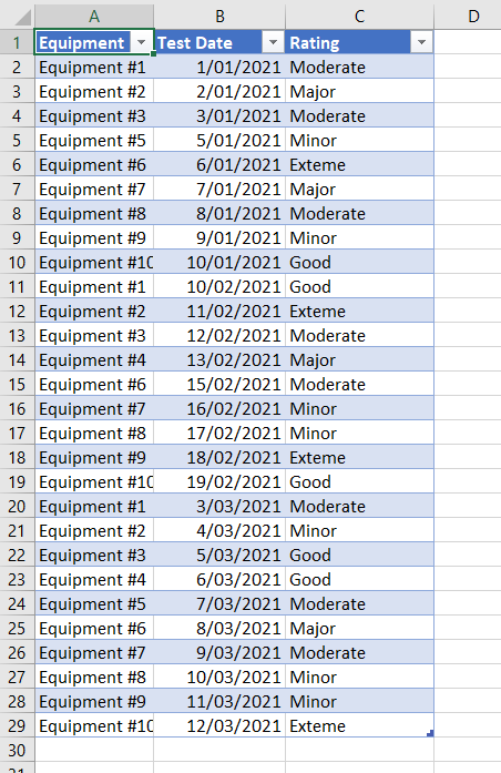
Thank you very much for your explanation, and I also got your sample data by message.
Thank you.
Sorry to ask many questions to your question, but if you do not mind, could you please check whether you want to show the information like in the below picture in a stacked bar chart, or am I still missing something?
Terribly sorry that it doesn't look like meet your requirement, but if I wanted to show all the information in the stacked bar chart, I had no choice but to come up with like the below picture.

If this post helps, then please consider accepting it as the solution to help other members find it faster, and give a big thumbs up.
- Mark as New
- Bookmark
- Subscribe
- Mute
- Subscribe to RSS Feed
- Permalink
- Report Inappropriate Content
Hi,
Unfortunately this is not what i need. What I'm after is one bar for all equipment, colored according to the rating, against each month. Similar to the picture3 in my original post.
I've tried many measures, but the date filter just isnt allowing for all equipment to show in one bar for a specific month.
- Mark as New
- Bookmark
- Subscribe
- Mute
- Subscribe to RSS Feed
- Permalink
- Report Inappropriate Content
Hi,
Thanks for your feedback.
I am sorry that my visualization was not the one.
However, if your problem was related to the date-month concern, can you try to switch the format of your date? For instance, instead of writing dd-mm-yyyy, try mm-dd-yyyy. It depends on what format is your computer system using, but if you face a problem that does not correctly consolidate the month, sometimes it is because of the date-format-issue.
Thank you very much.
If this post helps, then please consider accepting it as the solution to help other members find it faster, and give a big thumbs up.
- Mark as New
- Bookmark
- Subscribe
- Mute
- Subscribe to RSS Feed
- Permalink
- Report Inappropriate Content
I have 100 equipment. Every equipment has different test frequency. In a given month, not every equipment is tested but I still have last known rating of the equipment for which there is no test in that specific month. Now what I want to show (as in Picture 3 in my original post) is that for each month, what was the latest ratings for all 100 equipment. This way, the total number will remain 100 every month in the grapgh, but the rating distribution (color based on legend) will change based on last available rating.
for example, in january, 35 equipment were tested. So i have latest ratings on these 35 equipment. But as the rest of the equipment also have previous rating, the graph needs to show all 100, with last available rating.
I hope it is more clear now.
- Mark as New
- Bookmark
- Subscribe
- Mute
- Subscribe to RSS Feed
- Permalink
- Report Inappropriate Content
Hi,
Share the link from where i can download your PBI file.
Regards,
Ashish Mathur
http://www.ashishmathur.com
https://www.linkedin.com/in/excelenthusiasts/
- Mark as New
- Bookmark
- Subscribe
- Mute
- Subscribe to RSS Feed
- Permalink
- Report Inappropriate Content
Link sent.
- Mark as New
- Bookmark
- Subscribe
- Mute
- Subscribe to RSS Feed
- Permalink
- Report Inappropriate Content
Share the link here.
Regards,
Ashish Mathur
http://www.ashishmathur.com
https://www.linkedin.com/in/excelenthusiasts/
- Mark as New
- Bookmark
- Subscribe
- Mute
- Subscribe to RSS Feed
- Permalink
- Report Inappropriate Content
- Mark as New
- Bookmark
- Subscribe
- Mute
- Subscribe to RSS Feed
- Permalink
- Report Inappropriate Content
Hi,
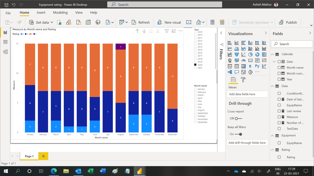
Is this the result you are expecting?
Regards,
Ashish Mathur
http://www.ashishmathur.com
https://www.linkedin.com/in/excelenthusiasts/
- Mark as New
- Bookmark
- Subscribe
- Mute
- Subscribe to RSS Feed
- Permalink
- Report Inappropriate Content
Yes. Exactly.
Jihwan's solution also worked on the sample data but isnt working on the main data. Plus, equipment will be filtered based on system, so keeping equipment constant also doesnt help.
- Mark as New
- Bookmark
- Subscribe
- Mute
- Subscribe to RSS Feed
- Permalink
- Report Inappropriate Content
Hi,
Share your main data in an MS Excel file. I only need the first 3 columns in that file (not the bins column. I have solved it without the bins column). Let me plug in that data to see whether my solution get your desired result or not.
Regards,
Ashish Mathur
http://www.ashishmathur.com
https://www.linkedin.com/in/excelenthusiasts/
- Mark as New
- Bookmark
- Subscribe
- Mute
- Subscribe to RSS Feed
- Permalink
- Report Inappropriate Content
- Mark as New
- Bookmark
- Subscribe
- Mute
- Subscribe to RSS Feed
- Permalink
- Report Inappropriate Content
Hi,
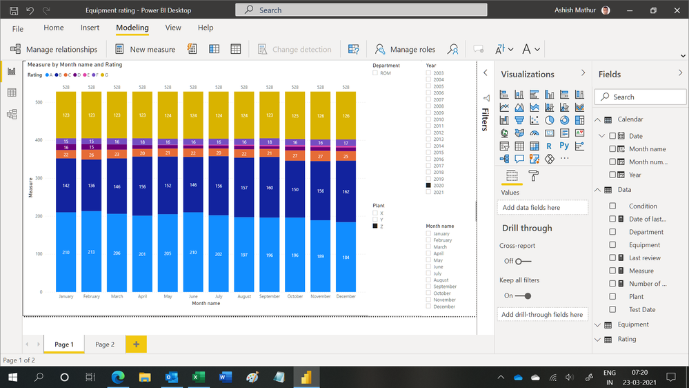
Is this the result you expect to see for 2020 and Plant Z?
Regards,
Ashish Mathur
http://www.ashishmathur.com
https://www.linkedin.com/in/excelenthusiasts/
- Mark as New
- Bookmark
- Subscribe
- Mute
- Subscribe to RSS Feed
- Permalink
- Report Inappropriate Content
Yes. This is correct.
Helpful resources

Microsoft Fabric Learn Together
Covering the world! 9:00-10:30 AM Sydney, 4:00-5:30 PM CET (Paris/Berlin), 7:00-8:30 PM Mexico City

Power BI Monthly Update - April 2024
Check out the April 2024 Power BI update to learn about new features.

| User | Count |
|---|---|
| 114 | |
| 105 | |
| 77 | |
| 67 | |
| 63 |
| User | Count |
|---|---|
| 144 | |
| 107 | |
| 105 | |
| 82 | |
| 69 |
