- Power BI forums
- Updates
- News & Announcements
- Get Help with Power BI
- Desktop
- Service
- Report Server
- Power Query
- Mobile Apps
- Developer
- DAX Commands and Tips
- Custom Visuals Development Discussion
- Health and Life Sciences
- Power BI Spanish forums
- Translated Spanish Desktop
- Power Platform Integration - Better Together!
- Power Platform Integrations (Read-only)
- Power Platform and Dynamics 365 Integrations (Read-only)
- Training and Consulting
- Instructor Led Training
- Dashboard in a Day for Women, by Women
- Galleries
- Community Connections & How-To Videos
- COVID-19 Data Stories Gallery
- Themes Gallery
- Data Stories Gallery
- R Script Showcase
- Webinars and Video Gallery
- Quick Measures Gallery
- 2021 MSBizAppsSummit Gallery
- 2020 MSBizAppsSummit Gallery
- 2019 MSBizAppsSummit Gallery
- Events
- Ideas
- Custom Visuals Ideas
- Issues
- Issues
- Events
- Upcoming Events
- Community Blog
- Power BI Community Blog
- Custom Visuals Community Blog
- Community Support
- Community Accounts & Registration
- Using the Community
- Community Feedback
Register now to learn Fabric in free live sessions led by the best Microsoft experts. From Apr 16 to May 9, in English and Spanish.
- Power BI forums
- Forums
- Get Help with Power BI
- Desktop
- Need help in Bing map
- Subscribe to RSS Feed
- Mark Topic as New
- Mark Topic as Read
- Float this Topic for Current User
- Bookmark
- Subscribe
- Printer Friendly Page
- Mark as New
- Bookmark
- Subscribe
- Mute
- Subscribe to RSS Feed
- Permalink
- Report Inappropriate Content
Need help in Bing map
Hi All,
Thanks Advanced.
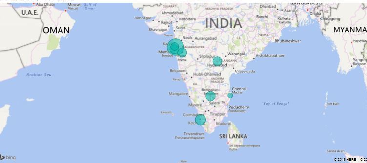
Presently am getting the below map. with sales by city.

But how client wants .
They want to see Sales in one circle and Profit as another circle in same map. like below

Is it possible in Power BI ?
help me 😞
@ankitpatira @Seth_C_Bauer @Greg_Deckler @SandyRI @Sandy
Solved! Go to Solution.
- Mark as New
- Bookmark
- Subscribe
- Mute
- Subscribe to RSS Feed
- Permalink
- Report Inappropriate Content
@Baskar I am not aware of any way to do this. The way you could convey the information would be via the tooltip so when the end users hovers over the circle that they see both sales and profit.
Looking for more Power BI tips, tricks & tools? Check out PowerBI.tips the site I co-own with Mike Carlo. Also, if you are near SE WI? Join our PUG Milwaukee Brew City PUG
- Mark as New
- Bookmark
- Subscribe
- Mute
- Subscribe to RSS Feed
- Permalink
- Report Inappropriate Content
I'm with @Seth_C_Bauer on this one. I know that there is the ability to have a pie chart on maps if you put a field in the Legend I believe. Not sure if that would meet your need or not.
@ me in replies or I'll lose your thread!!!
Instead of a Kudo, please vote for this idea
Become an expert!: Enterprise DNA
External Tools: MSHGQM
YouTube Channel!: Microsoft Hates Greg
Latest book!: The Definitive Guide to Power Query (M)
DAX is easy, CALCULATE makes DAX hard...
- Mark as New
- Bookmark
- Subscribe
- Mute
- Subscribe to RSS Feed
- Permalink
- Report Inappropriate Content
@Baskar I am not aware of any way to do this. The way you could convey the information would be via the tooltip so when the end users hovers over the circle that they see both sales and profit.
Looking for more Power BI tips, tricks & tools? Check out PowerBI.tips the site I co-own with Mike Carlo. Also, if you are near SE WI? Join our PUG Milwaukee Brew City PUG
Helpful resources

Microsoft Fabric Learn Together
Covering the world! 9:00-10:30 AM Sydney, 4:00-5:30 PM CET (Paris/Berlin), 7:00-8:30 PM Mexico City

Power BI Monthly Update - April 2024
Check out the April 2024 Power BI update to learn about new features.

| User | Count |
|---|---|
| 105 | |
| 105 | |
| 88 | |
| 73 | |
| 66 |
| User | Count |
|---|---|
| 122 | |
| 112 | |
| 98 | |
| 79 | |
| 72 |
