- Power BI forums
- Updates
- News & Announcements
- Get Help with Power BI
- Desktop
- Service
- Report Server
- Power Query
- Mobile Apps
- Developer
- DAX Commands and Tips
- Custom Visuals Development Discussion
- Health and Life Sciences
- Power BI Spanish forums
- Translated Spanish Desktop
- Power Platform Integration - Better Together!
- Power Platform Integrations (Read-only)
- Power Platform and Dynamics 365 Integrations (Read-only)
- Training and Consulting
- Instructor Led Training
- Dashboard in a Day for Women, by Women
- Galleries
- Community Connections & How-To Videos
- COVID-19 Data Stories Gallery
- Themes Gallery
- Data Stories Gallery
- R Script Showcase
- Webinars and Video Gallery
- Quick Measures Gallery
- 2021 MSBizAppsSummit Gallery
- 2020 MSBizAppsSummit Gallery
- 2019 MSBizAppsSummit Gallery
- Events
- Ideas
- Custom Visuals Ideas
- Issues
- Issues
- Events
- Upcoming Events
- Community Blog
- Power BI Community Blog
- Custom Visuals Community Blog
- Community Support
- Community Accounts & Registration
- Using the Community
- Community Feedback
Register now to learn Fabric in free live sessions led by the best Microsoft experts. From Apr 16 to May 9, in English and Spanish.
- Power BI forums
- Forums
- Get Help with Power BI
- Desktop
- Monthly quota tracking
- Subscribe to RSS Feed
- Mark Topic as New
- Mark Topic as Read
- Float this Topic for Current User
- Bookmark
- Subscribe
- Printer Friendly Page
- Mark as New
- Bookmark
- Subscribe
- Mute
- Subscribe to RSS Feed
- Permalink
- Report Inappropriate Content
Monthly quota tracking
Newbie here... I have a powerbi report tracking my Azure costs which is working quite nicely. My Azure has several resource groups that I track separately, pulling out and graphing their usage breakdown and costs. I have a separate manual table in PowerBI listing the groups and a monthly 'target quota' value. I'd like the report to have a guage visual showing how the cost looks against the quota. The quota isn't a fixed limit. It's just to highlight if the project is heading for a higher than anticipated cost.
project A - £500 pm
project B - £100pm
I can create that table. What I can't work out is how to create the visual so that if the time period selected is say 3 months, then the quota available for that period will show as A £1500 ( quota x 3) , B £300 (quota x 3). If the time period is 2 months then quota x2 etc.
Suggestions if this is possible? Would a guage visualisation be the place to start, and how do I use calculated values for the fields?
Solved! Go to Solution.
- Mark as New
- Bookmark
- Subscribe
- Mute
- Subscribe to RSS Feed
- Permalink
- Report Inappropriate Content
Hi, @novice99
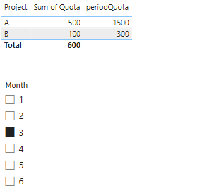
Based on your description, I have created many measures to achieve the effect you are looking for. Following picture shows the effect of the display.
Measure:
periodQuota =

VAR _months =

    SELECTEDVALUE ( 'Month'[Month] )

VAR _quota =

    SELECTEDVALUE ( 'Table'[Quota] )

VAR _periodQuota =

    CALCULATE ( _months * _quota )

RETURN

    _periodQuota
If this does not work, could you please share some sample data without sensitive information and expected output.
How to provide sample data in the Power BI Forum - Microsoft Fabric Community
Best Regards,
Yang
Community Support Team
If there is any post helps, then please consider Accept it as the solution to help the other members find it more quickly.
If I misunderstand your needs or you still have problems on it, please feel free to let us know. Thanks a lot!
How to get your questions answered quickly -- How to provide sample data in the Power BI Forum
Helpful resources

Microsoft Fabric Learn Together
Covering the world! 9:00-10:30 AM Sydney, 4:00-5:30 PM CET (Paris/Berlin), 7:00-8:30 PM Mexico City

Power BI Monthly Update - April 2024
Check out the April 2024 Power BI update to learn about new features.

| User | Count |
|---|---|
| 96 | |
| 95 | |
| 83 | |
| 70 | |
| 66 |
| User | Count |
|---|---|
| 118 | |
| 106 | |
| 93 | |
| 79 | |
| 72 |

