- Power BI forums
- Updates
- News & Announcements
- Get Help with Power BI
- Desktop
- Service
- Report Server
- Power Query
- Mobile Apps
- Developer
- DAX Commands and Tips
- Custom Visuals Development Discussion
- Health and Life Sciences
- Power BI Spanish forums
- Translated Spanish Desktop
- Power Platform Integration - Better Together!
- Power Platform Integrations (Read-only)
- Power Platform and Dynamics 365 Integrations (Read-only)
- Training and Consulting
- Instructor Led Training
- Dashboard in a Day for Women, by Women
- Galleries
- Community Connections & How-To Videos
- COVID-19 Data Stories Gallery
- Themes Gallery
- Data Stories Gallery
- R Script Showcase
- Webinars and Video Gallery
- Quick Measures Gallery
- 2021 MSBizAppsSummit Gallery
- 2020 MSBizAppsSummit Gallery
- 2019 MSBizAppsSummit Gallery
- Events
- Ideas
- Custom Visuals Ideas
- Issues
- Issues
- Events
- Upcoming Events
- Community Blog
- Power BI Community Blog
- Custom Visuals Community Blog
- Community Support
- Community Accounts & Registration
- Using the Community
- Community Feedback
Register now to learn Fabric in free live sessions led by the best Microsoft experts. From Apr 16 to May 9, in English and Spanish.
- Power BI forums
- Forums
- Get Help with Power BI
- Desktop
- Market share(%) by category
- Subscribe to RSS Feed
- Mark Topic as New
- Mark Topic as Read
- Float this Topic for Current User
- Bookmark
- Subscribe
- Printer Friendly Page
- Mark as New
- Bookmark
- Subscribe
- Mute
- Subscribe to RSS Feed
- Permalink
- Report Inappropriate Content
Market share(%) by category
Hi
I am trying to make the bar charts show Market share by each market segment. I have looked up all post but could not find a good case I am looking for. It would be much appreciated if you could help me to work out!
Condition: There are 5 market segments and multiple brands competing in each market segment. The data table is as below
| Market Segment | Brand | Qty Sold |
| Entry | A | 2 |
| Main | B | 3 |
| High | C | 11 |
| Premium | D | 23 |
| Luxury | E | 11 |
| Entry | E | 2 |
| Premium | D | 33 |
| Luxury | A | 11 |
| Luxury | C | 3 |
| Luxury | C | 4 |
| High | C | 1 |
| High | F | 2 |
| Entry | E | 3 |
| High | C | 11 |
| Entry | A | 9 |
| Entry | G | 2 |
| Entry | H | 2 |
| Entry | I | 2 |
| High | C | 1 |
| Entry | F | 2 |
| Entry | E | 3 |
| High | C | 11 |
| Entry | A | 9 |
Question
1. I want to make a bar chart shows category market share(%) by brand as below (in a bar chart)
| Chart1 | BrandA | Chart1 | BrandB | Chart1 | BrandC | Chart1 | BrandD | |||
| Entry | 65% | Entry | 0% | Entry | 0% | Entry | 0% | |||
| High | 0% | High | 0% | High | 83% | High | 0% | |||
| Luxury | 35% | Luxury | 0% | Luxury | 17% | Luxury | 0% | |||
| Main | 0% | Main | 100% | Main | 0% | Main | 0% | |||
| Premium | 0% | Premium | 0% | Premium | 0% | Premium | 100% |
2. I want to make a bar chart shows category market share(%) by brand and by Ranking
* Ranking: Ranking based on total number of Qty sales in total (Sum of all product category: Entry, Main, High, Premium, Luxury)
| Chart1 | BrandD | Chart1 | BrandC | Chart1 | BrandA | Chart1 | BrandE | |||
| Entry | 0% | Entry | 0% | Entry | 65% | Entry | 42% | |||
| High | 0% | High | 83% | High | 0% | High | 0% | |||
| Luxury | 0% | Luxury | 17% | Luxury | 35% | Luxury | 58% | |||
| Main | 0% | Main | 0% | Main | 0% | Main | 0% | |||
| Premium | 100% | Premium | 0% | Premium | 0% | Premium | 0% |
Solved! Go to Solution.
- Mark as New
- Bookmark
- Subscribe
- Mute
- Subscribe to RSS Feed
- Permalink
- Report Inappropriate Content
@junoglasgow Please try below:
Add "New Table"
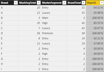
MarketBrandOutput = SUMMARIZE(MarketBrand,MarketBrand[Brand],MarketBrand[MarketSegment],"MarkSegTotal",SUM(MarketBrand[Qty]))
Add two additional fields using "New Column" option as below
BrandTotal = CALCULATE(SUM(MarketBrandOutput[MarkSegTotal]),FILTER(ALL(MarketBrandOutput),MarketBrandOutput[Brand]=EARLIER(MarketBrandOutput[Brand])))
Share% = DIVIDE(MarketBrandOutput[MarkSegTotal],MarketBrandOutput[BrandTotal])
Finally, your output will look like this...
Just representing the above data in Matrix visual, for your reference
Did I answer your question? Mark my post as a solution!
Proud to be a PBI Community Champion
- Mark as New
- Bookmark
- Subscribe
- Mute
- Subscribe to RSS Feed
- Permalink
- Report Inappropriate Content
I fixed the example table, now they are in line with with data
Can Anyone help me out this, please?
- Mark as New
- Bookmark
- Subscribe
- Mute
- Subscribe to RSS Feed
- Permalink
- Report Inappropriate Content
@junoglasgow Please try below:
Add "New Table"
MarketBrandOutput = SUMMARIZE(MarketBrand,MarketBrand[Brand],MarketBrand[MarketSegment],"MarkSegTotal",SUM(MarketBrand[Qty]))
Add two additional fields using "New Column" option as below
BrandTotal = CALCULATE(SUM(MarketBrandOutput[MarkSegTotal]),FILTER(ALL(MarketBrandOutput),MarketBrandOutput[Brand]=EARLIER(MarketBrandOutput[Brand])))
Share% = DIVIDE(MarketBrandOutput[MarkSegTotal],MarketBrandOutput[BrandTotal])
Finally, your output will look like this...
Just representing the above data in Matrix visual, for your reference
Did I answer your question? Mark my post as a solution!
Proud to be a PBI Community Champion
- Mark as New
- Bookmark
- Subscribe
- Mute
- Subscribe to RSS Feed
- Permalink
- Report Inappropriate Content
@junoglasgow Just to confirm, the expected output (the last two tabular data) is not aligned with the sample data. It just sample layout that you are expecting isn't it ?
Did I answer your question? Mark my post as a solution!
Proud to be a PBI Community Champion
- Mark as New
- Bookmark
- Subscribe
- Mute
- Subscribe to RSS Feed
- Permalink
- Report Inappropriate Content
@PattemManohar appreciate your reply, You are right. I created tabular tables just to demonstrate how the bar chart should look like. these are not aligned with the sample data.
- Mark as New
- Bookmark
- Subscribe
- Mute
- Subscribe to RSS Feed
- Permalink
- Report Inappropriate Content
@junoglasgow Thanks for confirming that.
Please try this for your 1st Requirement, by using "New Table" option
MarketShareByBrand = SUMMARIZECOLUMNS(MarketBrand[MarketSegment],MarketBrand[Brand],"Total",SUM(MarketBrand[Qty]))
Then in the chart visual, change the "Value" field to "Show Value as -> Percent of Grand Total". You can have one chart and a slicer on Brand instead of having different charts for each brand. If you want different charts for each brand, then have a "Visual Level Filter"
Did I answer your question? Mark my post as a solution!
Proud to be a PBI Community Champion
- Mark as New
- Bookmark
- Subscribe
- Mute
- Subscribe to RSS Feed
- Permalink
- Report Inappropriate Content
Appreciate your help, I Try it but it keep saying that "The expression refers to multiple columns, Multiple columns cannot be converted to a scalar value.
I try this "New measure" option
- Mark as New
- Bookmark
- Subscribe
- Mute
- Subscribe to RSS Feed
- Permalink
- Report Inappropriate Content
Did I answer your question? Mark my post as a solution!
Proud to be a PBI Community Champion
- Mark as New
- Bookmark
- Subscribe
- Mute
- Subscribe to RSS Feed
- Permalink
- Report Inappropriate Content
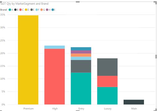
I made it as guided but it only shows % of Grand total. I want to see % of subtotal for a specific brand.
For example, Brand A market share 74% in Entry / Brand A Market share 34% in Luxury / 85% market share in Premium etc..
Helpful resources

Microsoft Fabric Learn Together
Covering the world! 9:00-10:30 AM Sydney, 4:00-5:30 PM CET (Paris/Berlin), 7:00-8:30 PM Mexico City

Power BI Monthly Update - April 2024
Check out the April 2024 Power BI update to learn about new features.

| User | Count |
|---|---|
| 106 | |
| 105 | |
| 79 | |
| 69 | |
| 62 |
| User | Count |
|---|---|
| 143 | |
| 104 | |
| 103 | |
| 82 | |
| 70 |


