- Power BI forums
- Updates
- News & Announcements
- Get Help with Power BI
- Desktop
- Service
- Report Server
- Power Query
- Mobile Apps
- Developer
- DAX Commands and Tips
- Custom Visuals Development Discussion
- Health and Life Sciences
- Power BI Spanish forums
- Translated Spanish Desktop
- Power Platform Integration - Better Together!
- Power Platform Integrations (Read-only)
- Power Platform and Dynamics 365 Integrations (Read-only)
- Training and Consulting
- Instructor Led Training
- Dashboard in a Day for Women, by Women
- Galleries
- Community Connections & How-To Videos
- COVID-19 Data Stories Gallery
- Themes Gallery
- Data Stories Gallery
- R Script Showcase
- Webinars and Video Gallery
- Quick Measures Gallery
- 2021 MSBizAppsSummit Gallery
- 2020 MSBizAppsSummit Gallery
- 2019 MSBizAppsSummit Gallery
- Events
- Ideas
- Custom Visuals Ideas
- Issues
- Issues
- Events
- Upcoming Events
- Community Blog
- Power BI Community Blog
- Custom Visuals Community Blog
- Community Support
- Community Accounts & Registration
- Using the Community
- Community Feedback
Register now to learn Fabric in free live sessions led by the best Microsoft experts. From Apr 16 to May 9, in English and Spanish.
- Power BI forums
- Forums
- Get Help with Power BI
- Desktop
- Re: Line chart of sales data not showing zero when...
- Subscribe to RSS Feed
- Mark Topic as New
- Mark Topic as Read
- Float this Topic for Current User
- Bookmark
- Subscribe
- Printer Friendly Page
- Mark as New
- Bookmark
- Subscribe
- Mute
- Subscribe to RSS Feed
- Permalink
- Report Inappropriate Content
Line chart of sales data not showing zero when there is no data
Hi,
Please bear with me as I am very new to Power BI
I have a line chart based on a table of data of sales by month. When there is no sales in that month the line chart doesn't drop to zero. Is there a simple way to make the chart drop to zero when there is no data for a month?
Thanks,
Tom
Solved! Go to Solution.
- Mark as New
- Bookmark
- Subscribe
- Mute
- Subscribe to RSS Feed
- Permalink
- Report Inappropriate Content
Here is the measure I'm using in my example:
Sum Forecast = SUM('Data Table'[Forecast]) +0So, try adding the "+0" to your measure as above and see if it solves the problem.
If it doesn't, please post a screenshot and let us know where the field for the x axis (Month Year) is coming from (Data table? Calendar Table?)
Did I answer your question? Mark my post as a solution!
In doing so, you are also helping me. Thank you!
Proud to be a Super User!
Paul on Linkedin.
- Mark as New
- Bookmark
- Subscribe
- Mute
- Subscribe to RSS Feed
- Permalink
- Report Inappropriate Content
Hi,
Using a measure you could replace blank values with 0 like the example code below
IF(ISBLANK(SUM('Table'[Sales])),0,SUM('Table'[Sales]))or maybe
SUM('Table'[Sales]) +0
- Mark as New
- Bookmark
- Subscribe
- Mute
- Subscribe to RSS Feed
- Permalink
- Report Inappropriate Content
Hi,
Sorry if i'm beng daft. My actual data doesn't have any blank data, the line chart is coming from a visual table? If this solution still works where do I apply the measure?
Thanks,
Tom
- Mark as New
- Bookmark
- Subscribe
- Mute
- Subscribe to RSS Feed
- Permalink
- Report Inappropriate Content
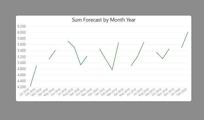
If your chart looking like this....
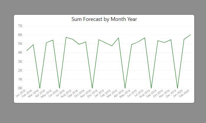
then the trick suggested by @Gordonlilj of including " + 0 " at the end of your measure will deliver this:
Did I answer your question? Mark my post as a solution!
In doing so, you are also helping me. Thank you!
Proud to be a Super User!
Paul on Linkedin.
- Mark as New
- Bookmark
- Subscribe
- Mute
- Subscribe to RSS Feed
- Permalink
- Report Inappropriate Content
Hi,
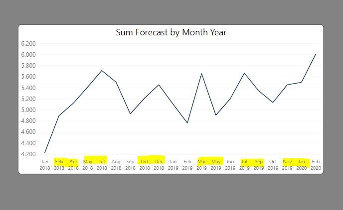
The chart looks like the below:
It comes from the below visual:
These are just samples of the visuals. There is data by month to 2020.
Thanks,
Tom
- Mark as New
- Bookmark
- Subscribe
- Mute
- Subscribe to RSS Feed
- Permalink
- Report Inappropriate Content
What measure are you using for the values in the chart?
BTW, the values in the x axis can be misleading. This is the chart I showed above without adding the "+0" to the measure and without the option of "showing items with no data" in the dropdown of the x Axis field:
The months with no data are simply omitted, creating a continuous line. Adding the "+0" solve this as there are values (including 0) in all months
PS:; are you using a column from a calendar table as your x axis?
Did I answer your question? Mark my post as a solution!
In doing so, you are also helping me. Thank you!
Proud to be a Super User!
Paul on Linkedin.
- Mark as New
- Bookmark
- Subscribe
- Mute
- Subscribe to RSS Feed
- Permalink
- Report Inappropriate Content
- Mark as New
- Bookmark
- Subscribe
- Mute
- Subscribe to RSS Feed
- Permalink
- Report Inappropriate Content
Here is the measure I'm using in my example:
Sum Forecast = SUM('Data Table'[Forecast]) +0So, try adding the "+0" to your measure as above and see if it solves the problem.
If it doesn't, please post a screenshot and let us know where the field for the x axis (Month Year) is coming from (Data table? Calendar Table?)
Did I answer your question? Mark my post as a solution!
In doing so, you are also helping me. Thank you!
Proud to be a Super User!
Paul on Linkedin.
Helpful resources

Microsoft Fabric Learn Together
Covering the world! 9:00-10:30 AM Sydney, 4:00-5:30 PM CET (Paris/Berlin), 7:00-8:30 PM Mexico City

Power BI Monthly Update - April 2024
Check out the April 2024 Power BI update to learn about new features.

| User | Count |
|---|---|
| 104 | |
| 95 | |
| 80 | |
| 67 | |
| 62 |
| User | Count |
|---|---|
| 147 | |
| 109 | |
| 107 | |
| 85 | |
| 63 |


