- Power BI forums
- Updates
- News & Announcements
- Get Help with Power BI
- Desktop
- Service
- Report Server
- Power Query
- Mobile Apps
- Developer
- DAX Commands and Tips
- Custom Visuals Development Discussion
- Health and Life Sciences
- Power BI Spanish forums
- Translated Spanish Desktop
- Power Platform Integration - Better Together!
- Power Platform Integrations (Read-only)
- Power Platform and Dynamics 365 Integrations (Read-only)
- Training and Consulting
- Instructor Led Training
- Dashboard in a Day for Women, by Women
- Galleries
- Community Connections & How-To Videos
- COVID-19 Data Stories Gallery
- Themes Gallery
- Data Stories Gallery
- R Script Showcase
- Webinars and Video Gallery
- Quick Measures Gallery
- 2021 MSBizAppsSummit Gallery
- 2020 MSBizAppsSummit Gallery
- 2019 MSBizAppsSummit Gallery
- Events
- Ideas
- Custom Visuals Ideas
- Issues
- Issues
- Events
- Upcoming Events
- Community Blog
- Power BI Community Blog
- Custom Visuals Community Blog
- Community Support
- Community Accounts & Registration
- Using the Community
- Community Feedback
Register now to learn Fabric in free live sessions led by the best Microsoft experts. From Apr 16 to May 9, in English and Spanish.
- Power BI forums
- Forums
- Get Help with Power BI
- Desktop
- Line Chart - 2 color in the same line
- Subscribe to RSS Feed
- Mark Topic as New
- Mark Topic as Read
- Float this Topic for Current User
- Bookmark
- Subscribe
- Printer Friendly Page
- Mark as New
- Bookmark
- Subscribe
- Mute
- Subscribe to RSS Feed
- Permalink
- Report Inappropriate Content
Line Chart - 2 color in the same line
Hi Everyone,
I've an issue and I'm out of the solution
I've two data base :
- The first is for the real financial data ;
- The second is for the forecasted financial data ;
=> both base are identical (same column, same format of data item....)
=> There is always 12 months, no partial analyze
I want to create a line chart represent the the cumulative amount per month where :
- The real data is on line ;
- The reforcast is on dashed line ;
For that, I've a cumulative measure :
- Cumulative amount : =CALCULATE(SUM('PL_cumulé'[Solde]),FILTER(ALLSELECTED('PL_cumulé'),'PL_cumulé'[Date] <=MAX('PL_cumulé'[Date]))
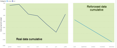
When I create a line chart, there is always a blank for the period beetwen real/reforecast. Does anyone know how to fill the blank to have one complete line. The first part is fill and the second on is dashed
Thank you for your help guys !
Solved! Go to Solution.
- Mark as New
- Bookmark
- Subscribe
- Mute
- Subscribe to RSS Feed
- Permalink
- Report Inappropriate Content
Hi @Balta-expertise,
You can use measure expression to replace raw value fields and add if statement on these values to skip calculation on speed ranges After these steps, power bi will auto-hidden these blank parts.
Regards,
Xiaoxin Sheng
If this post helps, please consider accept as solution to help other members find it more quickly.
- Mark as New
- Bookmark
- Subscribe
- Mute
- Subscribe to RSS Feed
- Permalink
- Report Inappropriate Content
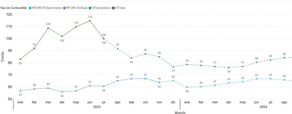
1.- crea una columna con la fecha (Eje X)
2.- columna con los valores (Eje Y)
3.- columna con etiquetas Real y Pronóstico, (según corresponda a los valores)
4.- columna Categoría (leyenda), en mi ejemplo tengo dos tipos de combustibles, este es mi caso
5.- En tu tabla agrega una columna concatenando la columna 3 y 4
6.- la columna creada en el paso 5 la colocas en Leyenda.
7.- cambia los estilos de líneas
- Mark as New
- Bookmark
- Subscribe
- Mute
- Subscribe to RSS Feed
- Permalink
- Report Inappropriate Content
@Balta-expertise , I a single line you can not get dashed and normal line. So you need to two measure. In two measures you will not have a connection
You can have a single measure but the line color will not be different.
example: assuming you have given actual, using a common date table
- Cumulative amount : =CALCULATE(SUM('PL_cumulé'[Solde]) + Sum(Target[Target]) ,FILTER(ALLSELECTED('Date'),'Date'[Date] <=MAX('Date'[Date]))
Microsoft Power BI Learning Resources, 2023 !!
Learn Power BI - Full Course with Dec-2022, with Window, Index, Offset, 100+ Topics !!
Did I answer your question? Mark my post as a solution! Appreciate your Kudos !! Proud to be a Super User! !!
- Mark as New
- Bookmark
- Subscribe
- Mute
- Subscribe to RSS Feed
- Permalink
- Report Inappropriate Content
Got it !
First, I calculate the cumulative amount
Second, I created 2 measures (as you sugget) with the filter on the data source base on the first calculate :
First :
- Mark as New
- Bookmark
- Subscribe
- Mute
- Subscribe to RSS Feed
- Permalink
- Report Inappropriate Content
hi @amitchandak ,
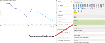
Thank you for your answer. What represent the "Target" on your SUM function ? When I try with 2 measures, they are superimposed. I try to add a filter on the calculate function but the lines doesn't stop and continued until the end of the year:
Thank you very much fr your help. It's is more easy, I can share the PBIX File via dropbox ?
Jules
- Mark as New
- Bookmark
- Subscribe
- Mute
- Subscribe to RSS Feed
- Permalink
- Report Inappropriate Content
Hi @Balta-expertise,
You can use measure expression to replace raw value fields and add if statement on these values to skip calculation on speed ranges After these steps, power bi will auto-hidden these blank parts.
Regards,
Xiaoxin Sheng
If this post helps, please consider accept as solution to help other members find it more quickly.
Helpful resources

Microsoft Fabric Learn Together
Covering the world! 9:00-10:30 AM Sydney, 4:00-5:30 PM CET (Paris/Berlin), 7:00-8:30 PM Mexico City

Power BI Monthly Update - April 2024
Check out the April 2024 Power BI update to learn about new features.

| User | Count |
|---|---|
| 105 | |
| 94 | |
| 75 | |
| 63 | |
| 62 |
| User | Count |
|---|---|
| 137 | |
| 105 | |
| 104 | |
| 80 | |
| 63 |


