- Power BI forums
- Updates
- News & Announcements
- Get Help with Power BI
- Desktop
- Service
- Report Server
- Power Query
- Mobile Apps
- Developer
- DAX Commands and Tips
- Custom Visuals Development Discussion
- Health and Life Sciences
- Power BI Spanish forums
- Translated Spanish Desktop
- Power Platform Integration - Better Together!
- Power Platform Integrations (Read-only)
- Power Platform and Dynamics 365 Integrations (Read-only)
- Training and Consulting
- Instructor Led Training
- Dashboard in a Day for Women, by Women
- Galleries
- Community Connections & How-To Videos
- COVID-19 Data Stories Gallery
- Themes Gallery
- Data Stories Gallery
- R Script Showcase
- Webinars and Video Gallery
- Quick Measures Gallery
- 2021 MSBizAppsSummit Gallery
- 2020 MSBizAppsSummit Gallery
- 2019 MSBizAppsSummit Gallery
- Events
- Ideas
- Custom Visuals Ideas
- Issues
- Issues
- Events
- Upcoming Events
- Community Blog
- Power BI Community Blog
- Custom Visuals Community Blog
- Community Support
- Community Accounts & Registration
- Using the Community
- Community Feedback
Register now to learn Fabric in free live sessions led by the best Microsoft experts. From Apr 16 to May 9, in English and Spanish.
- Power BI forums
- Forums
- Get Help with Power BI
- Desktop
- How to show this is visual
- Subscribe to RSS Feed
- Mark Topic as New
- Mark Topic as Read
- Float this Topic for Current User
- Bookmark
- Subscribe
- Printer Friendly Page
- Mark as New
- Bookmark
- Subscribe
- Mute
- Subscribe to RSS Feed
- Permalink
- Report Inappropriate Content
How to show this is visual
Hi Team,
I have 5 columns,
| Project | Baseline | Q1 | Q2 | Q3 | Q4 |
| B | 100% | 100% | 98% | ||
| C | 100% | 100% | 89% | ||
| D | 100% | 100% | 100% | ||
| E | 100% | 100% | 100% | ||
| F | 100% | 100% | 100% | ||
| G | 100% | 100% | 91% | ||
| H | 95% | 100% | 90% | ||
| G | 95% | 100% | 93% | ||
| H | 90% | N/A | 80% | ||
| I | 90% | N/A | N/A |
My requiremtnet is to compare each Quarter to Quarter to baseline value and see if they have meet the critirica.
Not sure which visual to use and how to show this.
Thanks in Advance !
Solved! Go to Solution.
- Mark as New
- Bookmark
- Subscribe
- Mute
- Subscribe to RSS Feed
- Permalink
- Report Inappropriate Content
Hi, @Anonymous
Has your problem been solved? Does my method above help?
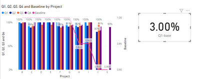
You can create some measures as indicators such as:
Q1-base=AVERAGE('Table'[Q1])-AVERAGE('Table'[Baseline])
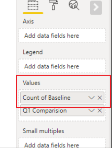
Note that in the screenshot above, your baseline is counting, which may indicate that this field is a text type. Please modify the type to percentage to calculate it normally.
It seems like a good idea to use line and clustered column char.
Please refer to the attachment below for details
Edit:
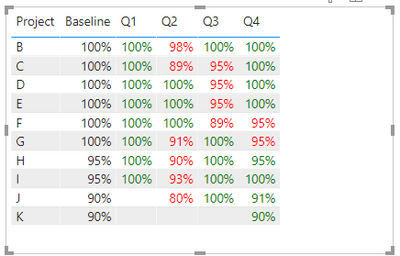
or just to create condition formatting rules to highlight the data in a table to see if they have meet the critirica.
create a measure for each quarter.
_Q1 = IF(SUM('Table'[Q1])>=SUM('Table'[Baseline]),"green","red")

_Q2 = IF(SUM('Table'[Q2])>=SUM('Table'[Baseline]),"green","red")

_Q3 = IF(SUM('Table'[Q3])>=SUM('Table'[Baseline]),"green","red")

_Q4 = IF(SUM('Table'[Q4])>=SUM('Table'[Baseline]),"green","red")
Hope this helps.
Best Regards,
Community Support Team _ Zeon Zheng
If this post helps, then please consider Accept it as the solution to help the other members find it more quickly.
- Mark as New
- Bookmark
- Subscribe
- Mute
- Subscribe to RSS Feed
- Permalink
- Report Inappropriate Content
Hi, @Anonymous
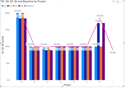
It seems like a good idea to use line and clustered column char.
Note that the data need to be formatted as the percentage type.
result:
Please refer to the attachment below for details
Hope this helps.
Best Regards,
Community Support Team _ Zeon Zheng
If this post helps, then please consider Accept it as the solution to help the other members find it more quickly.
- Mark as New
- Bookmark
- Subscribe
- Mute
- Subscribe to RSS Feed
- Permalink
- Report Inappropriate Content
@Anonymous , Line or clustered bar line should help .
You can create measures like
average(Table[Baseline]) - average(Table[Q1])
or
average(Table[Baseline]) - average(Table[Q2])
Microsoft Power BI Learning Resources, 2023 !!
Learn Power BI - Full Course with Dec-2022, with Window, Index, Offset, 100+ Topics !!
Did I answer your question? Mark my post as a solution! Appreciate your Kudos !! Proud to be a Super User! !!
- Mark as New
- Bookmark
- Subscribe
- Mute
- Subscribe to RSS Feed
- Permalink
- Report Inappropriate Content
- Mark as New
- Bookmark
- Subscribe
- Mute
- Subscribe to RSS Feed
- Permalink
- Report Inappropriate Content
Hi, @Anonymous
Has your problem been solved? Does my method above help?
You can create some measures as indicators such as:
Q1-base=AVERAGE('Table'[Q1])-AVERAGE('Table'[Baseline])
Note that in the screenshot above, your baseline is counting, which may indicate that this field is a text type. Please modify the type to percentage to calculate it normally.
It seems like a good idea to use line and clustered column char.
Please refer to the attachment below for details
Edit:
or just to create condition formatting rules to highlight the data in a table to see if they have meet the critirica.
create a measure for each quarter.
_Q1 = IF(SUM('Table'[Q1])>=SUM('Table'[Baseline]),"green","red")

_Q2 = IF(SUM('Table'[Q2])>=SUM('Table'[Baseline]),"green","red")

_Q3 = IF(SUM('Table'[Q3])>=SUM('Table'[Baseline]),"green","red")

_Q4 = IF(SUM('Table'[Q4])>=SUM('Table'[Baseline]),"green","red")
Hope this helps.
Best Regards,
Community Support Team _ Zeon Zheng
If this post helps, then please consider Accept it as the solution to help the other members find it more quickly.
Helpful resources

Microsoft Fabric Learn Together
Covering the world! 9:00-10:30 AM Sydney, 4:00-5:30 PM CET (Paris/Berlin), 7:00-8:30 PM Mexico City

Power BI Monthly Update - April 2024
Check out the April 2024 Power BI update to learn about new features.

| User | Count |
|---|---|
| 106 | |
| 98 | |
| 75 | |
| 63 | |
| 62 |
| User | Count |
|---|---|
| 135 | |
| 105 | |
| 104 | |
| 80 | |
| 65 |


