- Power BI forums
- Updates
- News & Announcements
- Get Help with Power BI
- Desktop
- Service
- Report Server
- Power Query
- Mobile Apps
- Developer
- DAX Commands and Tips
- Custom Visuals Development Discussion
- Health and Life Sciences
- Power BI Spanish forums
- Translated Spanish Desktop
- Power Platform Integration - Better Together!
- Power Platform Integrations (Read-only)
- Power Platform and Dynamics 365 Integrations (Read-only)
- Training and Consulting
- Instructor Led Training
- Dashboard in a Day for Women, by Women
- Galleries
- Community Connections & How-To Videos
- COVID-19 Data Stories Gallery
- Themes Gallery
- Data Stories Gallery
- R Script Showcase
- Webinars and Video Gallery
- Quick Measures Gallery
- 2021 MSBizAppsSummit Gallery
- 2020 MSBizAppsSummit Gallery
- 2019 MSBizAppsSummit Gallery
- Events
- Ideas
- Custom Visuals Ideas
- Issues
- Issues
- Events
- Upcoming Events
- Community Blog
- Power BI Community Blog
- Custom Visuals Community Blog
- Community Support
- Community Accounts & Registration
- Using the Community
- Community Feedback
Earn a 50% discount on the DP-600 certification exam by completing the Fabric 30 Days to Learn It challenge.
- Power BI forums
- Forums
- Get Help with Power BI
- Desktop
- How to show 2 years on x axis of bar chart when di...
- Subscribe to RSS Feed
- Mark Topic as New
- Mark Topic as Read
- Float this Topic for Current User
- Bookmark
- Subscribe
- Printer Friendly Page
- Mark as New
- Bookmark
- Subscribe
- Mute
- Subscribe to RSS Feed
- Permalink
- Report Inappropriate Content
How to show 2 years on x axis of bar chart when displaying months only?
Currently my data set has random dates between 01/01/2016 - 09/05/2017.
I'd like to show the count of dates per month spanning from the beginning of 2016 - present 2017, at the moment the count for months from 2017 are combining with those from 2016 and only forming 12 months along the x axis, rather than 17 months including the additional 5 from 2017.
Can anybody help?
Solved! Go to Solution.
- Mark as New
- Bookmark
- Subscribe
- Mute
- Subscribe to RSS Feed
- Permalink
- Report Inappropriate Content
Hi @HarryH
Try out the following
1. Create a column called YearMonthNumber as
YearMonthNumber = (Year('Sales'[Date])) * 12 + Month( 'Sales'[Date])
2. Create a column called MonthYear as
MonthYear = Format(Sales[Date],"mmm") & "-" & Format(Sales[Date],"yyyy")
3. Set the Sort by Coulmn for MonthYear to YearMonthNumber
4. Create a measure called DaysIntheMonth = DistinctCount(Sales[Date])
5. Now plot the barchart
with MonthYear as Axis and DaysIntheMonth as values.
6. You should get the Axis displayed for 17 months .
If this solves your issue please accept this as a solution and also give KUDOS.
Cheers
CheenuSing
Proud to be a Datanaut!
- Mark as New
- Bookmark
- Subscribe
- Mute
- Subscribe to RSS Feed
- Permalink
- Report Inappropriate Content
Hello @CheenuSing,
Sorry to be a pain.
I have one extra question.
I have created my new charts and they are excellent with data from my spreadsheet.
For example I might have list of 100 lines.
30 renewals & 70 settlements over 19 months.
Problem is when I am adding there measure from other spreadsheet.
I might have another excel with 200 lines.
I have measure 200-30 = 170
170 is conquest.
I can't visual conquest with renewals in my new chart.
I can visual them only in normal 12 month chart by date.
I have date table which links both spreadsheets.
Any idea how to sort this out?
Many thanks in advance.
Kind regards.
Andrej
- Mark as New
- Bookmark
- Subscribe
- Mute
- Subscribe to RSS Feed
- Permalink
- Report Inappropriate Content
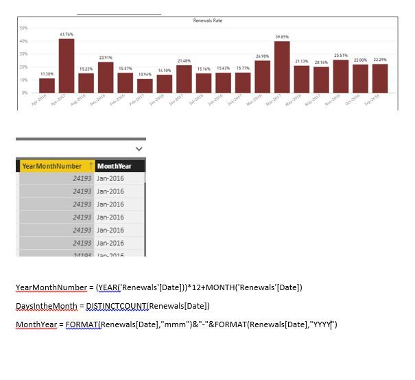
Hello @CheenuSing
Your tip was excelent.
I am facing now same issue.
I have still ony problem with sorting.
What I am doing wrongly?
I have MonthYear in Axis & me % rate in Values
Thx
- Mark as New
- Bookmark
- Subscribe
- Mute
- Subscribe to RSS Feed
- Permalink
- Report Inappropriate Content
Refer to point 3.
3. Set the Sort by Coulmn for MonthYear to YearMonthNumber.
This should resolve displaying the MonthYear in the correct order.
Cheers
CheenuSing
Proud to be a Datanaut!
- Mark as New
- Bookmark
- Subscribe
- Mute
- Subscribe to RSS Feed
- Permalink
- Report Inappropriate Content


