- Power BI forums
- Updates
- News & Announcements
- Get Help with Power BI
- Desktop
- Service
- Report Server
- Power Query
- Mobile Apps
- Developer
- DAX Commands and Tips
- Custom Visuals Development Discussion
- Health and Life Sciences
- Power BI Spanish forums
- Translated Spanish Desktop
- Power Platform Integration - Better Together!
- Power Platform Integrations (Read-only)
- Power Platform and Dynamics 365 Integrations (Read-only)
- Training and Consulting
- Instructor Led Training
- Dashboard in a Day for Women, by Women
- Galleries
- Community Connections & How-To Videos
- COVID-19 Data Stories Gallery
- Themes Gallery
- Data Stories Gallery
- R Script Showcase
- Webinars and Video Gallery
- Quick Measures Gallery
- 2021 MSBizAppsSummit Gallery
- 2020 MSBizAppsSummit Gallery
- 2019 MSBizAppsSummit Gallery
- Events
- Ideas
- Custom Visuals Ideas
- Issues
- Issues
- Events
- Upcoming Events
- Community Blog
- Power BI Community Blog
- Custom Visuals Community Blog
- Community Support
- Community Accounts & Registration
- Using the Community
- Community Feedback
Register now to learn Fabric in free live sessions led by the best Microsoft experts. From Apr 16 to May 9, in English and Spanish.
- Power BI forums
- Forums
- Get Help with Power BI
- Desktop
- How to get column in x axis of bar chart using mea...
- Subscribe to RSS Feed
- Mark Topic as New
- Mark Topic as Read
- Float this Topic for Current User
- Bookmark
- Subscribe
- Printer Friendly Page
- Mark as New
- Bookmark
- Subscribe
- Mute
- Subscribe to RSS Feed
- Permalink
- Report Inappropriate Content
How to get column in x axis of bar chart using measure
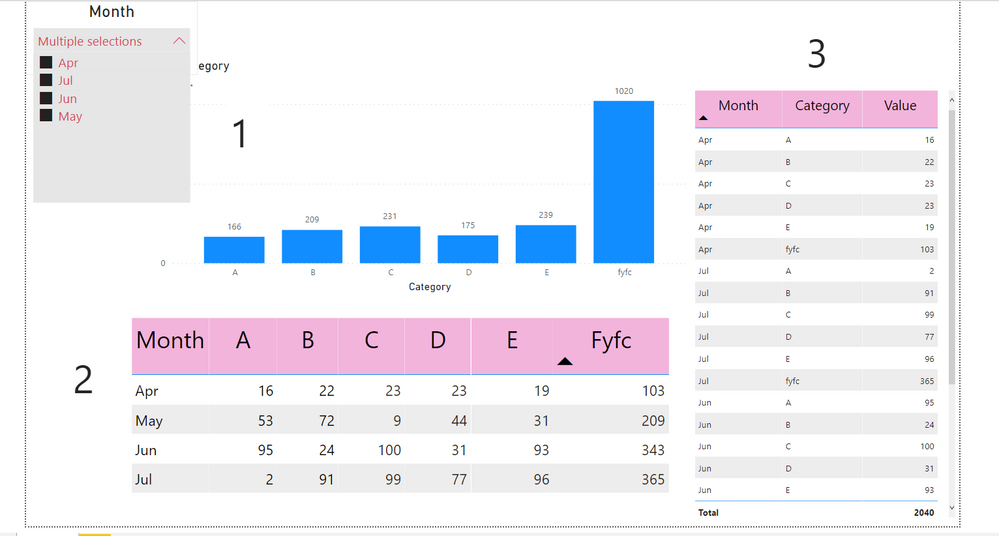
I want to create Graph 1 but my table structure is as Table 2, any measure to achieve this.
Also when table 2 is unpivoted (Table 3) then only its showing total otherwise Total is not appearing in Table 2.
Please help me resolve it, Thanking you in advance
Solved! Go to Solution.
- Mark as New
- Bookmark
- Subscribe
- Mute
- Subscribe to RSS Feed
- Permalink
- Report Inappropriate Content
Hi @Harsh333,
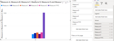
I'm not sure if I got your point accurately. You can create a separate measure for each category.
Measure A = CALCULATE(SUM(Test[A]),ALLEXCEPT(Test,Test[Month]))

Measure B= CALCULATE(SUM(Test[B]),ALLEXCEPT(Test,Test[Month]))

Measure C= CALCULATE(SUM(Test[C]),ALLEXCEPT(Test,Test[Month]))

Measure D= CALCULATE(SUM(Test[D]),ALLEXCEPT(Test,Test[Month]))

Measure E= CALCULATE(SUM(Test[E]),ALLEXCEPT(Test,Test[Month]))

Measure FYFC = CALCULATE(SUM(Test[FYFC]),ALLEXCEPT(Test,Test[Month]))
Then put your measure in the chart, you will get a result like this:
There is another, more convenient solution but it does not use measure.
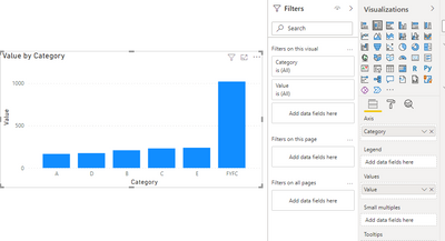
Based on what you mentioned above, you can unpivot Table2. You can enter data after unpivot into Power BI Desktop as Table 3.
Then use Table 3 to create a matrix like this:
Then adjust the matrix chart to a column chart. Put category in Axis. You can see this:
A demo is attached for your reference.
Hope it helps.
Best Regards,
Caitlyn Yan
If this post helps then please consider Accept it as the solution to help the other members find it more quickly.
- Mark as New
- Bookmark
- Subscribe
- Mute
- Subscribe to RSS Feed
- Permalink
- Report Inappropriate Content
@Anonymous , refer if this custom visual can help
https://appsource.microsoft.com/en-us/product/power-bi-visuals/wa200000675?tab=overview
Microsoft Power BI Learning Resources, 2023 !!
Learn Power BI - Full Course with Dec-2022, with Window, Index, Offset, 100+ Topics !!
Did I answer your question? Mark my post as a solution! Appreciate your Kudos !! Proud to be a Super User! !!
- Mark as New
- Bookmark
- Subscribe
- Mute
- Subscribe to RSS Feed
- Permalink
- Report Inappropriate Content
Sorry but I think you misunderstood my problem:
I want to created above bar graph (1) if my table was structured as (2).
not bar graph with table.
Helpful resources

Microsoft Fabric Learn Together
Covering the world! 9:00-10:30 AM Sydney, 4:00-5:30 PM CET (Paris/Berlin), 7:00-8:30 PM Mexico City

Power BI Monthly Update - April 2024
Check out the April 2024 Power BI update to learn about new features.

| User | Count |
|---|---|
| 104 | |
| 101 | |
| 79 | |
| 72 | |
| 64 |
| User | Count |
|---|---|
| 142 | |
| 108 | |
| 101 | |
| 81 | |
| 74 |


